When is comes to ADA Signs, no colors are specified, but there are a few hints. The finish must be a non-glare or matte finish, specifically mentioned is egg shell.
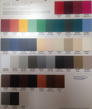
RowMark ADA Sign Colors in Plastic
The 2 colors must contrast. The contrast ratio is 7:1 or more. There is a large range of allowed colors, but 2 colors with a good contrast is required. This is at least a 70% color contrast differential between the pictogram and the background. The easiest way to achieved this is with a light colored pictogram on a dark background. A Black background with white letters has over 90% contrast, while a Green background with Blue letters is below the 70% requirement (About 50% contrast). The 2004 federal ADA Accessibility Guidelines define this is sections 4.1.2(7), 4.1.3(16) (a) (b) and 4.30.1-4.30.8.
Here are the colors pulled from the major supplier catalog. All these colors have been used for ADA Signs. There are a couple of other materials that are not in the catalog, the most popular is a brushed Aluminum against a black pictogram and lettering. Sticking to the tried and true colors and combinations makes a lot of sense. The effort required to mix, match and test is significant.
We can also match existing signs or other décor. Standard sign colors or custom colors and designs are possible.
Colors can be applied in different ways. Paint on the back side of clear acrylic is one way to produce a background color. This allows for any pantone color. Metals are also common, particularly a brushed Aluminum is common and popular.
Applique is the material used for letters and pictograms. This is normally black, white or dark gray. These are not the only chooses, but they are the common ones
What is your color? Give us a call and lets see what we can do!
Contact Frank at
760-730-5118
www.signsforsandiego.com