ADA Pictograms: Started by bored man in a cave. Yes the history of
ADA pictograms started with a
[caption id="attachment_985" align="alignright" width="300"]
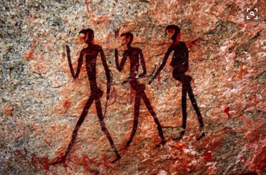
ADA Sign Pictograms were developed by a jilted lover[/caption]
poor sucker whos sweet heart kicked him out of the camp because he was caught with a longing glaze at a Neanderthal hotty. Pictograms are atleast 3000 years old and probably much much older.
In more modern times you have seen them,
stylized pictures of wheel chairs, men and women, stairs and more. They are everywhere, and in the US they are standardized. There was some need for a uniform code. Different people see the issues differently and were using different graphics to solve the problem. In the US there are 6 steps to creating corrent and usefull pictograms. Here they are:
Step 1 - Legal : The Americans with disabilities Act (ADA) seeks to bring about 10 million visually
[caption id="attachment_986" align="alignright" width="300"]
There is a need for ADA Sign Standards[/caption]
impaired people into the mainstream. All public buildings are required to provide access. For newer construction permits are not approved until the
ADA signs are in place and correct. There is a fire department requirement as well, the fire marshal or inspector will not sign off until the requirements are met.
Step -2 Defining Pictograms : Pictograms are stylized pictures of different functions. An ADA pictogram is an International symbol. The pictograms used in ADA signs contain the international symbols of accessibility (ISA), TTY, volume control telephones, assistive listening systems, and access for hearing loss. (ADAAG 703.7) (DSA A.C.M. 1117B.5.8) All Restroom
[caption id="attachment_984" align="alignright" width="300"]

International Standards[/caption]
signs, phone signs, no smoking signs, stair signs and other public access and evacuation signs are required to have a pictogram. Not all ADA signs require Pictograms: Office signs, room numbers, etc. are not required to have pictograms. Signs not requiring tactile pictograms also include exterior signs that are not located at the door to the space they serve shall not be required to comply with 703.2. Also, having a pictogram does not mean you can not have a flat, non-tactile picture as well. Company logos, photographic backgrounds and other design and astatic features enhance the look of the sign.
[caption id="attachment_982" align="alignright" width="300"]
Braille is not enough because the vision impaired[/caption]
Step 3 - Isn’t Braille Enough? Braille are used by people who learn the system. Many are blind from birth. Visually impaired people, particularly if the impairment developed later in life, often do not learn braille. They need the high contract tactile pictogram. The pictogram can be felt, so a smooth beveled edge is preferred. Also, there are different levels of vision impairment (Actually 3 defined levels). Persons with low vision need contrast so the background and the pictogram must have contrasting colors and be eggshell matte, or non-glare finish.
Step 4 - Construction Pictograms are made the same way the letters are made, with 1/32 inch thick plastic called applique or grovo. The pictogram is generally required to be is a specific place (above the letters and Braille) and a specific size (required to fit in a field that is a minimum of 6” in height)
[caption id="attachment_983" align="alignright" width="252"]
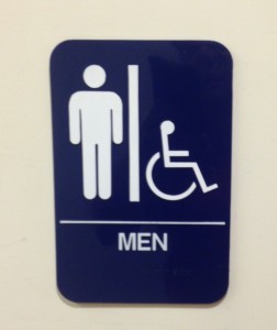
Contrasting colors and size help the visually impaired[/caption]
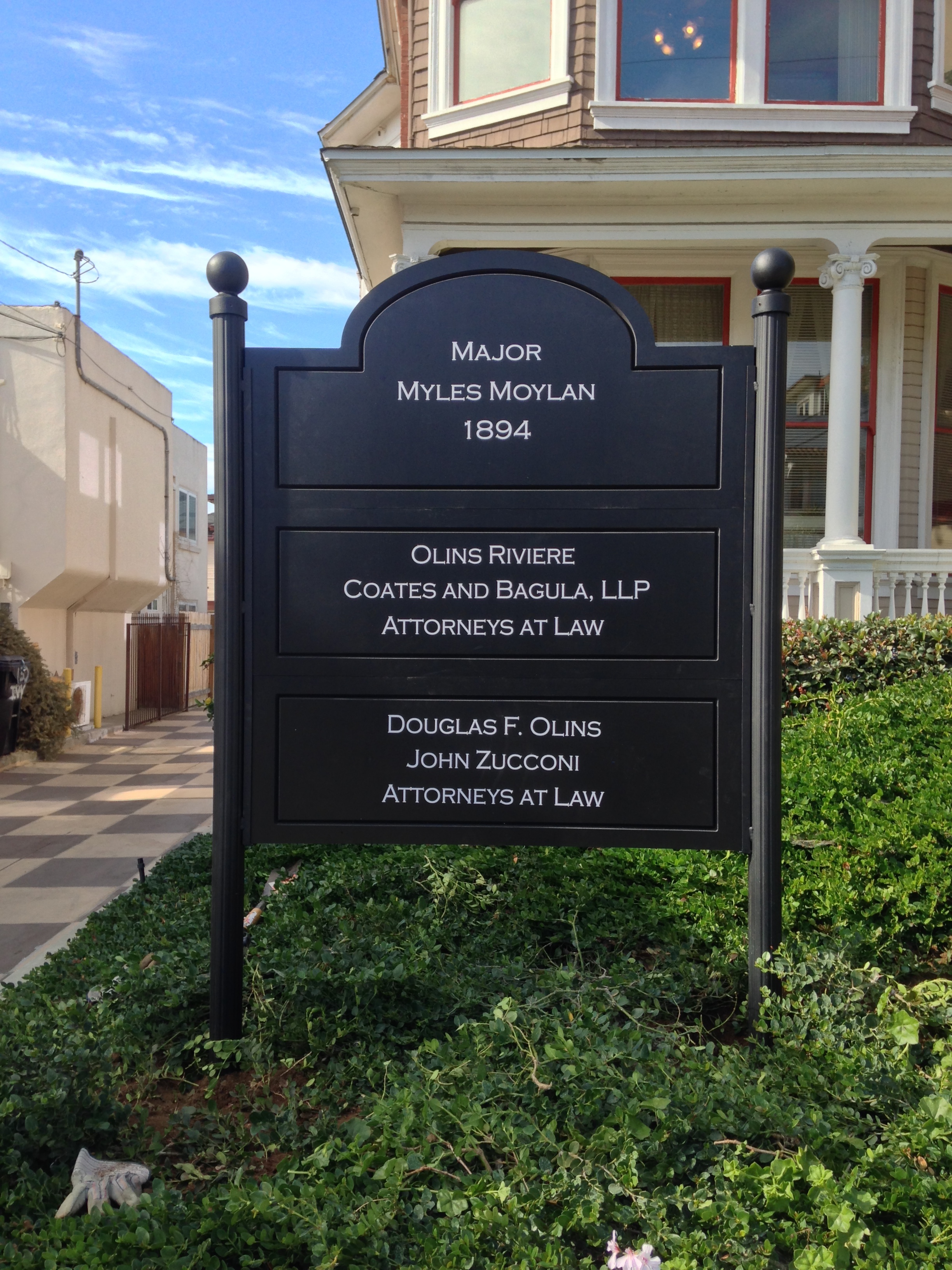
Step 5 - Colors and Contrast There is a large range of allowed colors, but 2 colors with a good contrast is required. This is pretty well defined to be at least a 70% color contrast differential between the pictogram and the background. Normally the easiest way to achieved this is with a light colored pictogram on a dark background. For example a Black background with white letters has over 90% contrast, while a Green background with blue letters is below the 70% requirement (About 50% contrast). The 2004 federal ADA Accessibility Guidelines define this is sections 4.1.2(7), 4.1.3(16) (a) (b) and 4.30.1-4.30.8.
Step 6 - How they are made. The pictograms are made with special cutting tools on a Grovograph IS800XP. There are other machines, but this is the granddaddy of them all.
Need ADA complant signs? Living in a cave because the wife kicks you out? Join us in the modern world of creating great ADA signs. Give us a call!
Signs for San Diego
Frank@signsforsandiego.com
760-730-5118