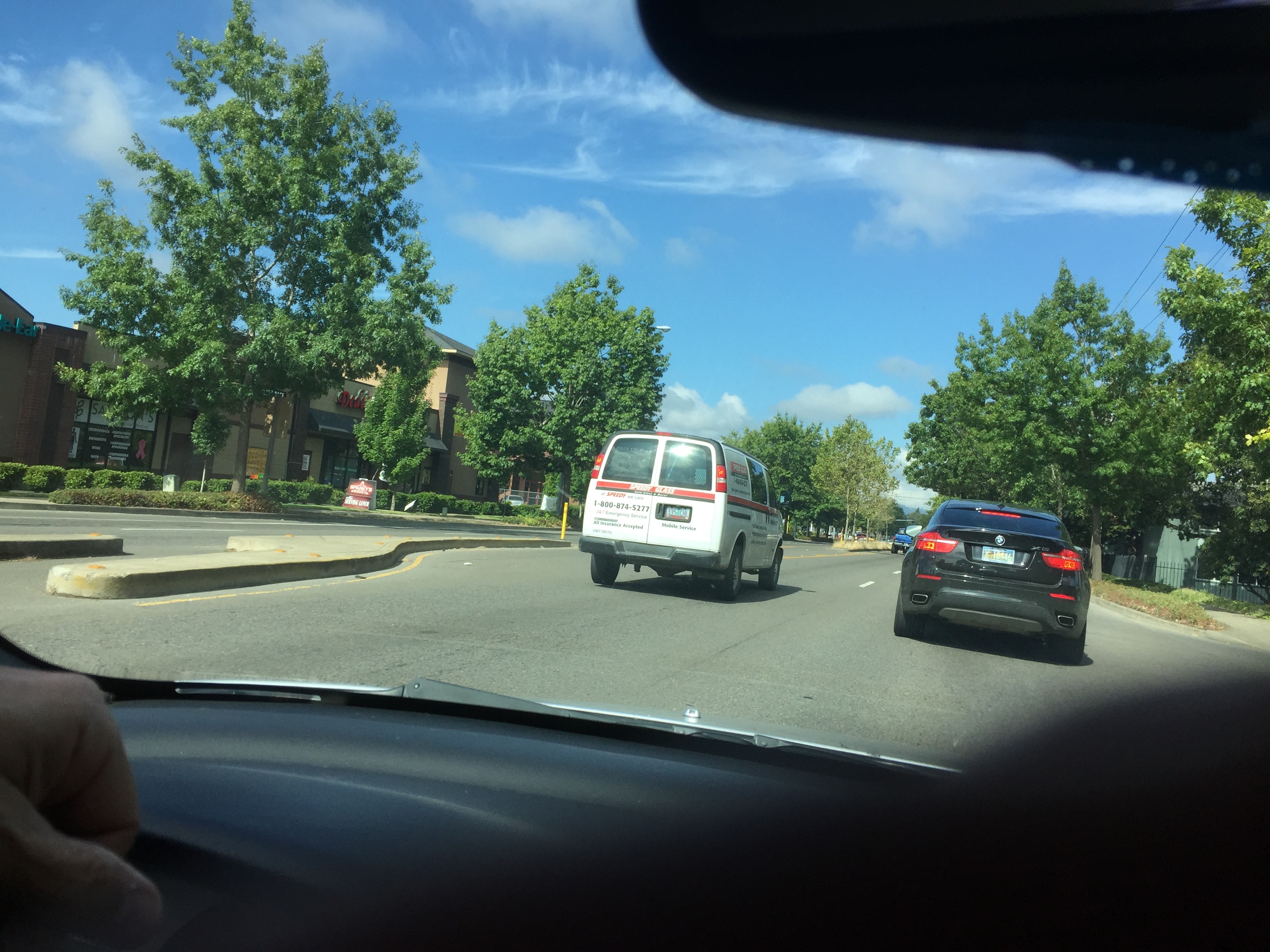
Can you read a sign on the rear window of this van?
Recently on a trip to Oregon, as we were driving through an area near Salem, I noticed a van pull out into traffic up ahead of us. Since I’m the business of signs, I noticed that it had some vehicle graphics. Then I noticed that the van had cut graphics on the inside of darkened windows in the back of the van; or, were they dark letters on the outside of the window? Straining as much as I could, I was never able to read the information, and it made me sad, because I know someone paid for the graphics and took the time to go to the sign company and wait for the graphics to be installed.
One of the customer service features we have at Signature d’Sign, is the ability to understand how graphics will look and fit on a vehicle or a window at a brick and mortar location, share our observations and give suggestions to our client.
On a darkened window we would naturally suggest a white, yellow, or perhaps a powder blue or even a light pink on the surface. If a dark letter is necessary, we would suggest an under layer of white which is a little wider than the letter so that it stands out. Another choice would be to use a printed graphic, which would include a stroke around the letter or graphic which is white or a light color of some sort.

Even though there are MANY words to read on Thor Door – you can read them easily because of the simple colors on white.
By the same token, we would never suggest white or yellow (or something similar) on a white or light color surface. A good way to test this would be to stop by and ask for a scrap or sample of a color. Many times we have pieces that are left over from another job, and we could let the client try it on their vehicle. “Stick it on and stand back. How far away can you read the letter or see the sample? If you can’t see it at least 20 feet, I would suggest you try a darker color. “
I hope this has helpful to you and your company graphics.
Lynn Koellermeier
Design & Business Development
Lynn@signaturedsign.com
www.signaturedsign.com
925 446 6477