SYNOPSIS: North Coast Signs, based in Vista and serving Carlsbad, fabricates 3D printed tactile and Grade 2 braille room ID signs that meet ADA reach and contrast rules.
3D Printed Tactile Signs Available at North Coast Signs
BY: ,
A finger catches a missing 1/32 inch faster than any eye can spot it, and that single dimension decides whether your room signs pass an ADA review. We get calls from Carlsbad property managers who installed clean-looking plates that fail the moment an inspector runs a thumb across the characters. North Coast Signs, based in Vista and serving Carlsbad, builds tactile room ID signs where the raised copy and braille are fabricated to a measured spec. This piece covers what 3D printing buys you on a small room plate.
What 3D Printing Adds to a Room Plate
Room ID signs are small, usually a restroom, an office number, or a suite label, so every tactile detail sits inside a tight field. We print the raised characters and braille as integral features on the acrylic first surface, which lets us control rise and dot geometry layer by layer. ADA sets tactile character rise at a minimum 1/32 inch above the surface, and a printed build holds that height across the whole run. Glued-on letters and loose raster beads can peel or work loose on a small plate that fingers touch every day. Printed elements leave no separate beads or adhesive line to fail.
Getting Tactile Character Height Right
The characters a hand reads are sized well above the type on a printed page, and ADA is specific here. Tactile letters run from 5/8 inch to 2 inches measured on the uppercase letter I, and they must be uppercase sans serif. We set the character height inside that band based on the plate size and the copy length for each room. A long suite name forces a smaller character height to keep the line on one row. Size it wrong and the characters either crowd the border or fall under the 5/8 inch floor.
Doming the Braille Dots to Spec
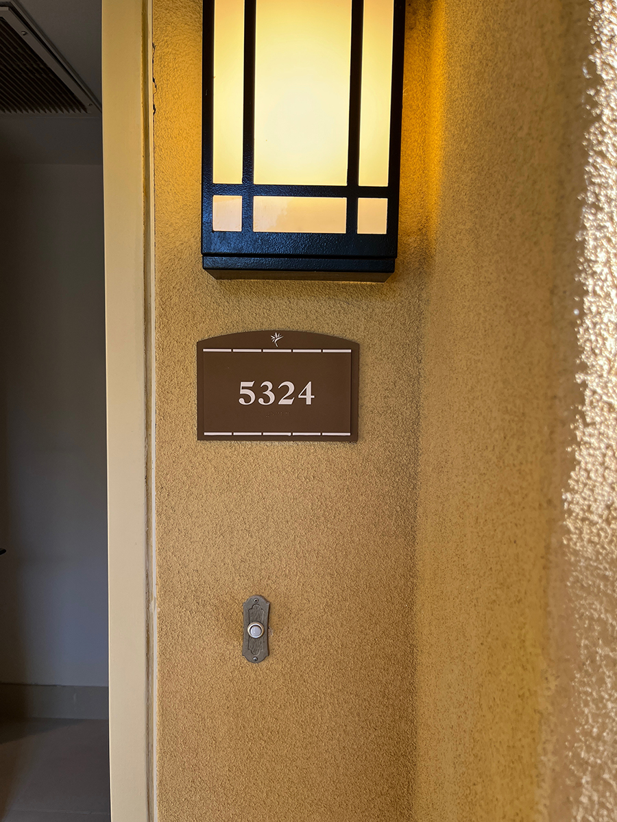
Grade 2 braille is contracted braille, and the dots have to be domed, never flat or sharp, to read correctly under a fingertip. We form each dot to the rounded profile ADA describes, between 0.025 and 0.037 inch high, with the cells spaced so a reader tracks them cleanly. Braille sits at least 3/8 inch below the baseline of the tactile characters, and we hold that clearance so the two never collide. A flat-topped dot or a dot pressed too close to its neighbor turns a word into noise. We lay the contracted braille out first and arrange the copy around it.
Hitting the Right Contrast
ADA requires the characters to contrast with their background, light-on-dark or dark-on-light, without naming a number, so we hold our plates to a 70 percent light reflectance value gap as a tighter shop standard. The brief pairs dark Deep Bronze copy with a light Netsuke field, the dark-on-light direction the standard favors and the one that hides fingerprints. We pull the LRV of each material and confirm the gap clears 70 percent before we commit the build, since eyes adapt to hallway light but the standard does not. We also keep the finish matte, because a glossy face throws glare that buries the contrast.
Where Printed ADA Plates Fail in the Field
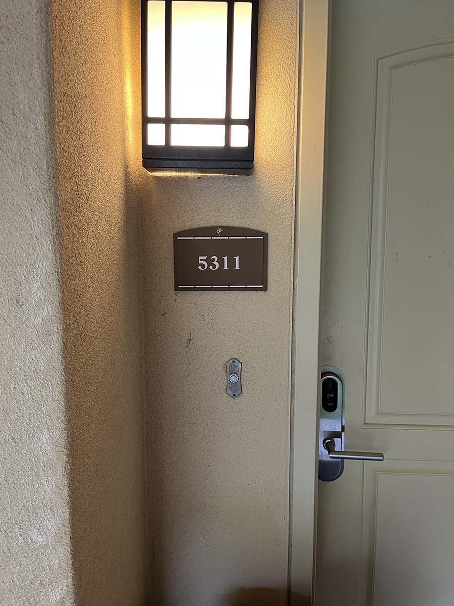
Most failures we get called to fix are the mounting and the placement, not the fabrication. ADA puts the sign on the latch side of the door with the tactile baseline set 48 to 60 inches above the finished floor. We anchor each plate with 3/16 inch studs into the wall and back them with VHB tape, so the studs carry the load and the tape pulls the face flat. A plate stuck over textured paint or hung at the wrong height passes the bench and fails the building. We set placement to the latch-side rule and the height band on every install.
Talk to Us Before Your Next Plate Order
Tactile and braille room signs reward precision, and the dimensions hold no slack under ADA. Call North Coast Signs at (760) 536-5454 and we will spec your Carlsbad room plates to the right character height, braille profile, and contrast before a single one is printed. We would rather size it correctly the first time than meet you at a failed inspection.
“Best Sign Company in Carlsbad, CA”
Top Rated Local Custom Sign Shop / Store / Business
North Coast Signs fabricated and mounted a clear acrylic panel for a San Marcos lobby, with a beveled perimeter, flame-polished edges, and eight stand…
Before a single exit route is drawn for a Carlsbad building, North Coast Signs calls the local fire marshal from its Vista shop, because that call set…
Working from its Vista shop, North Coast Signs follows one arriving guest across Grand Pacific MarBrisa, a resort property in Carlsbad, to show how a …
North Coast Signs, based in nearby Vista and serving Carlsbad, explains why an ADA room sign answers two separate character standards plus a pictogram…
North Coast Signs, based in Vista, breaks a hotel monument re-letter into two jobs: hitting the exact Duranodic Bronze standard with painted flat-cut …
North Coast Signs decodes a landlord's gooseneck lighting spec for a retail tenant, explaining how color temperature, rendering, reach, count, and sha…
North Coast Signs guides a first-time tenant through four approvals needed for a formed-plastic storefront sign, from the shopping center's sign crite…
North Coast Signs, based in Vista and serving San Diego, fabricates storefront signs along with the gooseneck lighting that washes them after dark. Wh…
“Best Sign Company in Carlsbad, CA”
Top Rated Local Custom Sign Shop / Store / Business
Carlsbad, CA
CityScoop is the top ranked local business news network in the United States. Established in 2008, CityScoop has been providing local communities with high quality news about local businesses and their most recent projects.
North Coast Signs, based in Vista and serving San Marcos, builds and installs a near 27-inch-square ADA entry …
ABOUT THE AUTHOR
BIO: Our team of professionals handles production for anything you want your customers to see, from interior and exterior corporate office signage to fleet graphics, trade show, event and retail presentation. Consistency in branding communications.