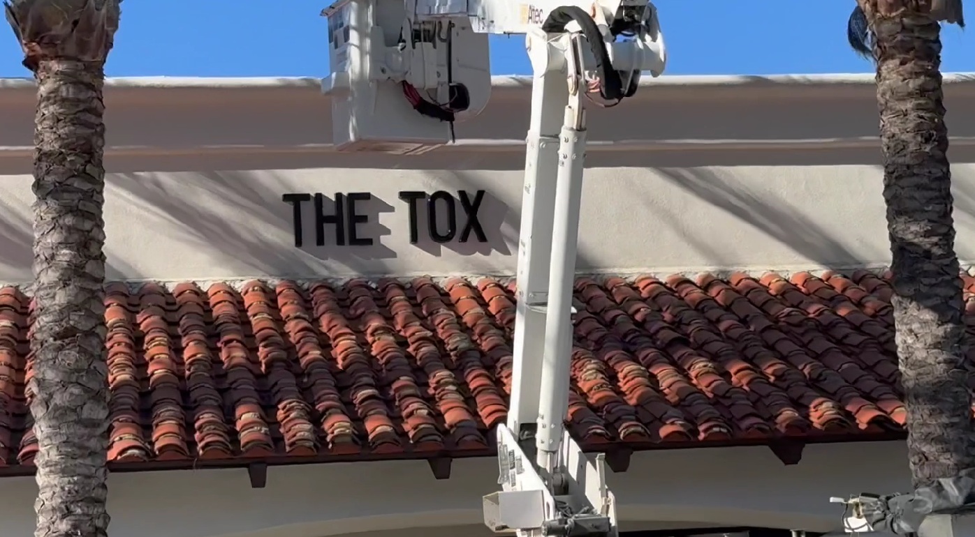
North Coast Signs, based in nearby Vista and serving Carlsbad, decodes a landlord's four-line gooseneck lighting spec for a retail tenant, showing how color temperature, rendering, reach, count, and a down-aimed shade each protect the sign's night read.
On a recent Carlsbad storefront job, the landlord's lighting spec landed on the owner's desk before the sign did: 2700K, a 24-inch arm, antique bronze, two lights. It looks like four lines of red tape handed to a tenant who never asked for it. Line by line, each one is a protection for the thing the owner paid the most for, and once you can read the sheet you can approve it with confidence. Here is what each number does for the sign after dark.
The First Line Matches the Warmth to the Face
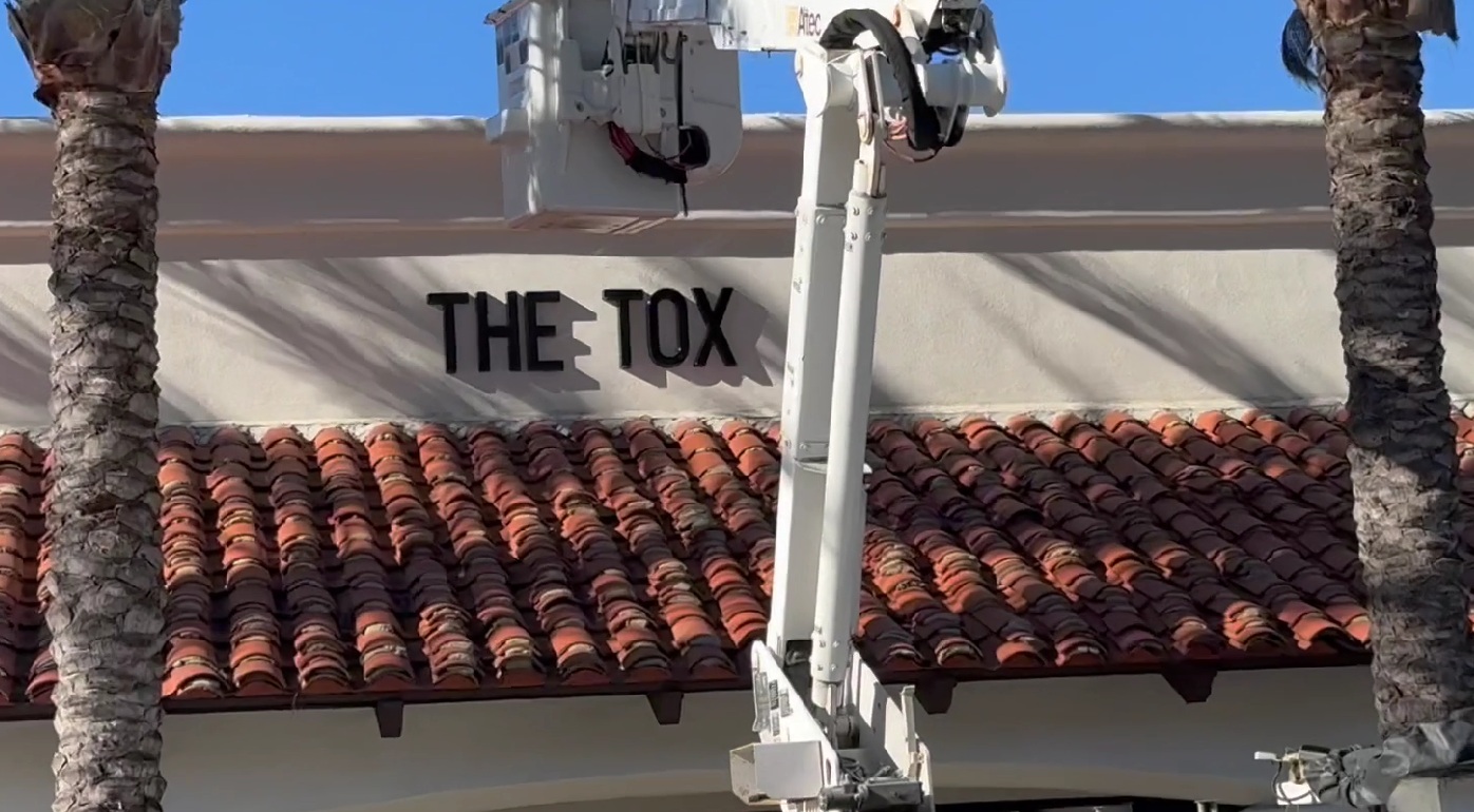
Color temperature decides how an externally lit sign looks at night. The spec calls for 2700K, a warm amber glow close to old incandescent light, and that warmth is chosen for a dark face. On the black storefront letters of this job, 2700K keeps the sign rich and intimate; the same lamp aimed at a white face would push it toward yellow. So the first line is a match, the light warmth set against the face color, and it is the difference between a sign that glows and one that looks off after sundown.
Rendering Keeps the Brand Color True at Night
The number the spec sheet rarely states, and the one worth asking for, is color rendering, measured as CRI. Two fixtures at the same 2700K can render a painted face very differently: a lamp at CRI 90 or better shows the brand color the way it looks by day, while a low-CRI one dulls it into something flat and off. We hold the rendering high on purpose, at CRI 90 or better, so the color the owner approved on the proof is the color the letters carry at nine at night, not a muddied version of it under a weaker lamp.
The Stem Length Is Coverage Math
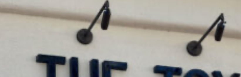
The 24-inch arm length is set by coverage math. A gooseneck lights the face from outside, holding a shade out and down so the cone of light rakes across the letters from above. The arm has to reach far enough that the cone lands on the full height of the face, not just the top row. Too short an arm and the light clips the sign and leaves the lower letters dim. The stem length on the spec is measured to the size of this face, so the wash covers the letters top to bottom.
Two Fixtures Close the Dark Gap
One light throws a single cone, and a single cone lights a patch, not a wide sign. That is why the spec calls for two. Across a face near 68 inches wide, two fixtures are spaced so their cones overlap in the middle with no dark band between them. The count is coverage math, the same as the stem length, aimed at an even wash instead of two bright pools with a shadow in the center. Get the count and the spacing right and the whole sign lights uniformly.
The Shade Keeps the Light Where It Belongs
The cupped shade that points the fixture down is doing more than aiming the cone. Outdoor lights are judged on where their light goes, on backlight, uplight, and glare, and a shade that sends the cone down onto the letters is controlling all three. It puts the wash on the sign while shielding the source from the street and the night sky, so the light lands on the letters and holds off the glare a passing driver would otherwise catch. On the coast, a down-aimed shielded fixture is the cleaner-looking choice and the one that sits right with local outdoor-lighting rules.
Call North Coast Signs at (760) 536-5454 with the spec sheet in front of you; ten minutes on the phone settles whether those numbers fit your face color, and we will install to the spec once you sign off.