SYNOPSIS: North Coast Signs, based in Vista and serving Carlsbad, builds ADA directional and wayfinding panels as a stacked acrylic assembly, pairing a 1/4 inch structural back with a 1/8 inch raised reading...
Carlsbad, CA - How Thick Should Acrylic Be for D
BY: ,
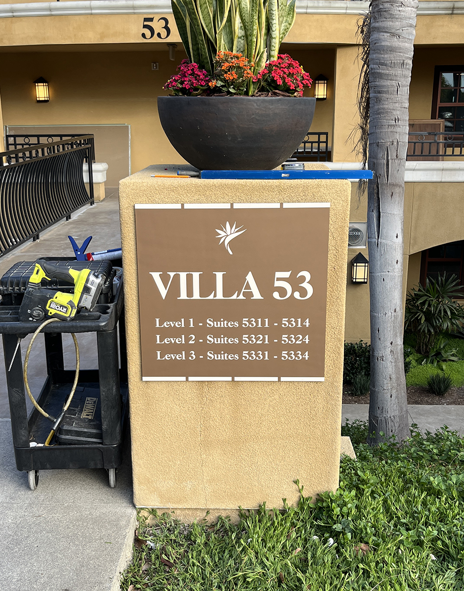
A directional panel can pass inspection the day we hang it and drift out of compliance a year later, and thickness is the usual reason. Acrylic moves with the temperature swings a building puts it through, so a thin unbacked sheet near a sunlit lobby window cups enough to lift its braille dots out of the 0.025 inch to 0.037 inch range an inspector gauges. We settle thickness before color and layout on every wayfinding panel we build. North Coast Signs, based in Vista and serving Carlsbad, builds these as a stacked acrylic assembly so each layer does one job.
Why We Stack Two Sheets Instead of Routing One
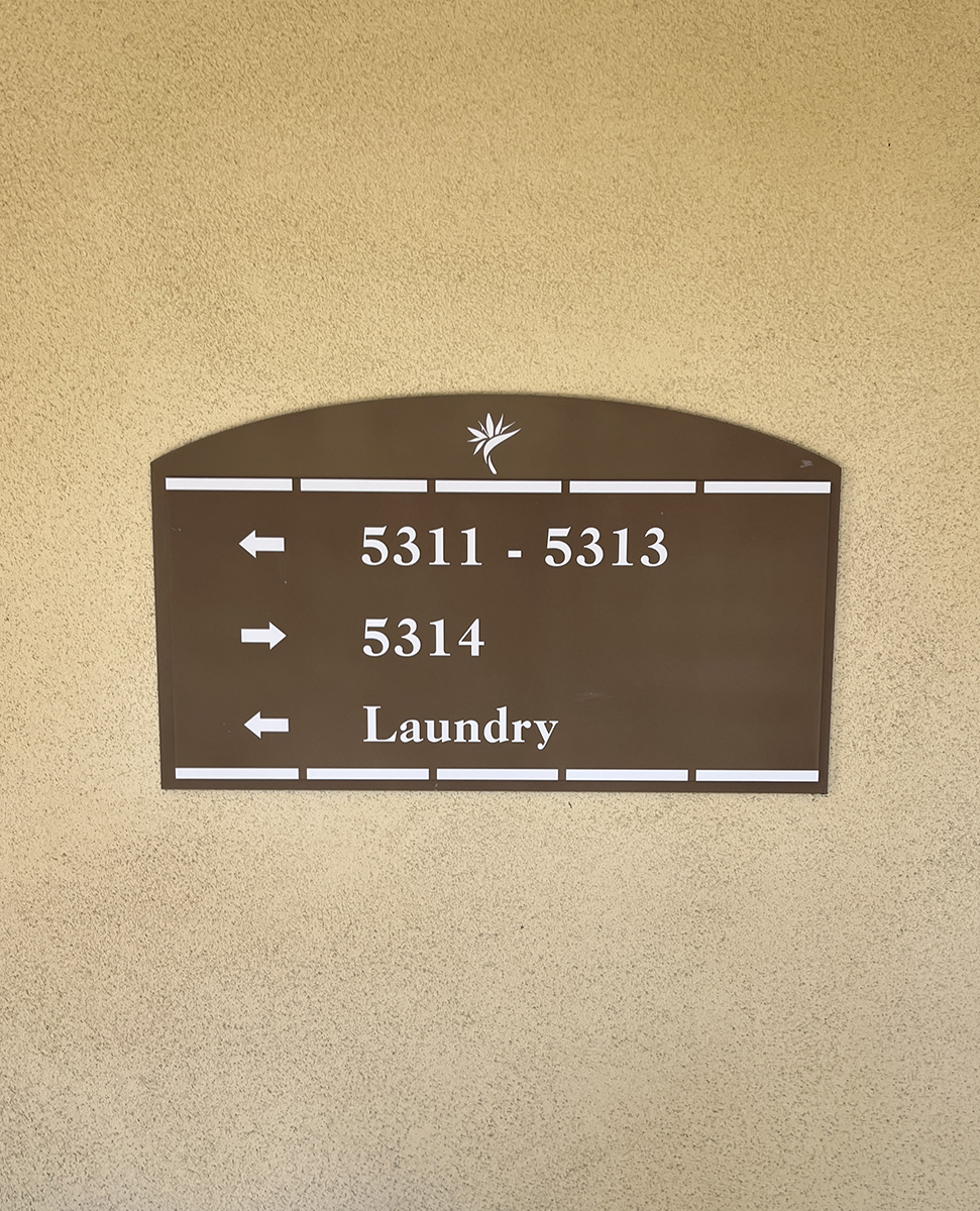
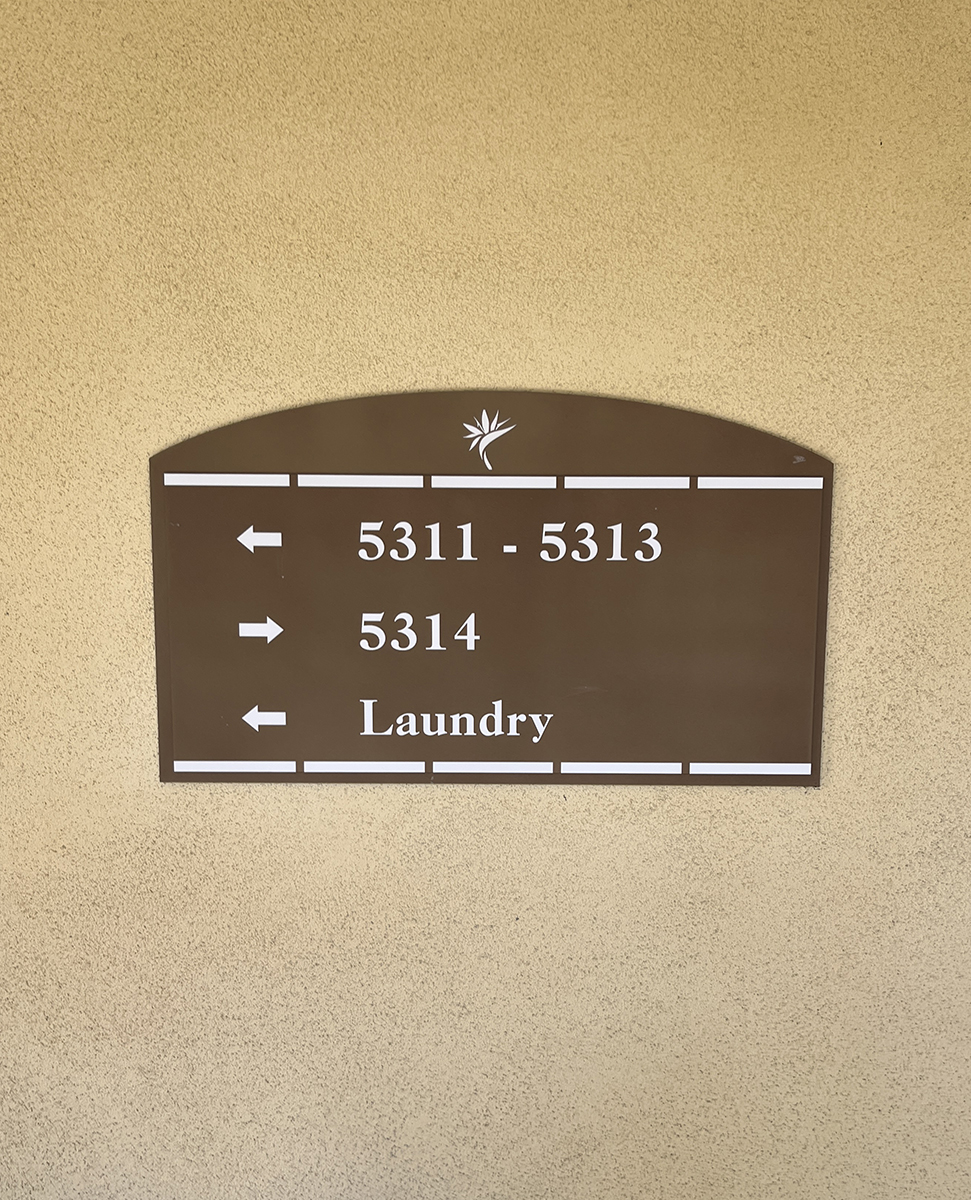
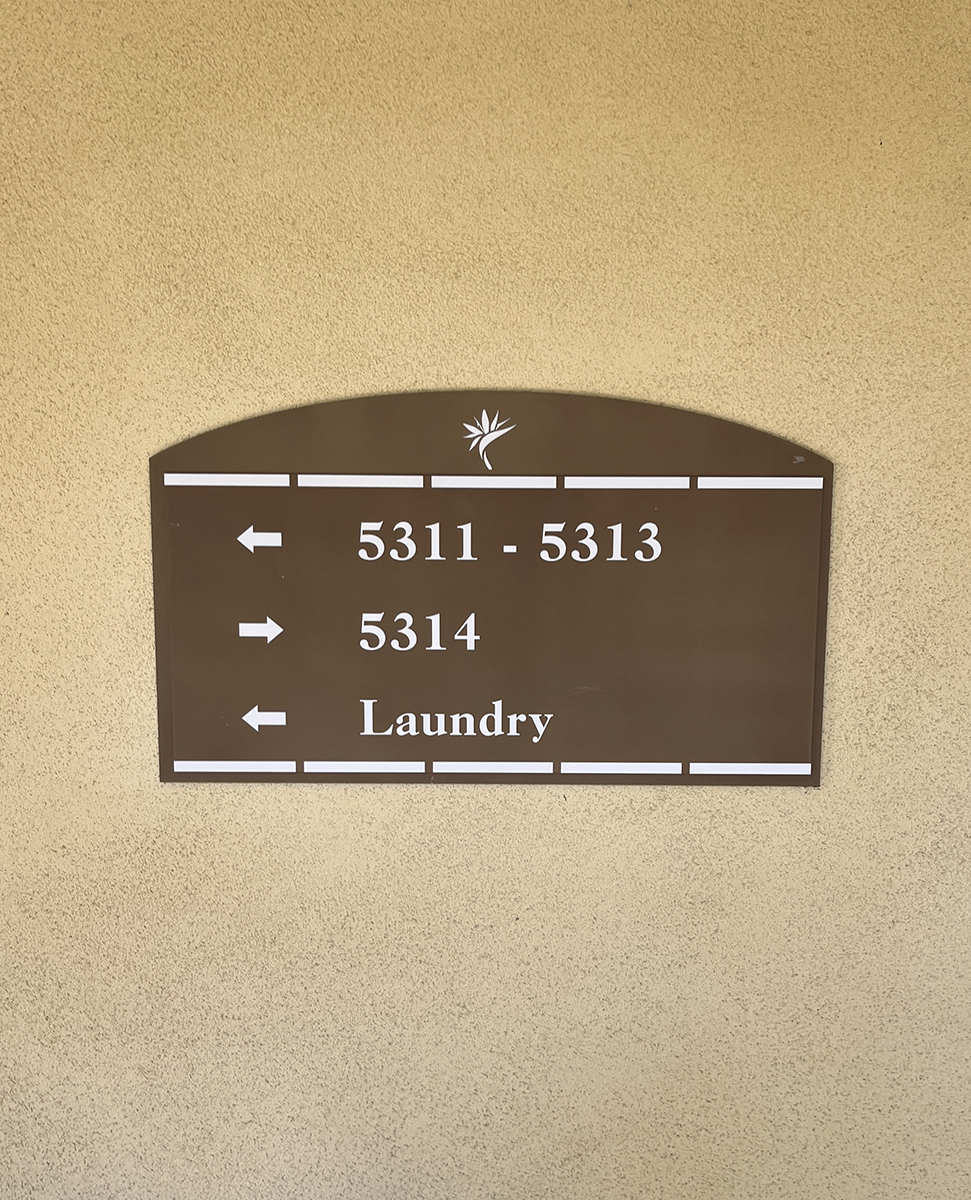
Take a typical ADA directional panel at 25 inches wide by 14.5 inches tall, built from a 1/4 inch acrylic back carrying a 1/8 inch raised rectangle. The thick back is the structural plate that holds the assembly flat and gives the studs solid material to seat into. The 1/8 inch rectangle lifts the message off the back plane and throws the shadow line that defines the panel edge. We could route one 3/8 inch slab to that height, but layering lets us finish each plane and reference the tactile rise to a clean field rather than a routed pocket.
What the Quarter-Inch Back Is Doing
We treat 1/4 inch acrylic as our workhorse for dimensional pieces, and a 25 inch span is where it earns the role. It stays flat across the full width, carries the 3/16 inch stud loads without flexing, and still pulls tight to the wall. Stepping up to 3/8 inch or 1/2 inch adds weight and cost with no readability gain on an interior panel, and heavier stock fights the bond on any wall that is not dead smooth. The reading surface above can only hold spec if the plate under it never moves.
Why the Reading Field Stops at One-Eighth
On top of that back we mount a 1/8 inch rectangle, the thinnest stock we trust for a raised reading layer. Thinner sheet at 1/16 inch or 3/32 inch flexes under a finger and bows during the press at install. Any bow shifts the measured tactile rise out of the 1/32 inch minimum the code sets and pushes the dome heights past their window. At 1/8 inch the field has the stiffness to stay planar, so the touch elements sit where an inspector expects them.
How the Tactile Layer Rides the Stack
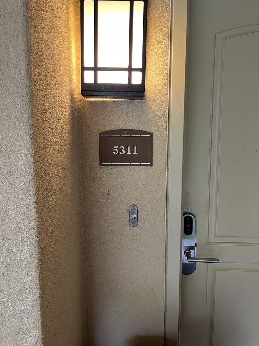
The 1/32 inch characters and the Grade 2 braille are 3D-printed as raised elements of that 1/8 inch field, so the touch layer is part of the sheet rather than beads glued on that compress or shear off. A dot only reads as a rounded crown when the plane it sits on stays flat, which is again a job for the stiffness underneath. We run the tactile letters 5/8 inch to 2 inches tall at 10 to 30 percent stroke width, and we set the braille at least 3/8 inch below the baseline.
How Thickness Holds the Color and Contrast in Spec
Thickness keeps the panel flat, and the surface treatment keeps it legible once it is. We match this build to Rowmark 3X1-871 Deep Bronze copy against a field painted SW 6134 Netsuke, a dark-on-light pairing that clears a 70 percent LRV gap, the benchmark we hold above the contrast ADA requires, which we verify with a meter. Dark-on-light ages better too, since reverse light-on-dark signs show fingerprints in a high-touch corridor and need wiping that drifts their reflectance. A matte finish on the raised field scatters overhead light rather than bouncing a hotspot onto copy someone scans mid-stride.
How Mounting Loops Back to the Stack
We anchor this panel with 3/16 inch studs and VHB tape together, and both fasteners still depend on a back plate stiff enough to stay flat. Get the stack right and the studs seat clean, the tape pulls tight, and the tactile rise reads the same on year five as on day one. If you are planning a directional or wayfinding panel for a Carlsbad property, call North Coast Signs at (760) 536-5454 and we will spec the layer stack around your size, your wall, and the read your visitors need.
“Best Sign Company in Carlsbad, CA”
Top Rated Local Custom Sign Shop / Store / Business
North Coast Signs fabricated and mounted a clear acrylic panel for a San Marcos lobby, with a beveled perimeter, flame-polished edges, and eight stand…
Before a single exit route is drawn for a Carlsbad building, North Coast Signs calls the local fire marshal from its Vista shop, because that call set…
Working from its Vista shop, North Coast Signs follows one arriving guest across Grand Pacific MarBrisa, a resort property in Carlsbad, to show how a …
North Coast Signs, based in nearby Vista and serving Carlsbad, explains why an ADA room sign answers two separate character standards plus a pictogram…
North Coast Signs, based in Vista, breaks a hotel monument re-letter into two jobs: hitting the exact Duranodic Bronze standard with painted flat-cut …
North Coast Signs decodes a landlord's gooseneck lighting spec for a retail tenant, explaining how color temperature, rendering, reach, count, and sha…
North Coast Signs guides a first-time tenant through four approvals needed for a formed-plastic storefront sign, from the shopping center's sign crite…
North Coast Signs, based in Vista and serving San Diego, fabricates storefront signs along with the gooseneck lighting that washes them after dark. Wh…
“Best Sign Company in Carlsbad, CA”
Top Rated Local Custom Sign Shop / Store / Business
Carlsbad, CA
CityScoop is the top ranked local business news network in the United States. Established in 2008, CityScoop has been providing local communities with high quality news about local businesses and their most recent projects.
North Coast Signs, based in Vista and serving San Marcos, builds and installs a near 27-inch-square ADA entry …
ABOUT THE AUTHOR
BIO: Our team of professionals handles production for anything you want your customers to see, from interior and exterior corporate office signage to fleet graphics, trade show, event and retail presentation. Consistency in branding communications.