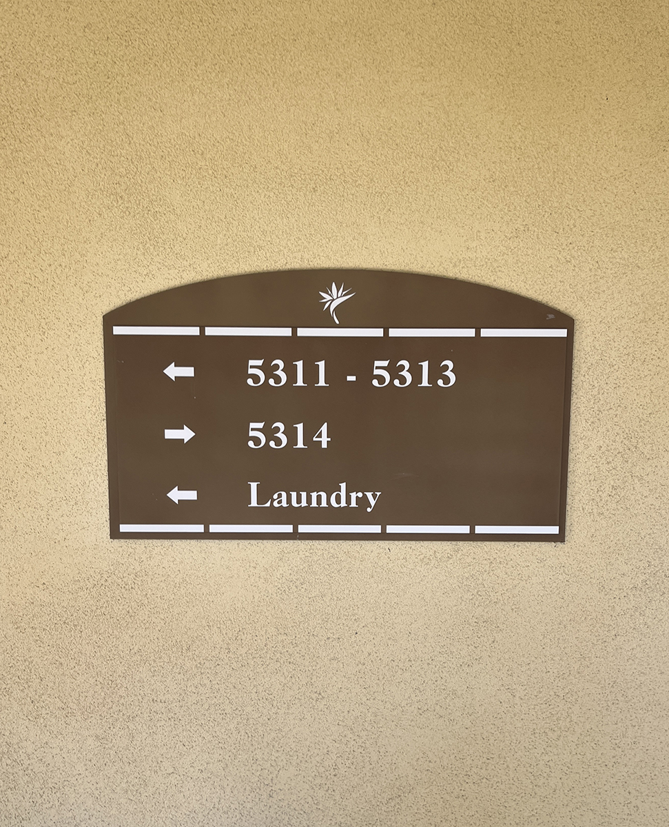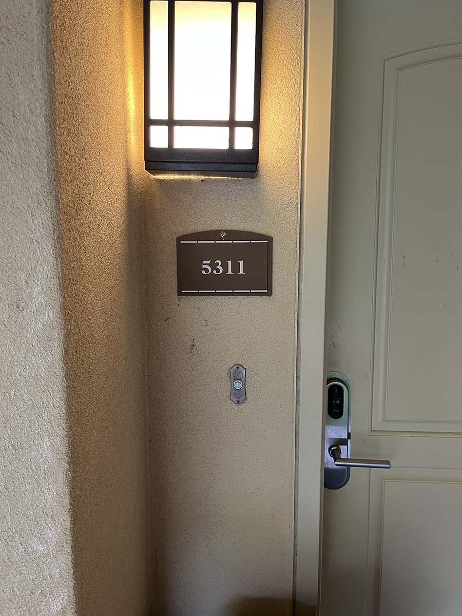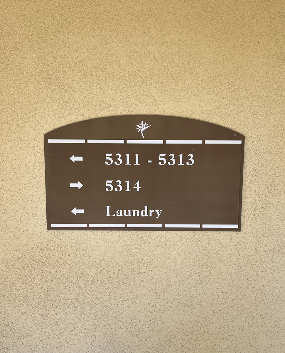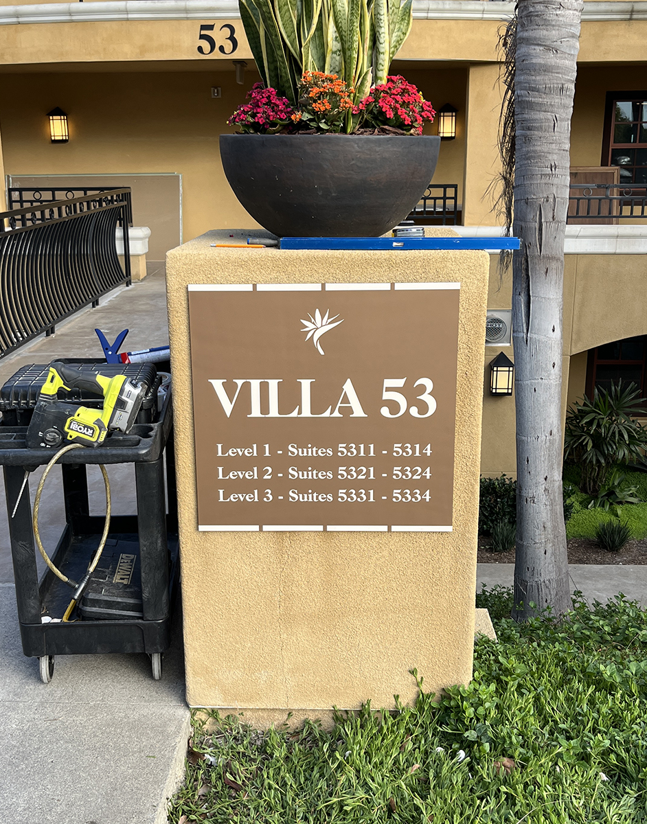
A sign can carry perfect braille and still fail inspection. The reason is that an ADA room sign answers two separate character standards plus a pictogram geometry, and a shop that hits one set can still miss the others. On a recent Carlsbad resort project, the room and wayfinding plates had to satisfy all of it at once and still match the property’s palette. Here is the split most buyers never see, and how one build clears every part of it.
Two Rule-Sets in One Sign
Every ADA room sign does two jobs governed by different rules. The tactile characters are touched up close, so the code sets their raise height and letter style. The visual characters are read from across the room, so a separate section sizes them by viewing distance, starting at five-eighths of an inch and running larger on wayfinding plates. A generic catalog plate can serve the fingers and shortchange the eyes, or the reverse. The build has to answer both sections deliberately, because passing one is not passing the sign.
The Tactile Floor
Raised characters carry hard numbers a fabricator either hits or misses. They must project at least one thirty-second of an inch off the background, in an uppercase sans-serif letter, and the contracted Grade 2 braille sits below the text separated at least three-eighths of an inch from the characters and any border. On the resort plates we build that tactile line as a one-thirty-second-inch machined layer on the first surface, sized to meet the raise minimum. These are tolerances a fabricator hits or fails; a printed-look imitation reads fine to the eye and fails to the hand.
The Six-Inch Pictogram Field
The accessibility and restroom symbols on a wayfinding sign carry their own geometry rule. The code gives the pictogram its own field, at least six inches tall, with the text descriptor placed directly below that field. Get the field too short or drop the caption and an otherwise clean sign is out of compliance. So we lay out the symbol and its caption to the field rule from the start, which keeps the wayfinding plates consistent from door to door and keeps an inspector from flagging the one detail most catalog signs skip.
Finish and Contrast as Code
Finish and contrast are set by the ADA code. The characters and their background both need a non-glare finish, because glare defeats the low-vision reader and the touch reader at once, and the characters must contrast light-on-dark or dark-on-light. On this project the Deep Bronze characters on a Netsuke background clear the dark-on-light requirement while matching the resort’s warm off-white palette. That is one color choice doing two jobs, meeting the finish and contrast the code requires and matching the property, so compliance and the resort look land together.
The Wall Position That Passes
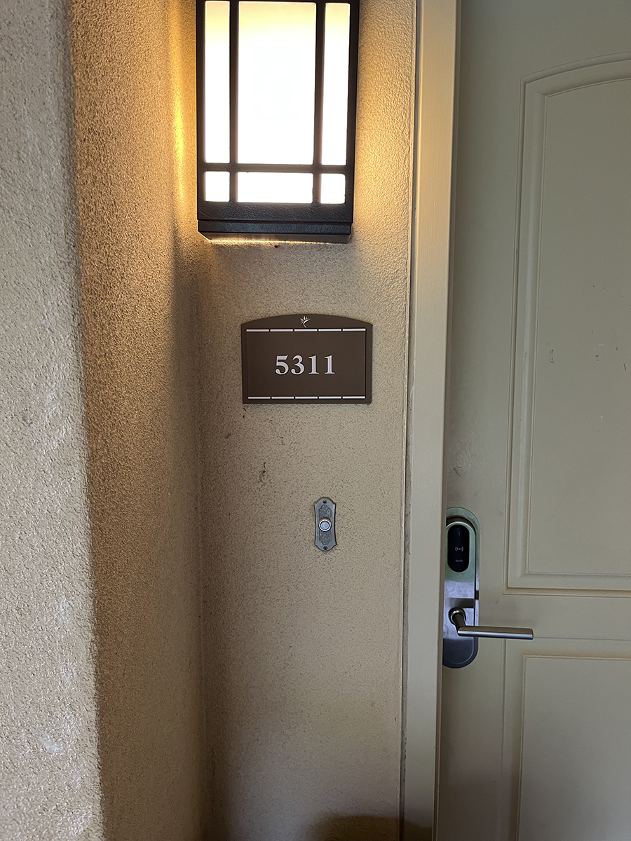
Where the plate lands is as regulated as what is on it. Tactile characters mount between forty-eight and sixty inches above the floor, measured to the baseline, on the latch side of the door, with clear floor space in front. A sign correct in every other way still fails if it hangs at the wrong height or on the wrong side. We set these on three-sixteenths-inch studs and VHB so they seat flat and true at the required height, which is the last rule a room sign has to clear and the one that gets overlooked once the plate itself looks right.
Bring us your room count and door list, and we will spec plates that clear the tactile rules, the visual rules, and the pictogram fields while matching your building. Call North Coast Signs at (760) 536-5454.