Companies change their logos to indicate anything from a shift in strategy to the simple need to modernize their brand. Some logo changes are subtle, while others look nearly unrecognizable from their former designs. Brand loyalists and design critics have no problem voicing their opinions of these “flops” and sometimes enough negative feedback of a poor redesign can cause a company to return to its original logo. But when a new logo is a hit it can breathe new life into a brand. The best logo changes represent where a company is going without making customers feel like they’re dealing with a completely new brand. Current trends in company logo design include more cartoonish graphics and a less-is-more approach to fine-tuning the original design. Below are seven logo redesigns that hit the mark.
Gatorade
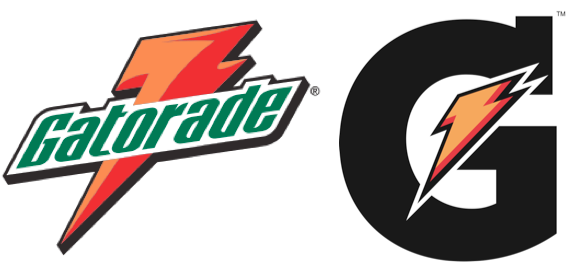
This famous sports electrolyte beverage has modified their logo six times since the start of the company. Most recently, Gatorade changed their logo from green lettering over the signature orange lightning bolt to something cleaner and more modern. Gatorade felt enough people recognized the product that they could drop all of the letters following the capital G, which now stands alone with a smaller orange lightning bolt over it. This logo redesign worked to encompass original Gatorade products and their newer G2 products as well as the many athletes and personas endorsed by this influential brand. The new logo is modern, recognizable and in keeping with Gatorade’s initial design.
 Nike
Nike
In 1995 Nike did away with their brand name in bold, uppercase letters in the logo. Once a brand becomes as internationally identifiable as Nike, the brand name within the logo is no longer necessary for consumers to recognize it. Now the simple “swoosh” insignia is enough to bring the brand and its products into the minds of millions. The original design was created by college student Carolyn Davidson in 1971 and she was only paid $35! Later, Davidson was presented with stock in Nike as the swoosh logo gained more fame and the company decided to keep it as a staple.
 Starbucks
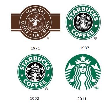
Coffee conglomerate Starbucks also felt their logo needed to be re-positioned to portray their brand as a familiar, household name. In 2011, the brand revealed a new logo, also marking the company’s 40-year anniversary. The logo dropped the ring and the Starbucks brand name. Now, cups everywhere are adorned with the iconic green Starbucks Siren and that is enough for consumers to recognize the brand. While there was some backlash from loyal patrons, Starbucks stood by their new logo. Chief Executive, Howard Schultz said, “by allowing the siren to ‘come out of the circle’ we are thinking beyond coffee.”
 UPS
UPS
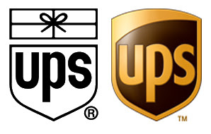
UPS redesigned its logo in 2003, abandoning the iconic black and white logo created by renowned graphic designer Paul Rand in favor of something very different. With the new logo, UPS rebranded their shipping company to keep up with current design trends. While the brand kept the iconic shield emblem, it added shades of the color UPS is most known for: brown. The new logo lost the beloved gift parcel at the top, but as the largest package delivery company in the world, UPS no longer needed to remind people of the packages that come from back of those big brown trucks.
 Wendy’s
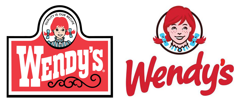
The original Wendy’s logo was created in 1983 and remained in place until nearly 30 years later. Wendy’s served up a logo redesign that featured an imaginative typeface and a detailed cartoon of a more grown-up Wendy. The new company logo design is fresh and plays into the fast-food chain revamping their offerings with healthier options. The new design has more volume and less clutter than the original Wendy’s logo. The bold script feels more up-to-date than some of the other fast food logos and sets Wendy’s apart from outdated competitor logos with this improved design, which some critics called “a great redesign.” FASTSIGNS contributed to the Wendy’s rebranding by creating a series of product-themed signage, wayfinding directional signage and playful dimensional lettering throughout the corporate offices.
 Microsoft
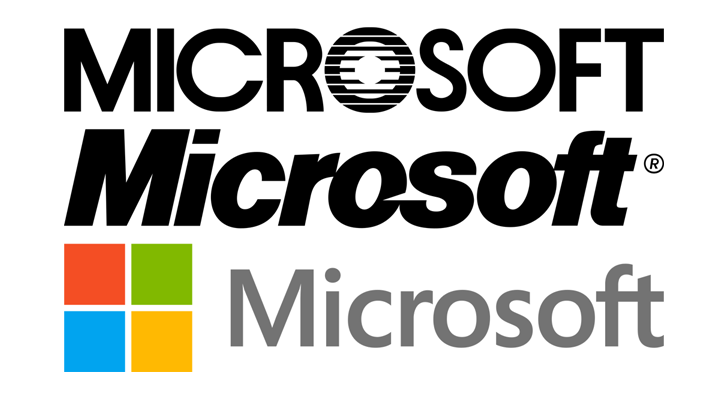
As one of the pioneers in the digital world, it made sense for Microsoft’s logo to reflect their promise of function and forward-thinking. But when Microsoft improved the quality of their hardware and debuted edgier products like the xBox gaming console and Surface tablet, the company needed to shift its branding. In 2012, Microsoft unveiled their new logo: a vibrant representation of the company’s new direction. “The symbol’s colorful squares are meant to represent the company’s diverse portfolio of products,” said Jeff Hansen, General Manager of Brand Strategy for Microsoft. And the new logo is a positive illustration of the company’s journey.
 Billboard
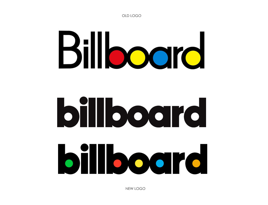
American companies at the forefront of pop-culture (like Coca Cola and McDonalds) often take more consideration in a logo redesign than others might. Billboard Magazine was no different. In 2013, the weekly music magazine revamped their logo, which kept many of the same elements as the original, but introduced a heavier, all-lowercase font and varying color palette within the letters (on the website logo only). The switch to all-lowercase type is another recent logo trend that many companies are adopting with their new designs. The new logo presents a striking statement for Billboard, without losing the iconic identity the magazine has cultivated over the years. Billboard enthusiasts didn’t much mind the change as it was a mild alteration in keeping with the “pop” of the original logo.

Even the best logo redesigns received some negative reactions before they were finally accepted. The themes of the best redesigned logos are simple and modern. If you plan to change your company’s logo, do so in a way that recalls the old logo while indicating where your brand plans to go in the future.If your logo is in need of an update we are more than equipped and happy to help you with this. Just give us a shout or click the link below.

 Nike
In 1995 Nike did away with their brand name in bold, uppercase letters in the logo. Once a brand becomes as internationally identifiable as Nike, the brand name within the logo is no longer necessary for consumers to recognize it. Now the simple “swoosh” insignia is enough to bring the brand and its products into the minds of millions. The original design was created by college student Carolyn Davidson in 1971 and she was only paid $35! Later, Davidson was presented with stock in Nike as the swoosh logo gained more fame and the company decided to keep it as a staple.
Nike
In 1995 Nike did away with their brand name in bold, uppercase letters in the logo. Once a brand becomes as internationally identifiable as Nike, the brand name within the logo is no longer necessary for consumers to recognize it. Now the simple “swoosh” insignia is enough to bring the brand and its products into the minds of millions. The original design was created by college student Carolyn Davidson in 1971 and she was only paid $35! Later, Davidson was presented with stock in Nike as the swoosh logo gained more fame and the company decided to keep it as a staple.
 UPS
UPS redesigned its logo in 2003, abandoning the iconic black and white logo created by renowned graphic designer Paul Rand in favor of something very different. With the new logo, UPS rebranded their shipping company to keep up with current design trends. While the brand kept the iconic shield emblem, it added shades of the color UPS is most known for: brown. The new logo lost the beloved gift parcel at the top, but as the largest package delivery company in the world, UPS no longer needed to remind people of the packages that come from back of those big brown trucks.
UPS
UPS redesigned its logo in 2003, abandoning the iconic black and white logo created by renowned graphic designer Paul Rand in favor of something very different. With the new logo, UPS rebranded their shipping company to keep up with current design trends. While the brand kept the iconic shield emblem, it added shades of the color UPS is most known for: brown. The new logo lost the beloved gift parcel at the top, but as the largest package delivery company in the world, UPS no longer needed to remind people of the packages that come from back of those big brown trucks.
 Wendy’s
The original Wendy’s logo was created in 1983 and remained in place until nearly 30 years later. Wendy’s served up a logo redesign that featured an imaginative typeface and a detailed cartoon of a more grown-up Wendy. The new company logo design is fresh and plays into the fast-food chain revamping their offerings with healthier options. The new design has more volume and less clutter than the original Wendy’s logo. The bold script feels more up-to-date than some of the other fast food logos and sets Wendy’s apart from outdated competitor logos with this improved design, which some critics called “a great redesign.” FASTSIGNS contributed to the Wendy’s rebranding by creating a series of product-themed signage, wayfinding directional signage and playful dimensional lettering throughout the corporate offices.
Wendy’s
The original Wendy’s logo was created in 1983 and remained in place until nearly 30 years later. Wendy’s served up a logo redesign that featured an imaginative typeface and a detailed cartoon of a more grown-up Wendy. The new company logo design is fresh and plays into the fast-food chain revamping their offerings with healthier options. The new design has more volume and less clutter than the original Wendy’s logo. The bold script feels more up-to-date than some of the other fast food logos and sets Wendy’s apart from outdated competitor logos with this improved design, which some critics called “a great redesign.” FASTSIGNS contributed to the Wendy’s rebranding by creating a series of product-themed signage, wayfinding directional signage and playful dimensional lettering throughout the corporate offices.
 Microsoft
As one of the pioneers in the digital world, it made sense for Microsoft’s logo to reflect their promise of function and forward-thinking. But when Microsoft improved the quality of their hardware and debuted edgier products like the xBox gaming console and Surface tablet, the company needed to shift its branding. In 2012, Microsoft unveiled their new logo: a vibrant representation of the company’s new direction. “The symbol’s colorful squares are meant to represent the company’s diverse portfolio of products,” said Jeff Hansen, General Manager of Brand Strategy for Microsoft. And the new logo is a positive illustration of the company’s journey.
Microsoft
As one of the pioneers in the digital world, it made sense for Microsoft’s logo to reflect their promise of function and forward-thinking. But when Microsoft improved the quality of their hardware and debuted edgier products like the xBox gaming console and Surface tablet, the company needed to shift its branding. In 2012, Microsoft unveiled their new logo: a vibrant representation of the company’s new direction. “The symbol’s colorful squares are meant to represent the company’s diverse portfolio of products,” said Jeff Hansen, General Manager of Brand Strategy for Microsoft. And the new logo is a positive illustration of the company’s journey.
 Billboard
American companies at the forefront of pop-culture (like Coca Cola and McDonalds) often take more consideration in a logo redesign than others might. Billboard Magazine was no different. In 2013, the weekly music magazine revamped their logo, which kept many of the same elements as the original, but introduced a heavier, all-lowercase font and varying color palette within the letters (on the website logo only). The switch to all-lowercase type is another recent logo trend that many companies are adopting with their new designs. The new logo presents a striking statement for Billboard, without losing the iconic identity the magazine has cultivated over the years. Billboard enthusiasts didn’t much mind the change as it was a mild alteration in keeping with the “pop” of the original logo.
Billboard
American companies at the forefront of pop-culture (like Coca Cola and McDonalds) often take more consideration in a logo redesign than others might. Billboard Magazine was no different. In 2013, the weekly music magazine revamped their logo, which kept many of the same elements as the original, but introduced a heavier, all-lowercase font and varying color palette within the letters (on the website logo only). The switch to all-lowercase type is another recent logo trend that many companies are adopting with their new designs. The new logo presents a striking statement for Billboard, without losing the iconic identity the magazine has cultivated over the years. Billboard enthusiasts didn’t much mind the change as it was a mild alteration in keeping with the “pop” of the original logo.
 Even the best logo redesigns received some negative reactions before they were finally accepted. The themes of the best redesigned logos are simple and modern. If you plan to change your company’s logo, do so in a way that recalls the old logo while indicating where your brand plans to go in the future.If your logo is in need of an update we are more than equipped and happy to help you with this. Just give us a shout or click the link below.