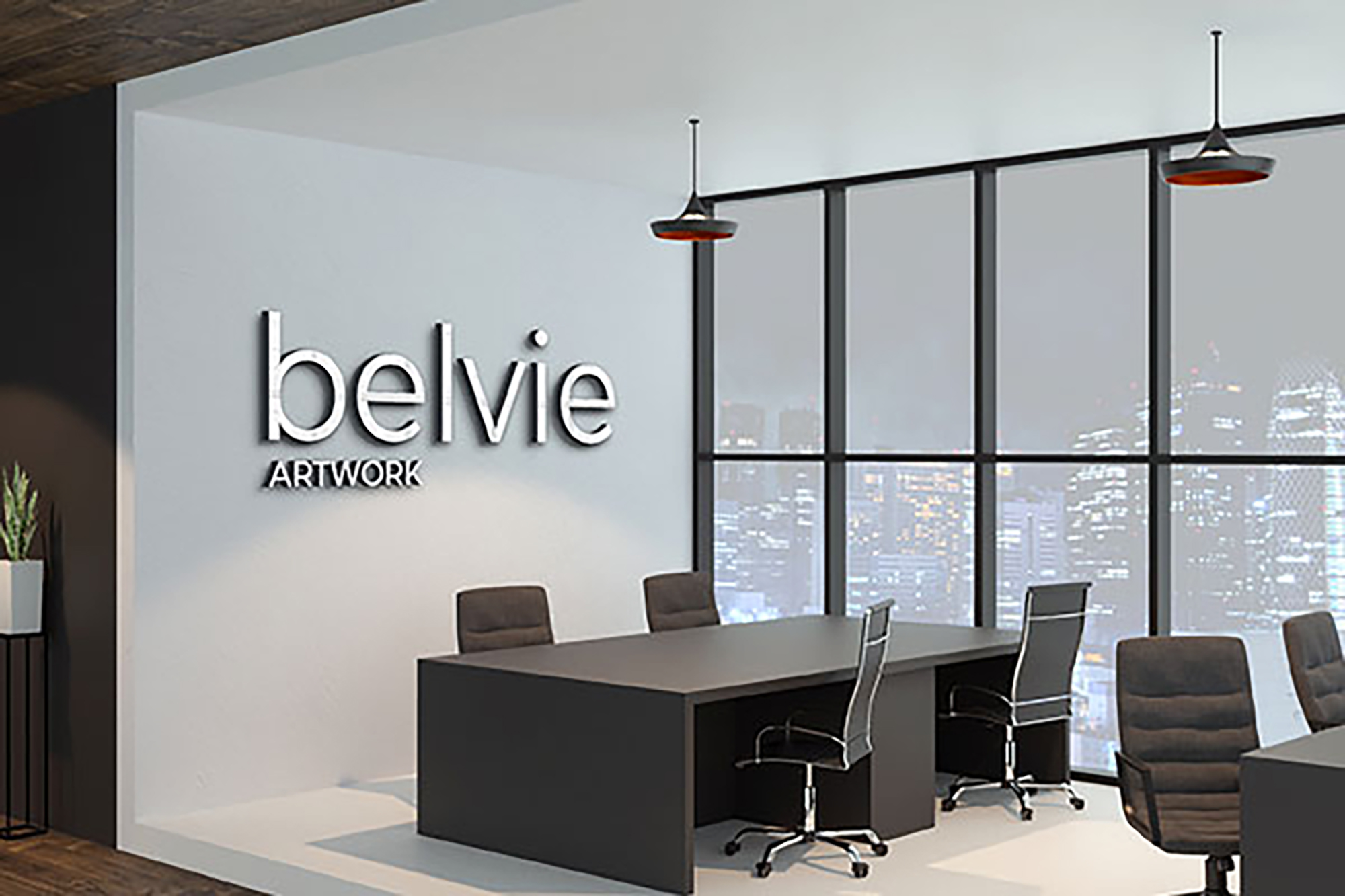
 Every visitor begins forming an opinion before they meet your team. The tone of your space defines trust faster than any sales pitch ever could. The logo on the wall, the finish of the metal, the way the light reflects across the face; all of it tells a story.
At Amazing Signs, we treat lobby design like brand architecture. We scale letters for real-world sightlines, choose finishes that stay sharp under Florida light, and align every element to the building’s geometry. When materials reflect evenly and spacing stays precise, people don’t just notice, they feel that control.
Typography That Reads Like Leadership
Good typography has gravity. It tells people your company understands order, clarity, and precision. Fonts that look clever on a laptop can collapse in real space. We choose typefaces that carry weight: wide counters, strong lines, clean proportions. Every character has a job to do, and we make sure it does it.
We size letters using tested sight-distance ratios, usually one inch per eight to ten feet of viewing range. We test prints on your actual walls, under your actual lighting, and refine spacing until reading feels instinctive. Clean typography is more than readability; it’s rhythm. It sets the pace for how people experience your space.
Color and Lighting That Stay Honest
Color defines emotion. Light decides if people believe it. Offices in Zephyrhills mix sunlight, LEDs, and reflections from glass; conditions that distort color fast. We calibrate every hue under those exact lighting temperatures to keep brand integrity intact.
We use matte and satin finishes that tame glare without dulling tone. LEDs are balanced for even illumination, so every wall reads as part of one visual ecosystem. Balanced light tells a story of consistency, proof that what you say publicly matches what you practice internally. Consistency is its own kind of honesty, and people feel it before they name it.
Materials Built for Real Work
Office interiors age fast. Carts scrape walls. Cleaners spray chemicals. Staff rearrange furniture. Every material choice either resists that wear or starts to crumble under it. We design for endurance.
Second-surface acrylic keeps graphics safe behind a protective face. Anodized aluminum resists fingerprints and corrosion. Acoustic felt panels absorb noise and deliver tactile warmth. High-tack adhesives hold firm on low-VOC paints where cheaper films peel. We design like you run your business, with no room for shortcuts. A sign that still looks right after a year says more about your standards than a slogan ever could.
Accessibility That Anticipates People
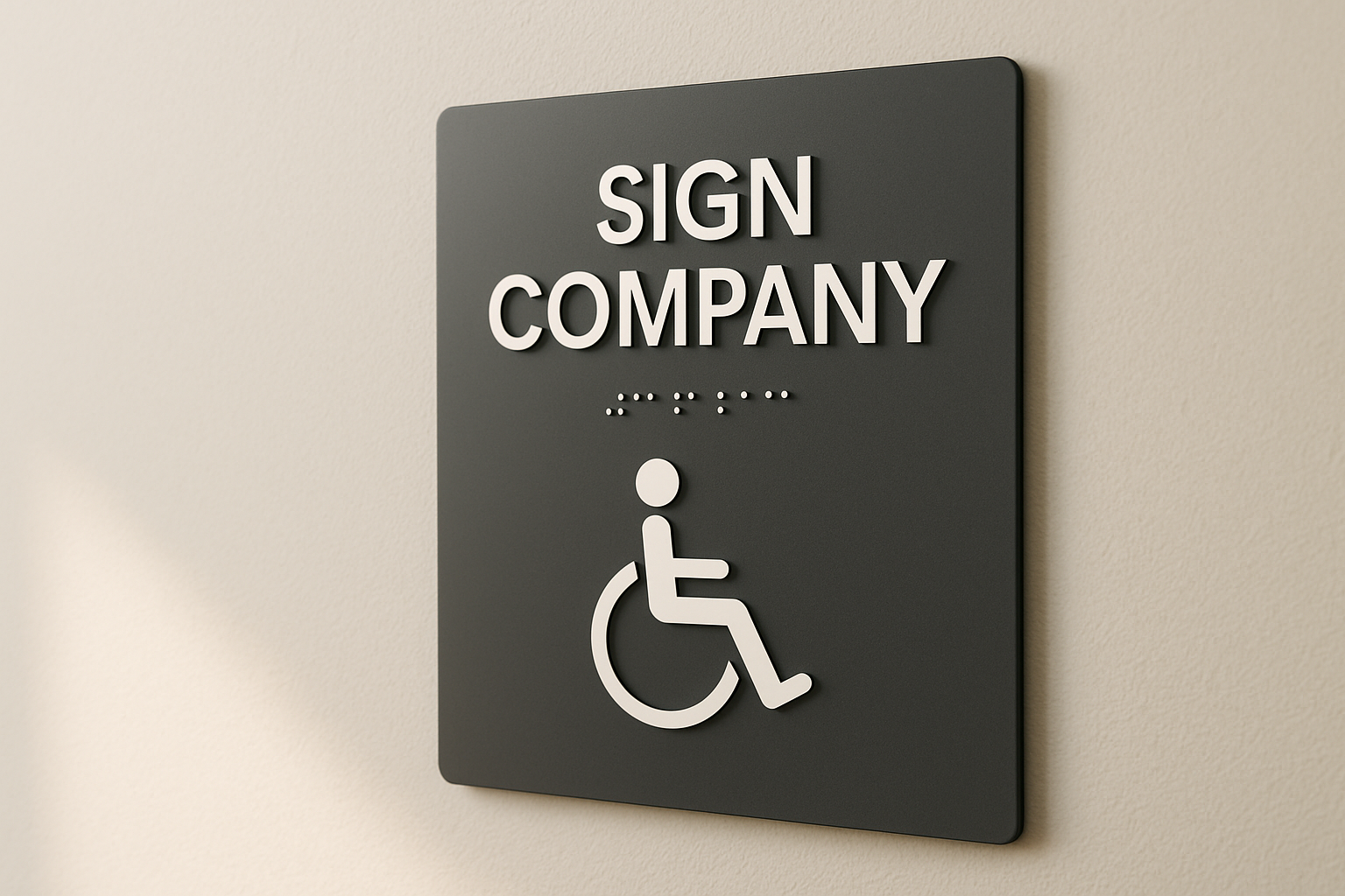
True accessibility is invisible. It’s the sign you don’t notice because it already makes sense. We design ADA-compliant systems that function as seamlessly as they look. Tactile letters are fabricated to precise height; Braille dots are smooth and evenly spaced; mounting heights never vary between floors.
Wayfinding That Simplifies Movement
Confusion wastes time and erodes calm. Great wayfinding design removes both. We study how people move naturally, then position signage where decisions actually happen: at hallway forks, elevator exits, and thresholds that split attention.
Our layouts follow the logic of human vision: top-down, left-to-right, movement-first. We keep hierarchy consistent, using typography and color repetition to teach people how to navigate instinctively. The best systems are the ones that disappear, because they work perfectly. Navigation shouldn’t make you think; it should make you trust the space you’re in.
Installation That Speaks in Straight Lines
Alignment is silent credibility. People might not notice a perfect installation, but they always notice when it’s off. We measure, level, and anchor with discipline. Structural adhesives are chosen for each substrate; mechanical fasteners are used where weight demands certainty.
Every seam stays tight. Every edge holds true. That steadiness is more than craftsmanship; it’s character made visible. A clean install says someone cared enough to get it right. That message outlasts any brochure.
Where Design Turns into Discipline
A modern office is defined by how clearly it communicates purpose. Signage is that purpose made tangible. Every letter, light, and material adds to the story your space tells about your business. At Amazing Signs in Zephyrhills, we build systems that show precision, durability, and restraint.
If your interiors feel inconsistent or outdated, people already sense it. Call (813) 779-7446 and tell us where your message breaks down. We’ll rebuild it in color, form, and light until it reads as confidently as you work because clarity is more persuasive than any marketing pitch.
Every visitor begins forming an opinion before they meet your team. The tone of your space defines trust faster than any sales pitch ever could. The logo on the wall, the finish of the metal, the way the light reflects across the face; all of it tells a story.
At Amazing Signs, we treat lobby design like brand architecture. We scale letters for real-world sightlines, choose finishes that stay sharp under Florida light, and align every element to the building’s geometry. When materials reflect evenly and spacing stays precise, people don’t just notice, they feel that control.
Typography That Reads Like Leadership
Good typography has gravity. It tells people your company understands order, clarity, and precision. Fonts that look clever on a laptop can collapse in real space. We choose typefaces that carry weight: wide counters, strong lines, clean proportions. Every character has a job to do, and we make sure it does it.
We size letters using tested sight-distance ratios, usually one inch per eight to ten feet of viewing range. We test prints on your actual walls, under your actual lighting, and refine spacing until reading feels instinctive. Clean typography is more than readability; it’s rhythm. It sets the pace for how people experience your space.
Color and Lighting That Stay Honest
Color defines emotion. Light decides if people believe it. Offices in Zephyrhills mix sunlight, LEDs, and reflections from glass; conditions that distort color fast. We calibrate every hue under those exact lighting temperatures to keep brand integrity intact.
We use matte and satin finishes that tame glare without dulling tone. LEDs are balanced for even illumination, so every wall reads as part of one visual ecosystem. Balanced light tells a story of consistency, proof that what you say publicly matches what you practice internally. Consistency is its own kind of honesty, and people feel it before they name it.
Materials Built for Real Work
Office interiors age fast. Carts scrape walls. Cleaners spray chemicals. Staff rearrange furniture. Every material choice either resists that wear or starts to crumble under it. We design for endurance.
Second-surface acrylic keeps graphics safe behind a protective face. Anodized aluminum resists fingerprints and corrosion. Acoustic felt panels absorb noise and deliver tactile warmth. High-tack adhesives hold firm on low-VOC paints where cheaper films peel. We design like you run your business, with no room for shortcuts. A sign that still looks right after a year says more about your standards than a slogan ever could.
Accessibility That Anticipates People
True accessibility is invisible. It’s the sign you don’t notice because it already makes sense. We design ADA-compliant systems that function as seamlessly as they look. Tactile letters are fabricated to precise height; Braille dots are smooth and evenly spaced; mounting heights never vary between floors.
Wayfinding That Simplifies Movement
Confusion wastes time and erodes calm. Great wayfinding design removes both. We study how people move naturally, then position signage where decisions actually happen: at hallway forks, elevator exits, and thresholds that split attention.
Our layouts follow the logic of human vision: top-down, left-to-right, movement-first. We keep hierarchy consistent, using typography and color repetition to teach people how to navigate instinctively. The best systems are the ones that disappear, because they work perfectly. Navigation shouldn’t make you think; it should make you trust the space you’re in.
Installation That Speaks in Straight Lines
Alignment is silent credibility. People might not notice a perfect installation, but they always notice when it’s off. We measure, level, and anchor with discipline. Structural adhesives are chosen for each substrate; mechanical fasteners are used where weight demands certainty.
Every seam stays tight. Every edge holds true. That steadiness is more than craftsmanship; it’s character made visible. A clean install says someone cared enough to get it right. That message outlasts any brochure.
Where Design Turns into Discipline
A modern office is defined by how clearly it communicates purpose. Signage is that purpose made tangible. Every letter, light, and material adds to the story your space tells about your business. At Amazing Signs in Zephyrhills, we build systems that show precision, durability, and restraint.
If your interiors feel inconsistent or outdated, people already sense it. Call (813) 779-7446 and tell us where your message breaks down. We’ll rebuild it in color, form, and light until it reads as confidently as you work because clarity is more persuasive than any marketing pitch.
Zephyrhills, FL - Interior Signage Ideas for Modern Offices from a Sign Company
SYNOPSIS: Your office has a voice. Make sure it says something worth believing. At Amazing Signs in Zephyrhills, we create interior signage that pairs form with focus: ADA-compliant systems, durable materials,
Every Wall Says Something. Make It Count
BY: Dathan Bieberle, Amazing Signs
Every visitor begins forming an opinion before they meet your team. The tone of your space defines trust faster than any sales pitch ever could. The logo on the wall, the finish of the metal, the way the light reflects across the face; all of it tells a story.
At Amazing Signs, we treat lobby design like brand architecture. We scale letters for real-world sightlines, choose finishes that stay sharp under Florida light, and align every element to the building’s geometry. When materials reflect evenly and spacing stays precise, people don’t just notice, they feel that control.
Typography That Reads Like Leadership
Good typography has gravity. It tells people your company understands order, clarity, and precision. Fonts that look clever on a laptop can collapse in real space. We choose typefaces that carry weight: wide counters, strong lines, clean proportions. Every character has a job to do, and we make sure it does it.
We size letters using tested sight-distance ratios, usually one inch per eight to ten feet of viewing range. We test prints on your actual walls, under your actual lighting, and refine spacing until reading feels instinctive. Clean typography is more than readability; it’s rhythm. It sets the pace for how people experience your space.
Color and Lighting That Stay Honest
Color defines emotion. Light decides if people believe it. Offices in Zephyrhills mix sunlight, LEDs, and reflections from glass; conditions that distort color fast. We calibrate every hue under those exact lighting temperatures to keep brand integrity intact.
We use matte and satin finishes that tame glare without dulling tone. LEDs are balanced for even illumination, so every wall reads as part of one visual ecosystem. Balanced light tells a story of consistency, proof that what you say publicly matches what you practice internally. Consistency is its own kind of honesty, and people feel it before they name it.
Materials Built for Real Work
Office interiors age fast. Carts scrape walls. Cleaners spray chemicals. Staff rearrange furniture. Every material choice either resists that wear or starts to crumble under it. We design for endurance.
Second-surface acrylic keeps graphics safe behind a protective face. Anodized aluminum resists fingerprints and corrosion. Acoustic felt panels absorb noise and deliver tactile warmth. High-tack adhesives hold firm on low-VOC paints where cheaper films peel. We design like you run your business, with no room for shortcuts. A sign that still looks right after a year says more about your standards than a slogan ever could.
Accessibility That Anticipates People
True accessibility is invisible. It’s the sign you don’t notice because it already makes sense. We design ADA-compliant systems that function as seamlessly as they look. Tactile letters are fabricated to precise height; Braille dots are smooth and evenly spaced; mounting heights never vary between floors.
Wayfinding That Simplifies Movement
Confusion wastes time and erodes calm. Great wayfinding design removes both. We study how people move naturally, then position signage where decisions actually happen: at hallway forks, elevator exits, and thresholds that split attention.
Our layouts follow the logic of human vision: top-down, left-to-right, movement-first. We keep hierarchy consistent, using typography and color repetition to teach people how to navigate instinctively. The best systems are the ones that disappear, because they work perfectly. Navigation shouldn’t make you think; it should make you trust the space you’re in.
Installation That Speaks in Straight Lines
Alignment is silent credibility. People might not notice a perfect installation, but they always notice when it’s off. We measure, level, and anchor with discipline. Structural adhesives are chosen for each substrate; mechanical fasteners are used where weight demands certainty.
Every seam stays tight. Every edge holds true. That steadiness is more than craftsmanship; it’s character made visible. A clean install says someone cared enough to get it right. That message outlasts any brochure.
Where Design Turns into Discipline
A modern office is defined by how clearly it communicates purpose. Signage is that purpose made tangible. Every letter, light, and material adds to the story your space tells about your business. At Amazing Signs in Zephyrhills, we build systems that show precision, durability, and restraint.
If your interiors feel inconsistent or outdated, people already sense it. Call (813) 779-7446 and tell us where your message breaks down. We’ll rebuild it in color, form, and light until it reads as confidently as you work because clarity is more persuasive than any marketing pitch.