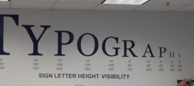
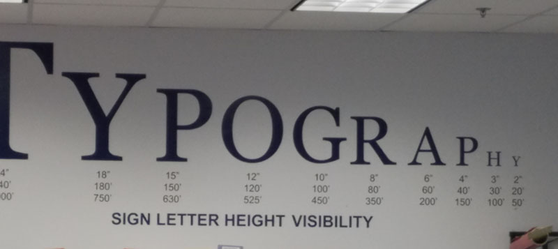
 Type size makes the difference[/caption]
You, the small business owner, have ordered a sign to promote the location of your business. Your sign manufacturer is bringing a design to you for your review and approval. What should you be thinking about as you review the proposed design to ensure your sign can be easily read?
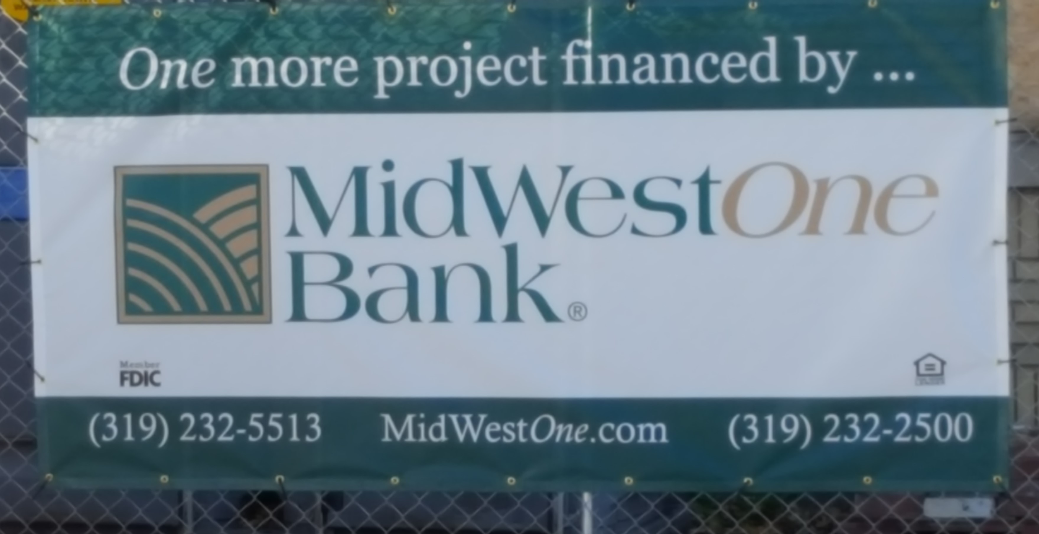
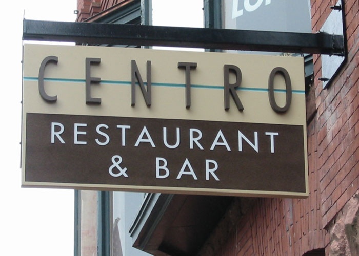
1.) Font: Is the font clear and easy to read? Some fonts that have been tested to be superior in legibility are: Gill Sans MT, Avenir LT Medium, Copperplate Gothic Bold, Helvetica and Kabel Ultra BT.
2.) Font Size: How far away do you want the sign to be read? A good rule of thumb is a 1” high letter can be read from 10 feet away. There have been some additional studies completed that you may want to adjust that to a 1” high letter to 7 feet away if there is a lot of visual stimulus in the area your sign will be placed.
3.) Contrast: Is the color contrast dramatic? Do the letters pop from the background?
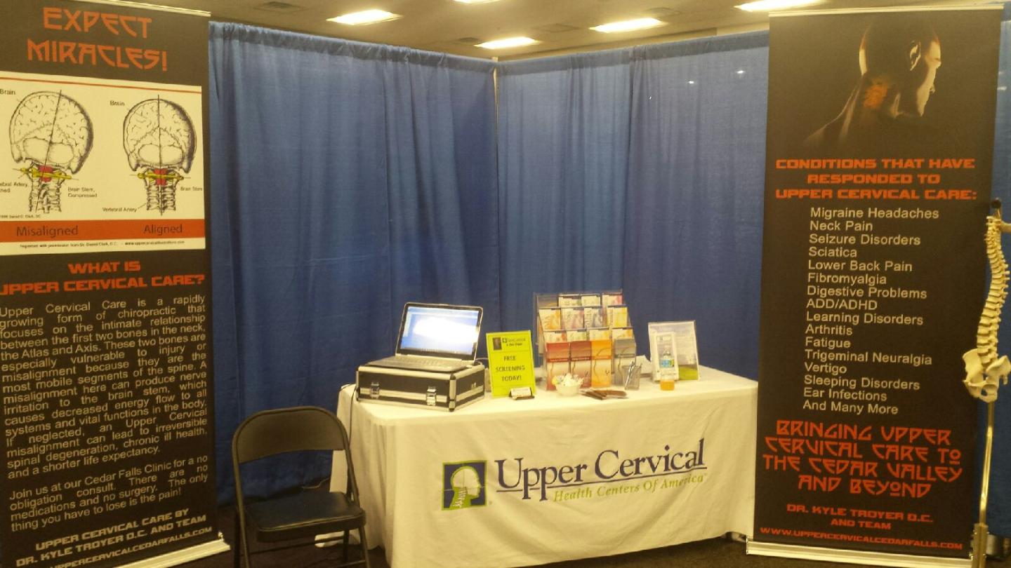
4.) Number of Words: It is no big surprise that each word takes the brain time to process. The more words on your sign, the more time it takes the brain to absorb the information. Focus on the most critical message to ensure it has optimum legibility.
Sometimes a business owner will realize that their much beloved logo does not meet the above tests. Your exterior sign does not have to match the logo. At the end of the day, you are buying a sign to be noticed and read.
A simple way to test the effectiveness of your design is to tape it to the wall and back up 20 feet. Walk towards the sign at a quick pace. At what point is it easy to read the most important message? More importantly have an honest friend do the same test. At what point are they able to easily read the primary message? At what point are they able to easily read the secondary message? Determine if you are meeting the 1 inch font at 10 feet test. If not, then what elements are you willing to change to improve legibility?
A sign is in an investment in your business. Maximize your return.
Convey Sign Solutions is passionate about our customers having a sign that meets their goals. For more information, contact Convey at sales@conveysign.com for help with your signage needs.
Type size makes the difference[/caption]
You, the small business owner, have ordered a sign to promote the location of your business. Your sign manufacturer is bringing a design to you for your review and approval. What should you be thinking about as you review the proposed design to ensure your sign can be easily read?
1.) Font: Is the font clear and easy to read? Some fonts that have been tested to be superior in legibility are: Gill Sans MT, Avenir LT Medium, Copperplate Gothic Bold, Helvetica and Kabel Ultra BT.
2.) Font Size: How far away do you want the sign to be read? A good rule of thumb is a 1” high letter can be read from 10 feet away. There have been some additional studies completed that you may want to adjust that to a 1” high letter to 7 feet away if there is a lot of visual stimulus in the area your sign will be placed.
3.) Contrast: Is the color contrast dramatic? Do the letters pop from the background?
4.) Number of Words: It is no big surprise that each word takes the brain time to process. The more words on your sign, the more time it takes the brain to absorb the information. Focus on the most critical message to ensure it has optimum legibility.
Sometimes a business owner will realize that their much beloved logo does not meet the above tests. Your exterior sign does not have to match the logo. At the end of the day, you are buying a sign to be noticed and read.
A simple way to test the effectiveness of your design is to tape it to the wall and back up 20 feet. Walk towards the sign at a quick pace. At what point is it easy to read the most important message? More importantly have an honest friend do the same test. At what point are they able to easily read the primary message? At what point are they able to easily read the secondary message? Determine if you are meeting the 1 inch font at 10 feet test. If not, then what elements are you willing to change to improve legibility?
A sign is in an investment in your business. Maximize your return.
Convey Sign Solutions is passionate about our customers having a sign that meets their goals. For more information, contact Convey at sales@conveysign.com for help with your signage needs.
Waterloo, IA - What to Look for in Your Sign Design
SYNOPSIS: Customers must be able to read your sign to get your message. Using a good font will make this possible.
BY: ,
[caption id="attachment_1131" align="alignleft" width="365"] Type size makes the difference[/caption]
You, the small business owner, have ordered a sign to promote the location of your business. Your sign manufacturer is bringing a design to you for your review and approval. What should you be thinking about as you review the proposed design to ensure your sign can be easily read?
1.) Font: Is the font clear and easy to read? Some fonts that have been tested to be superior in legibility are: Gill Sans MT, Avenir LT Medium, Copperplate Gothic Bold, Helvetica and Kabel Ultra BT.
2.) Font Size: How far away do you want the sign to be read? A good rule of thumb is a 1” high letter can be read from 10 feet away. There have been some additional studies completed that you may want to adjust that to a 1” high letter to 7 feet away if there is a lot of visual stimulus in the area your sign will be placed.
3.) Contrast: Is the color contrast dramatic? Do the letters pop from the background?
4.) Number of Words: It is no big surprise that each word takes the brain time to process. The more words on your sign, the more time it takes the brain to absorb the information. Focus on the most critical message to ensure it has optimum legibility.
Sometimes a business owner will realize that their much beloved logo does not meet the above tests. Your exterior sign does not have to match the logo. At the end of the day, you are buying a sign to be noticed and read.
A simple way to test the effectiveness of your design is to tape it to the wall and back up 20 feet. Walk towards the sign at a quick pace. At what point is it easy to read the most important message? More importantly have an honest friend do the same test. At what point are they able to easily read the primary message? At what point are they able to easily read the secondary message? Determine if you are meeting the 1 inch font at 10 feet test. If not, then what elements are you willing to change to improve legibility?
A sign is in an investment in your business. Maximize your return.
Convey Sign Solutions is passionate about our customers having a sign that meets their goals. For more information, contact Convey at sales@conveysign.com for help with your signage needs.
Type size makes the difference[/caption]
You, the small business owner, have ordered a sign to promote the location of your business. Your sign manufacturer is bringing a design to you for your review and approval. What should you be thinking about as you review the proposed design to ensure your sign can be easily read?
1.) Font: Is the font clear and easy to read? Some fonts that have been tested to be superior in legibility are: Gill Sans MT, Avenir LT Medium, Copperplate Gothic Bold, Helvetica and Kabel Ultra BT.
2.) Font Size: How far away do you want the sign to be read? A good rule of thumb is a 1” high letter can be read from 10 feet away. There have been some additional studies completed that you may want to adjust that to a 1” high letter to 7 feet away if there is a lot of visual stimulus in the area your sign will be placed.
3.) Contrast: Is the color contrast dramatic? Do the letters pop from the background?
4.) Number of Words: It is no big surprise that each word takes the brain time to process. The more words on your sign, the more time it takes the brain to absorb the information. Focus on the most critical message to ensure it has optimum legibility.
Sometimes a business owner will realize that their much beloved logo does not meet the above tests. Your exterior sign does not have to match the logo. At the end of the day, you are buying a sign to be noticed and read.
A simple way to test the effectiveness of your design is to tape it to the wall and back up 20 feet. Walk towards the sign at a quick pace. At what point is it easy to read the most important message? More importantly have an honest friend do the same test. At what point are they able to easily read the primary message? At what point are they able to easily read the secondary message? Determine if you are meeting the 1 inch font at 10 feet test. If not, then what elements are you willing to change to improve legibility?
A sign is in an investment in your business. Maximize your return.
Convey Sign Solutions is passionate about our customers having a sign that meets their goals. For more information, contact Convey at sales@conveysign.com for help with your signage needs.