San Diego, CA — How Do Local Sign Shops Design Channel Letters for Retail?
Channel Letter Design for Retail Storefronts
Synopsis:
Channel letters help San Diego retailers improve visibility, reinforce branding, and attract shoppers with custom storefront signage designed for clarity and impact.
Retail storefronts in San Diego compete for attention every day. Shoppers pass by quickly, compare nearby businesses, and often decide where to stop based on what catches their eye first. Channel letters give retail stores a strong visual advantage by adding depth, lighting, and brand personality to the storefront. At Sign Distinction, we design channel letter signs built to help retailers stand out while keeping the finished sign clear, professional, and easy to recognize.
We Start With the Storefront and Viewing Distance
A channel letter design begins with the building itself. Before choosing colors or lighting, we consider the storefront size, wall surface, entrance placement, nearby signs, and how customers approach the business. A sign viewed from a parking lot needs different proportions than one viewed by pedestrians walking past a storefront.
Viewing distance affects letter height, spacing, and overall sign scale. If letters are too small, customers may miss the business. If they are too large, the sign may feel crowded or unbalanced. The right design fits the building and remains readable from the customer’s natural approach.
Branding Shapes the Look
Retail signs must do more than display a name. They should reflect the store’s personality. A children’s boutique may need playful lettering and bright colors, while a high-end clothing store may need clean lines and a refined finish. We use the retailer’s logo, fonts, colors, and overall brand style to guide the design.
Consistency matters. A storefront sign should connect with window graphics, interior signs, packaging, menus, displays, and online branding. When customers see the same visual identity across every touchpoint, the store becomes easier to remember.
Lighting Choices Change the Feel
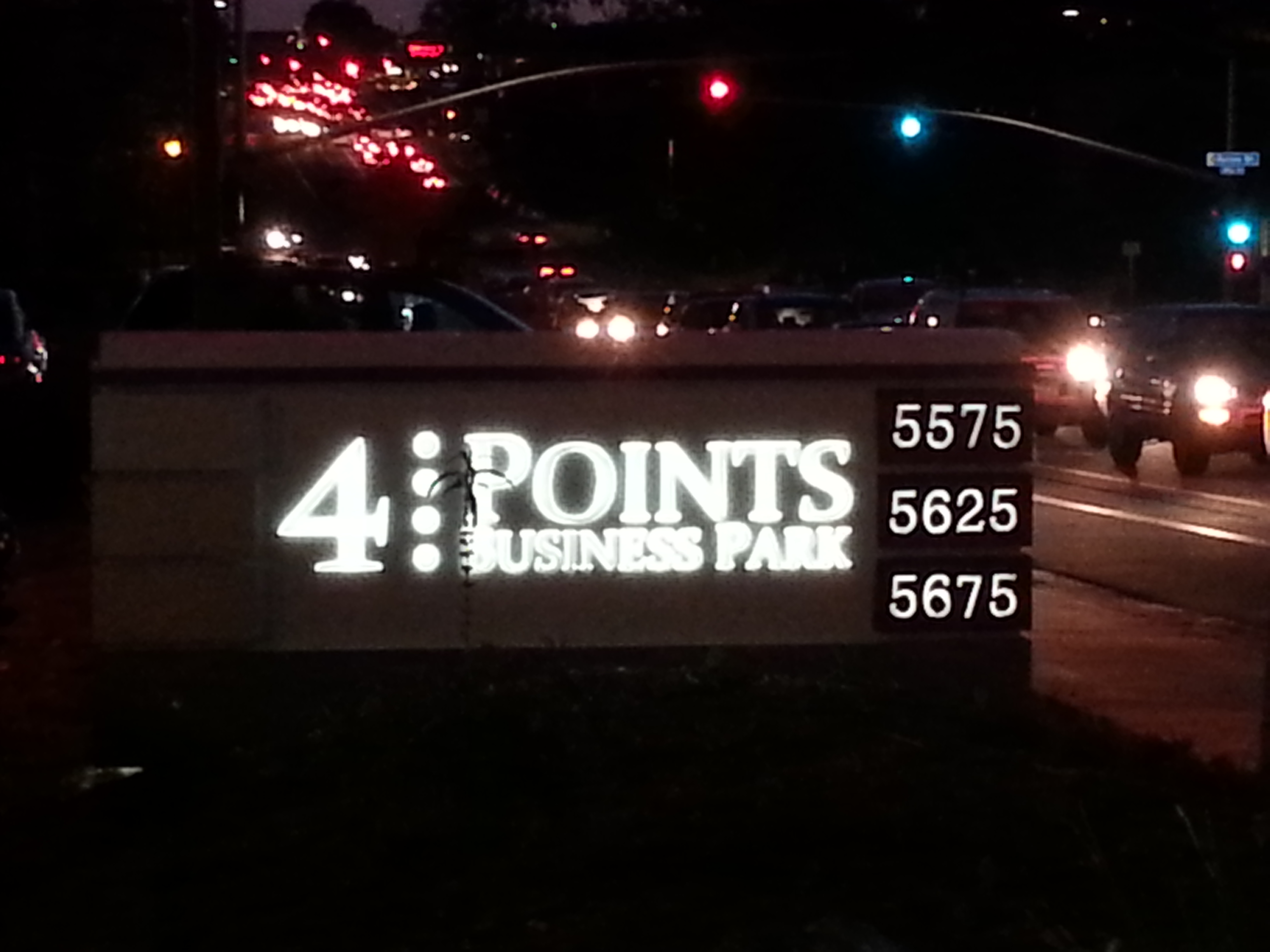
Channel letters offer several lighting options. Front-lit letters create bright, direct visibility and work well for busy retail centers. Back-lit, or halo-lit, letters cast a softer glow behind each letter, creating a more polished look. Combo-lit letters use both effects to create strong visibility with added dimension.
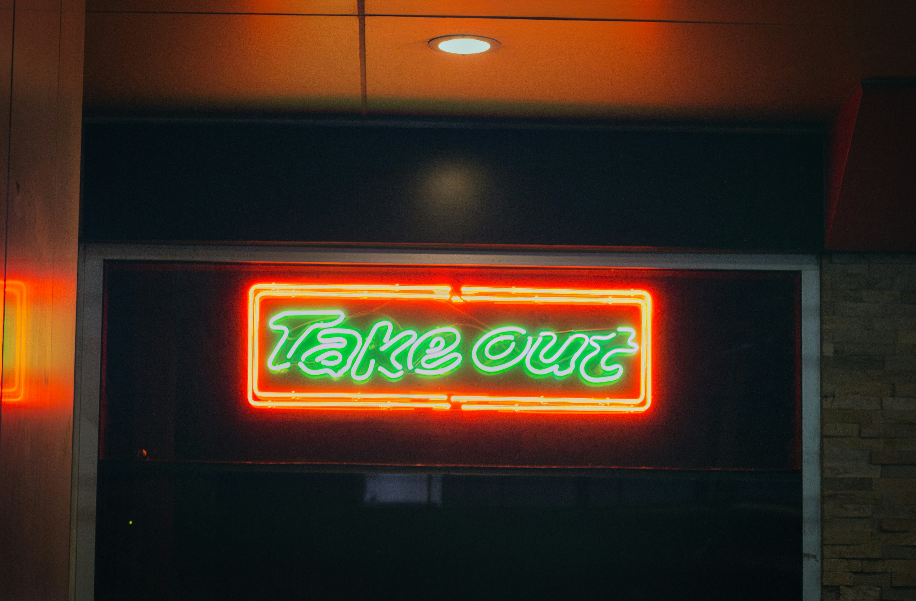
The right lighting depends on the store’s hours, location, and desired image. Retailers who open late often benefit from illuminated signs because their storefronts remain visible after dark.
Materials Support Durability
Retail channel letters need to handle sun, wind, moisture, and daily exposure. We consider materials such as aluminum, acrylic, and durable lighting components based on the sign design and installation location. Quality materials help prevent fading, cracking, and premature wear.
A good sign should continue to represent the business well over time. This is especially important for retail stores where curb appeal influences foot traffic.
Mounting and Installation Matter
The final design must work with the building structure. Some channel letters are mounted directly to the wall for a clean look. Others use a raceway, which houses electrical components and may reduce wall penetrations. We review each location to determine the best mounting method for appearance, service access, and long-term performance.
Designed to Bring Shoppers Inside
A strong channel letter sign makes a retail storefront easier to find, easier to trust, and easier to remember. From layout and lighting to materials and installation, every choice affects how customers see the business.
If your San Diego retail store needs channel letters designed with purpose and precision, contact Sign Distinction today. We will help create signage that supports your brand and draws more attention to your storefront.