Creating graphics with accurate color is a discipline shared between you and your sign company. With accurate color production being a shared responsibility, finding the right vendor is only a start.
In this week’s article, we present some tips to make color graphic creation easier. In our last article, we presented tips in selecting a qualified vendor. This week, we’ll cover suitable discipline in artwork creation, and what you or your graphic artist should know to ensure that your art is properly created prior to submission to your sign company.
Working With Your Sign Company
You have a good start once you’ve found a qualified sign company with a color-managed workflow. Though there’s more to accurate color production, the hardest part is behind you and a qualified sign company can help you with artwork submission tips.
Color Selection
Selecting a color to print isn’t as easy as picking a color in the software you use to create and maintain artwork. Visual color perception in this manner depends on your monitor as well as ambient light. In order to have any chance of even being close, your monitor must be profiled and you must have lighting that is as close to natural light as possible.
Color Spaces For Display And Print
Before going further, it is important to understand a fundamental difference in color presentation in display (your monitor) and print (the sign or other graphic printed by your sign company). Each has its own color space, and as such, the range of colors that can be presented (gamut) varies since they’re entirely different means of presenting color. Our perception of color on a monitor is from projected light, whereas our perception of color in printed matter is from reflected light.
Your monitor uses a color space called RGB, an acronym for the base colors it can present: Red, Green and Blue. A monitor can be thought of as a grid of thousands of little red, green, and blue lamps, each with their own dimmer switch. The RGB color space is additive, meaning that color is presented by adding light.
Your monitor starts with a black background. Color is presented by projecting red, green and blue light in various intensities. For example, black is the result of no light being projected. Pure red is the result of projecting red light at full intensity. The color yellow is the result of projecting red and green, and so on.
The color space for printed material is CMYK, a subtractive color model that refers to the base color inks Cyan, Magenta, Yellow and Key (or Black). Printer matter starts out white, by adding ink we can control the light reflected back to our eyes.
With an understanding of how color is presented differently in these color models, it follows that the gamut, or range of colors that can be presented varies between display and print.
Color Specification
If “close enough” is sufficient, selecting colors visually from your monitor may suffice provided you design with good lighting, and that your monitor is profiled to present colors accurately. For critical color accuracy however, this will not suffice and we must work in the target CMYK color space when specifying colors in your artwork. For color critical printing, consult with your sign shop in advance of submitting artwork to determine the best method of color specification for your particular needs.
One common means of specifying colors is by referencing PMS or Pantone colors. Oversimplified, the Pantone reference materials are printed swatches in a variety of colors – each with a unique name or identifier. When using Pantone colors from swatches, you’re working with reflected light (printed), not projected light (your monitor). For printed work, the best Pantone reference to use is the Color Bridge. The complete Pantone reference guide is made up of colors that are produced with pre-mixed colors, as well as those made entirely of CMYK as used in digital printing. The Color Bridge reference shows a side-by-side comparison of process color simulations and solid Pantone Colors. For graphics printed by your sign shop, the color chip on the right of the swatch card is most representative of the color as printed in CMYK.
Regardless of the design software used, Pantone spot colors should be installed for your reference. Select an object and “tag” it with the spot color that represents the color you want to print – again, using the printed “Color Bridge” Pantone reference guide to select the desired color.
For many print jobs, selecting a color-managed vendor, adequate communication and specification of color within your artwork will yield fairly accurate color. For the most critical color jobs however, this may not be sufficient and additional work may be needed.
For the most critical color jobs, it’s best to reference color swatches printed by your printer or sign company. Most printer manufacturers have a proprietary color reference library. For example, at Spectrum Signs, our Roland printer includes Roland’s Color System Library. The swatches used for color reference are printed on our printer, with our genuine Roland ink, in our environment, and on the target media. As such, we know that the colors can be recreated with absolute accuracy because the reference colors were created in a controlled, identical and consistent manner.
For our customers with recurring color critical need, we provide *printed reference materials and the corresponding swatch library for use in Adobe Illustrator,
Adobe Photoshop or Corel Draw.
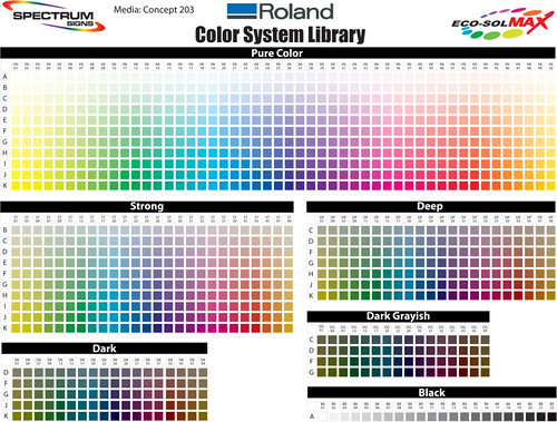
Spectrum Signs' Roland Color System Library
* Note that the color chart link above is intended as an aid in understanding the Roland Color System Library. In actual use, you’ll want to use reference colors printed by us on the media you intend to use for your project.
Environmental Considerations
Ambient lighting can affect the perception of color. Whether you are selecting reference colors from a profiled monitor or printed swatches, you need to be aware that not all light is the same. The safest means of referencing color is to choose your reference colors in lighting that closely matches the environment that your printed material will be viewed. If you design your art indoors, but the art will be viewed outdoors, you should be aware that incandescent or fluorescent light is not the same as sunlight. One option is to take your reference swatches outdoors to select in natural sunlight. This is not the most convenient however; perhaps a better option is to choose indoor lighting that better approximates natural sunlight. At Spectrum Signs for example, our design and production area is lit with special fluorescent lighting with the highest CRI – or Color Rendering Index available.
Color Rendering Index
A color rendering index (CRI) is a measure of the ability of a light source to reproduce the colors of various objects faithfully in comparison with an ideal or natural light source.
The higher the CRI, the better the color rendering ability. Light sources with a CRI of 85 to 90 are considered good at color rendering. Light sources with a CRI of 90 or higher are excellent at color rendering and should be used for tasks requiring the most accurate color discrimination.
Most sign shops use whatever lighting was in the building when they leased it. Most commonly, this will be fluorescent lighting with Cool White bulbs. Cool White bulbs are the least expensive, and as such, most widely used. However, their CRI is very poor. If you’ve ever taken a picture in a room lit with typical fluorescent lighting, you’ll note an unnatural color tint in the picture overall. Cool White bulbs commonly have a CRI of 62. Daylight bulbs are available at increased cost and have a CRI of about 75. Though an improvement over Cool White, this is still not a good choice for color critical applications. Some manufacturers offer bulbs called “Designer”, “Natural” and “Colortone” at additional cost with a CRI from 80-92.
At approximately 15 times the cost for Cool White bulbs, Spectrum Signs uses Lumichrome with a CRI of 98 – the highest available. As such, there’s no need to take a printed graphic outdoors in natural sunlight to gauge relative color accuracy. Designs on our color profiles monitor aren’t adversely affected by ambient light, so the color you see on the monitor when designing is the best representation of the printed output available considering the differences in color spaces.
Design Considerations
If you are dependent on the appearance of your design on screen, in addition to good lighting, you’ll need to ensure that your monitor accurately displays color. At Spectrum Signs, our monitors are profiled regularly to ensure they are accurate. To profile a monitor, a color spectrophotometer is needed – we use the I1Xtreme from XRite.
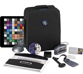
I1Xtreme Color Spectrophotometer
Your artwork should be created in the CMYK Color Mode. If your document was created in RGB, you may notice when switching to CMYK that the colors may not be as vibrant. Remember that these are different color spaces: RGB is additive color dealing with projected light, whereas CMYK is subtractive and deals with reflected light. As such, the color gamut, or range of colors possible are unique to each color space.
If you’ll be specifying spot colors in your artwork, you need to understand both spot and process colors, and the affect of using transparencies in your artwork.
Transparencies and Spot Colors
The use of both transparencies and spot colors in your art presents a challenge when printed. By default, Illustrator presents a warning similar to the following:
When spot colors are used with transparency, changing them to process colors outside of Illustrator can generate unexpected results
When this warning is displayed however, it gives you the option of turning off this warning subsequently. If the target of your art is always video or web, it’s safe enough to turn off this warning, but you should be aware of this combination when the output is printed matter. Illustrator displays this message because transparencies are such an integral part of Illustrator that it’s possible to add transparency to your artwork without realizing it. Transparencies can be added to artwork by doing any of the following:
- Lowering the opacity of objects so that underlying artwork becomes visible.
- Using opacity masks to create variations in transparency.
- Using a blending mode to change how colors interact among overlapping objects.
- Applying gradients and meshes that include transparency.
- Applying effects or graphic styles that include transparency, such as drop shadows.
- Importing Adobe Photoshop files that include transparency.
Oversimplified, what this warning means is that your artwork contains transparencies and your spot colors may not be recognized when printed, so all your work to ensure accurate color was for nothing. As such, additional work is needed to ensure your art is printed as intended.
Submitting Your Artwork
When submitting your artwork, be sure to communicate with your sign company. Minimally they’ll need to know that the job contains spot colors. This is true regardless of the spot color reference library used.
If your artwork has transparencies, you’ll need to flatten the transparencies prior to submitting your artwork even if spot colors are not used. Representation of transparencies in your design software may not be presented on screen in the same manner as any given RIP (software that drives the printer). When flattening transparencies in Illustrator, we recommend turning on the Preview option and verifying that the results are as intended, tuning the options presented and confirming that spot colors are retained afterward.
For color critical applications, request a proof from your printer. Though this adds to the cost of your project, the size of the proof can be reduced to minimize the cost. The intent of the proof is to verify that your art is prepared and submitted properly, and that the printer’s RIP renders the art as intended. If there’s an issue in art submission or communication, it’s better to find out early on in production to save time and money.
About Spectrum Signs
Spectrum Signs is an independent, locally owned, full service sign manufacturing company located in south Orange County – Mission Viejo, California. We are affiliated with over 240 independent sign companies with access to resources nationwide. This affiliation provides significant discounts from sign suppliers, and allows us to offer competitive pricing without compromising in quality and service.
For more information, contact:
Spectrum Signs
23382 Madero Suite L
Mission Viejo, CA 92691
(949) 297-3800