Your sign is one of the only parts of your brand that is always working, 24/7. So what do you want customers to know about you in the 3 seconds that they have to look at your sign?
A commercial sign serves many purposes, but the single biggest is to immediately convey the brand identity. Beyond that, everything about the design, including the color, letter height and spacing, type and finish of material and installation location on the property, all have to reinforce the brand identity as well.
Color and Contrast Come First
High contrast is typically read before content. So, black on white or white on black can be read from far away. Similar brightness colors will blend together, even if they look good on a computer screen. To check for contrast, view your design from across the parking lot. It will give you the truest view of your sign design.
The height of letters also matters greatly. A good rule of thumb is to use 1 inch of letter height for every 10 feet of viewing distance. A store sign with a name that is intended to be read by people driving by would need to use very tall letters in order to be readable.
Placement and Lighting
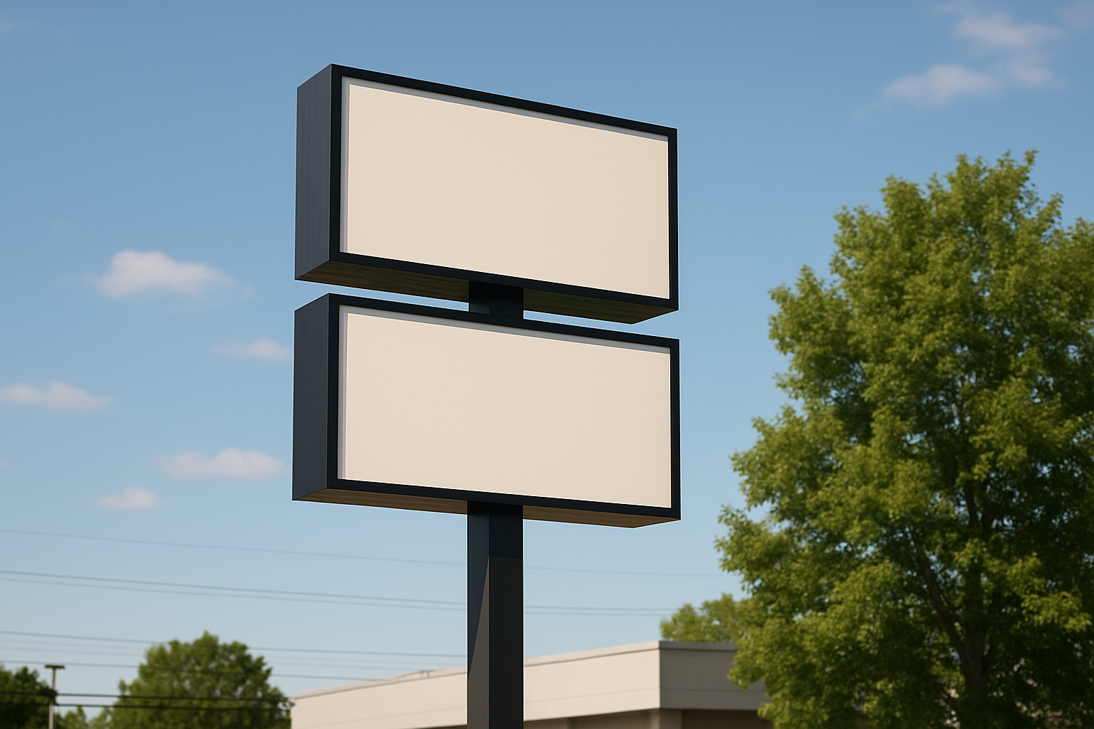
Where will your sign be placed? How many people will see your sign? A sign placed behind a tree or up too high will not provide you with the return on investment that a quality sign can bring. A commercial sign that is placed in the spot where your customers first look for you is the best place for your sign.
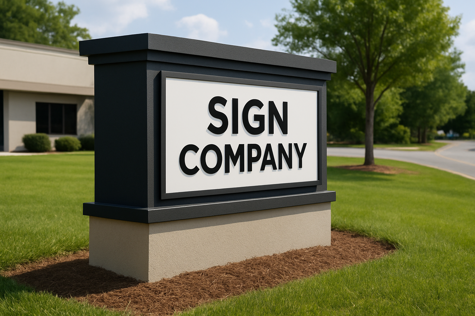
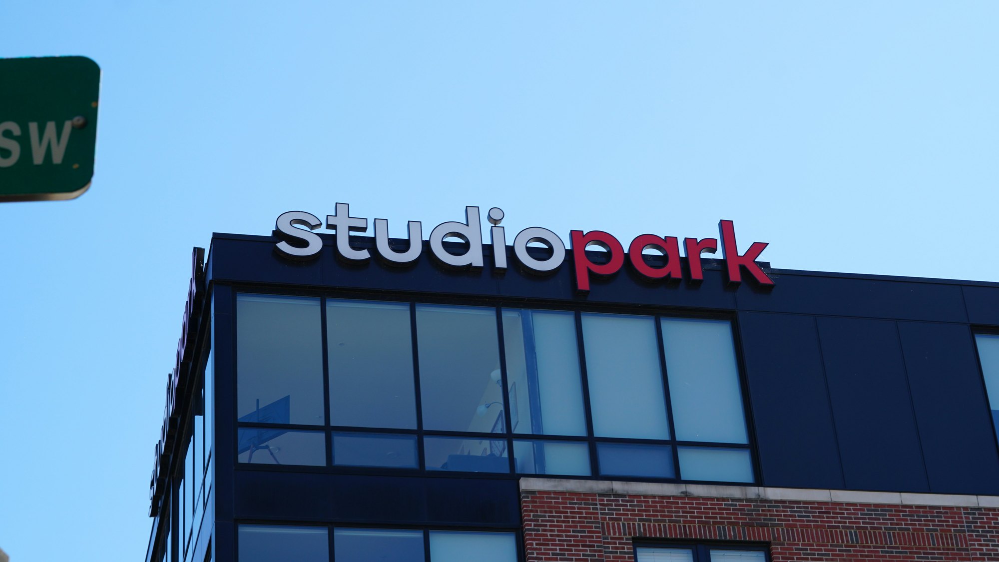
With the amount of time Grand Rapids is clouded by dark winter nights, having a way to make your sign stand out is crucial. Channel letter signs, backlit sign panels and monument signs are all lit and provide good visibility after dark.
Keep Every Sign Consistent
Different signs mean conflicting messages, so make sure all of your signs (building sign, window signs, car signs, indoor signs) contain the same font, same colors and same logo. Consistent signs will allow your customers to recognize your brand after a couple of views of a particular sign.
What a Strong Commercial Sign Does
Most well-designed signs share a few traits:
- The business name can be read in a glance
- The colors match the logo and the rest of the brand
- The materials fit the building and hold up outdoors
- The lighting works after dark
- The size follows local sign rules for the property.
Most municipalities have guidelines and regulations regarding signs, including size, height and lighting. We get the necessary permits for you so you don’t have to.
Let Us Design Yours
New sign or need to upgrade existing signs? We would be happy to look at your building and you can tell us what your brand is all about and what you would like people to remember about you. We can walk you through all of the sign design options and materials that would work well for you and even provide you with a quote. Call Grand Rapids Sign Company today.