Slow Tuesday morning. Someone walks past a cafe with a phone in one hand and no real plan. The building sign gives the name of the place, and that’s all. Then a board on the sidewalk says maple latte, fresh scones, and now there’s a reason to stop. That’s the whole job.
Cafes in Comstock Park sit along busy roads like Alpine Avenue and West River Drive. Cars move faster than people walk out there. The building sign catches drivers. The sidewalk sign catches everyone on foot, plus anybody slowing down for the turn.
What A-Frame Signs Are
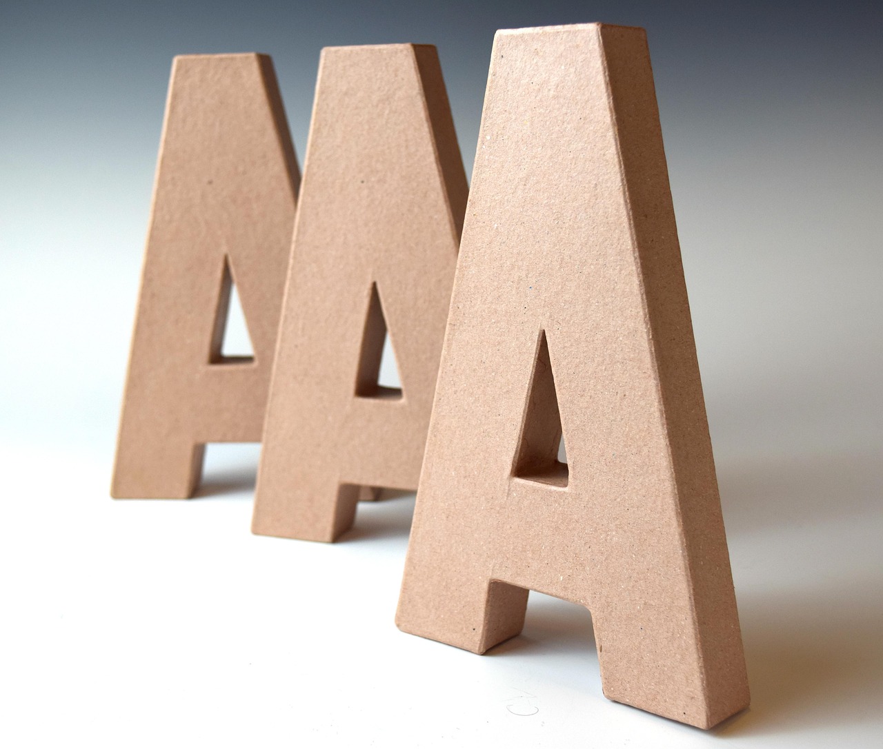
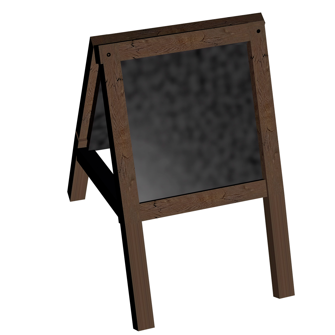
An A-frame sign is a freestanding sign shaped like the letter A. Two panels hinge at the top and lean apart, so the sign stands up on its own. Fold it flat and carry it in one hand. Plenty of people call them sandwich boards. Most have a message on both sides, so someone coming from either direction can read it.
No mounting, no wiring. Cafes like that. The message changes whenever the menu does.
Types of A-Frame Signs
Four styles cover most cafes:
- Chalkboard: the classic. Rewrite it every morning.
- Dry erase: handles rain and snow better than chalk, and the writing stays sharp.
- Printed panel: permanent logo on top, a changeable strip below.
- Weighted base: a panel on a wide, heavy base you fill with water or sand. Stays upright when the wind picks up.
Frames come in wood or metal. Wood suits a cafe with exposed brick and hanging plants. Metal handles weather better, and a slim black frame fits a modern coffee bar.
Best Picks for Cafes
Most cafes should start with chalkboard or dry erase, since the daily message is the whole point. Chalk fits a cozy shop that wants a handmade look. Dry erase wins when your handwriting is rough or February turns ugly. A printed header over a dry erase area splits the difference. Name and logo stay put, the special changes by hand.
Space matters too. A cafe in a busy plaza competes with a lot of other signs, so a bigger two-sided frame earns its spot. A tight sidewalk wants something tall and narrow.
What to Put on It
Less than you think. The drink or the food, the price, done. A line or two, big enough to read from a few steps away. Neat handwriting is charming. Messy isn’t. If that’s you, print the header and handwrite only the daily item.
Place it where people already walk, near the door, angled toward the main foot traffic. Not in the middle of a narrow sidewalk. It gets kicked there.
Get a Sign That Gets Noticed
We build custom A-frame signs in chalkboard, dry erase, and printed styles. Reach out to Grand Rapids Sign Company and we’ll help you pick one that fits your cafe and holds up outside.