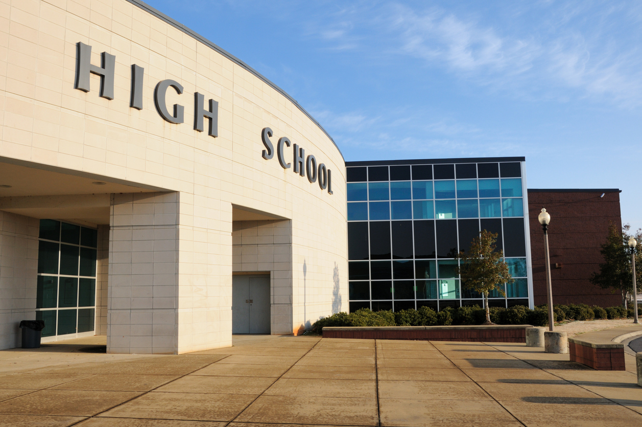
 We once removed a set of channel letters less than eight months after they were installed. The school had chosen a low-cost online provider who shipped aluminum frames with no template, no mounting instructions, and no proper LED insulation. From a distance, the letters looked fine—until the lights flickered, the R detached during a heatwave, and the sign began pulling away from the wall. Students had already toured. Parents had already driven past. The school paid twice—once for the wrong sign and once to get it right. At Elevate Sign Studio in San Ramon, we work with colleges that understand this: the letters on the wall are part of your admissions process, and the wrong choice leaves a mark students don’t forget.
Front-Lit Channel Letters: The Workhorse for Building Names
When most people picture college signage, they’re thinking of front-lit channel letters. These are the bread and butter of campus visibility—individual letters made from fabricated aluminum, mounted to the building face, and illuminated with internal LEDs that shine through colored acrylic faces. For main building names, gymnasiums, or admin entrances, front-lit letters offer the most readability during both day and night, and their dimensional depth communicates permanence and legitimacy from the moment someone enters campus. San Ramon colleges often choose this style because it adapts to nearly every architectural surface, performs well in outdoor weather, and meets brightness thresholds without overpowering nearby windows or walkways. We spec these signs with calculated return depths and optimized lighting angles, not just so they look good in photos, but so they’re readable from actual campus approach paths.
Reverse-Lit (Halo) Letters: Prestige Without Noise
Reverse-lit letters, also known as halo-lit channel letters, don’t shine light through the face; instead, they push light backward against the wall behind the letter, creating a glow effect that reads like sophistication without volume. These are used more selectively on campuses—most often for libraries, fine arts buildings, or leadership offices—where the institution wants a sense of calm authority, not retail-level brightness. The key to successful halo letters is the surface they’re mounted to: brushed steel or painted aluminum must contrast cleanly with the wall color, and the LEDs must sit at precise depths to create even, soft-edged glow fields. When colleges in San Ramon want to communicate refinement or timelessness, this is the tool we reach for, but only when conditions are right; get the spacing wrong or pick the wrong wall texture, and the glow turns into a blotchy shadow that no one can read from ten feet away.
Raceway-Mounted Systems: Fast to Install, Easy to Maintain
A raceway is a rectangular channel that houses all electrical components, which then supports the individual channel letters above it. For large academic campuses or multi-building installs where time, access, or budgets are constrained, raceway-mounted letters offer speed and scalability without compromising long-term value. Most colleges in San Ramon use raceways on secondary buildings—science annexes, dorms, maintenance hubs—where flush-mounting may be cost-prohibitive or architecturally inconsistent. Done correctly, the raceway blends into the wall color and becomes visually invisible while still allowing quick service access for LED repair, wiring upgrades, or modular letter replacement. We never default to raceways, but when they’re needed, we engineer them to disappear while performing flawlessly under pressure.
Flush-Mounted Channel Letters: Clean Look, Tough Permits
Flush-mounting, or direct-to-wall channel letter installs, is the gold standard for aesthetics—each letter is drilled and mounted independently, with power run through a wall cavity or internal raceway hidden behind the facade. For San Ramon campuses where image and accreditation optics matter, this is often the preferred approach. However, flush-mounting requires advanced coordination with facilities teams, wall surveys, and often permit review based on electrical exposure, building material, and wind load tolerance. We’ve advised colleges to avoid flush-mounting on older stucco or textured masonry unless the backing surface is reinforced, sealed, and prepped. You never want to discover the anchor spacing is off when you’re 12 feet in the air with a power drill and an LED junction box in hand.
Open-Face Letters: Not Just for Drama, But Best Used With Care
Open-face channel letters remove the acrylic face entirely, leaving visible neon or LED tubing inside each character—often used for stylized departments, like student unions, theaters, or alumni centers. These letters command attention and deliver a bold aesthetic, but their success depends entirely on control. If used too close to a main entrance or in inconsistent daylight, they become unreadable or just plain overwhelming. For San Ramon colleges trying to balance tradition with creativity, we use open-face lettering sparingly and only after verifying zoning regulations and safety lighting codes. These letters can energize a campus brand, but they also attract scrutiny—so we only recommend them when the building, the lighting plan, and the design intent all align with discipline.
If the Letters Don’t Hold Up, Neither Will the Story
Your college in San Ramon might have great programs, expert faculty, and competitive admissions—but if your sign flickers, sags, or disappears into a shadow at sunset, the story your signage tells is one of neglect. That story gets remembered. It gets photographed. And it makes students hesitate. At Elevate Sign Studio in San Ramon, we don’t just build channel letters—we build durable credibility. Call us at (925) 413-7127 and let’s build a sign your college can actually be proud of.
We once removed a set of channel letters less than eight months after they were installed. The school had chosen a low-cost online provider who shipped aluminum frames with no template, no mounting instructions, and no proper LED insulation. From a distance, the letters looked fine—until the lights flickered, the R detached during a heatwave, and the sign began pulling away from the wall. Students had already toured. Parents had already driven past. The school paid twice—once for the wrong sign and once to get it right. At Elevate Sign Studio in San Ramon, we work with colleges that understand this: the letters on the wall are part of your admissions process, and the wrong choice leaves a mark students don’t forget.
Front-Lit Channel Letters: The Workhorse for Building Names
When most people picture college signage, they’re thinking of front-lit channel letters. These are the bread and butter of campus visibility—individual letters made from fabricated aluminum, mounted to the building face, and illuminated with internal LEDs that shine through colored acrylic faces. For main building names, gymnasiums, or admin entrances, front-lit letters offer the most readability during both day and night, and their dimensional depth communicates permanence and legitimacy from the moment someone enters campus. San Ramon colleges often choose this style because it adapts to nearly every architectural surface, performs well in outdoor weather, and meets brightness thresholds without overpowering nearby windows or walkways. We spec these signs with calculated return depths and optimized lighting angles, not just so they look good in photos, but so they’re readable from actual campus approach paths.
Reverse-Lit (Halo) Letters: Prestige Without Noise
Reverse-lit letters, also known as halo-lit channel letters, don’t shine light through the face; instead, they push light backward against the wall behind the letter, creating a glow effect that reads like sophistication without volume. These are used more selectively on campuses—most often for libraries, fine arts buildings, or leadership offices—where the institution wants a sense of calm authority, not retail-level brightness. The key to successful halo letters is the surface they’re mounted to: brushed steel or painted aluminum must contrast cleanly with the wall color, and the LEDs must sit at precise depths to create even, soft-edged glow fields. When colleges in San Ramon want to communicate refinement or timelessness, this is the tool we reach for, but only when conditions are right; get the spacing wrong or pick the wrong wall texture, and the glow turns into a blotchy shadow that no one can read from ten feet away.
Raceway-Mounted Systems: Fast to Install, Easy to Maintain
A raceway is a rectangular channel that houses all electrical components, which then supports the individual channel letters above it. For large academic campuses or multi-building installs where time, access, or budgets are constrained, raceway-mounted letters offer speed and scalability without compromising long-term value. Most colleges in San Ramon use raceways on secondary buildings—science annexes, dorms, maintenance hubs—where flush-mounting may be cost-prohibitive or architecturally inconsistent. Done correctly, the raceway blends into the wall color and becomes visually invisible while still allowing quick service access for LED repair, wiring upgrades, or modular letter replacement. We never default to raceways, but when they’re needed, we engineer them to disappear while performing flawlessly under pressure.
Flush-Mounted Channel Letters: Clean Look, Tough Permits
Flush-mounting, or direct-to-wall channel letter installs, is the gold standard for aesthetics—each letter is drilled and mounted independently, with power run through a wall cavity or internal raceway hidden behind the facade. For San Ramon campuses where image and accreditation optics matter, this is often the preferred approach. However, flush-mounting requires advanced coordination with facilities teams, wall surveys, and often permit review based on electrical exposure, building material, and wind load tolerance. We’ve advised colleges to avoid flush-mounting on older stucco or textured masonry unless the backing surface is reinforced, sealed, and prepped. You never want to discover the anchor spacing is off when you’re 12 feet in the air with a power drill and an LED junction box in hand.
Open-Face Letters: Not Just for Drama, But Best Used With Care
Open-face channel letters remove the acrylic face entirely, leaving visible neon or LED tubing inside each character—often used for stylized departments, like student unions, theaters, or alumni centers. These letters command attention and deliver a bold aesthetic, but their success depends entirely on control. If used too close to a main entrance or in inconsistent daylight, they become unreadable or just plain overwhelming. For San Ramon colleges trying to balance tradition with creativity, we use open-face lettering sparingly and only after verifying zoning regulations and safety lighting codes. These letters can energize a campus brand, but they also attract scrutiny—so we only recommend them when the building, the lighting plan, and the design intent all align with discipline.
If the Letters Don’t Hold Up, Neither Will the Story
Your college in San Ramon might have great programs, expert faculty, and competitive admissions—but if your sign flickers, sags, or disappears into a shadow at sunset, the story your signage tells is one of neglect. That story gets remembered. It gets photographed. And it makes students hesitate. At Elevate Sign Studio in San Ramon, we don’t just build channel letters—we build durable credibility. Call us at (925) 413-7127 and let’s build a sign your college can actually be proud of.
San Ramon CA - Why Colleges Use Custom Channel Letters from a Local Sign Company
SYNOPSIS: Elevate Sign Studio, based in San Ramon, explains why colleges rely on specific types of channel letters to meet visibility, branding, and structural demands that prefab signage just can’t match.
Channel Letters are the First Test of a Real Campus
BY: ,
We once removed a set of channel letters less than eight months after they were installed. The school had chosen a low-cost online provider who shipped aluminum frames with no template, no mounting instructions, and no proper LED insulation. From a distance, the letters looked fine—until the lights flickered, the R detached during a heatwave, and the sign began pulling away from the wall. Students had already toured. Parents had already driven past. The school paid twice—once for the wrong sign and once to get it right. At Elevate Sign Studio in San Ramon, we work with colleges that understand this: the letters on the wall are part of your admissions process, and the wrong choice leaves a mark students don’t forget.
Front-Lit Channel Letters: The Workhorse for Building Names
When most people picture college signage, they’re thinking of front-lit channel letters. These are the bread and butter of campus visibility—individual letters made from fabricated aluminum, mounted to the building face, and illuminated with internal LEDs that shine through colored acrylic faces. For main building names, gymnasiums, or admin entrances, front-lit letters offer the most readability during both day and night, and their dimensional depth communicates permanence and legitimacy from the moment someone enters campus. San Ramon colleges often choose this style because it adapts to nearly every architectural surface, performs well in outdoor weather, and meets brightness thresholds without overpowering nearby windows or walkways. We spec these signs with calculated return depths and optimized lighting angles, not just so they look good in photos, but so they’re readable from actual campus approach paths.
Reverse-Lit (Halo) Letters: Prestige Without Noise
Reverse-lit letters, also known as halo-lit channel letters, don’t shine light through the face; instead, they push light backward against the wall behind the letter, creating a glow effect that reads like sophistication without volume. These are used more selectively on campuses—most often for libraries, fine arts buildings, or leadership offices—where the institution wants a sense of calm authority, not retail-level brightness. The key to successful halo letters is the surface they’re mounted to: brushed steel or painted aluminum must contrast cleanly with the wall color, and the LEDs must sit at precise depths to create even, soft-edged glow fields. When colleges in San Ramon want to communicate refinement or timelessness, this is the tool we reach for, but only when conditions are right; get the spacing wrong or pick the wrong wall texture, and the glow turns into a blotchy shadow that no one can read from ten feet away.
Raceway-Mounted Systems: Fast to Install, Easy to Maintain
A raceway is a rectangular channel that houses all electrical components, which then supports the individual channel letters above it. For large academic campuses or multi-building installs where time, access, or budgets are constrained, raceway-mounted letters offer speed and scalability without compromising long-term value. Most colleges in San Ramon use raceways on secondary buildings—science annexes, dorms, maintenance hubs—where flush-mounting may be cost-prohibitive or architecturally inconsistent. Done correctly, the raceway blends into the wall color and becomes visually invisible while still allowing quick service access for LED repair, wiring upgrades, or modular letter replacement. We never default to raceways, but when they’re needed, we engineer them to disappear while performing flawlessly under pressure.
Flush-Mounted Channel Letters: Clean Look, Tough Permits
Flush-mounting, or direct-to-wall channel letter installs, is the gold standard for aesthetics—each letter is drilled and mounted independently, with power run through a wall cavity or internal raceway hidden behind the facade. For San Ramon campuses where image and accreditation optics matter, this is often the preferred approach. However, flush-mounting requires advanced coordination with facilities teams, wall surveys, and often permit review based on electrical exposure, building material, and wind load tolerance. We’ve advised colleges to avoid flush-mounting on older stucco or textured masonry unless the backing surface is reinforced, sealed, and prepped. You never want to discover the anchor spacing is off when you’re 12 feet in the air with a power drill and an LED junction box in hand.
Open-Face Letters: Not Just for Drama, But Best Used With Care
Open-face channel letters remove the acrylic face entirely, leaving visible neon or LED tubing inside each character—often used for stylized departments, like student unions, theaters, or alumni centers. These letters command attention and deliver a bold aesthetic, but their success depends entirely on control. If used too close to a main entrance or in inconsistent daylight, they become unreadable or just plain overwhelming. For San Ramon colleges trying to balance tradition with creativity, we use open-face lettering sparingly and only after verifying zoning regulations and safety lighting codes. These letters can energize a campus brand, but they also attract scrutiny—so we only recommend them when the building, the lighting plan, and the design intent all align with discipline.
If the Letters Don’t Hold Up, Neither Will the Story
Your college in San Ramon might have great programs, expert faculty, and competitive admissions—but if your sign flickers, sags, or disappears into a shadow at sunset, the story your signage tells is one of neglect. That story gets remembered. It gets photographed. And it makes students hesitate. At Elevate Sign Studio in San Ramon, we don’t just build channel letters—we build durable credibility. Call us at (925) 413-7127 and let’s build a sign your college can actually be proud of.