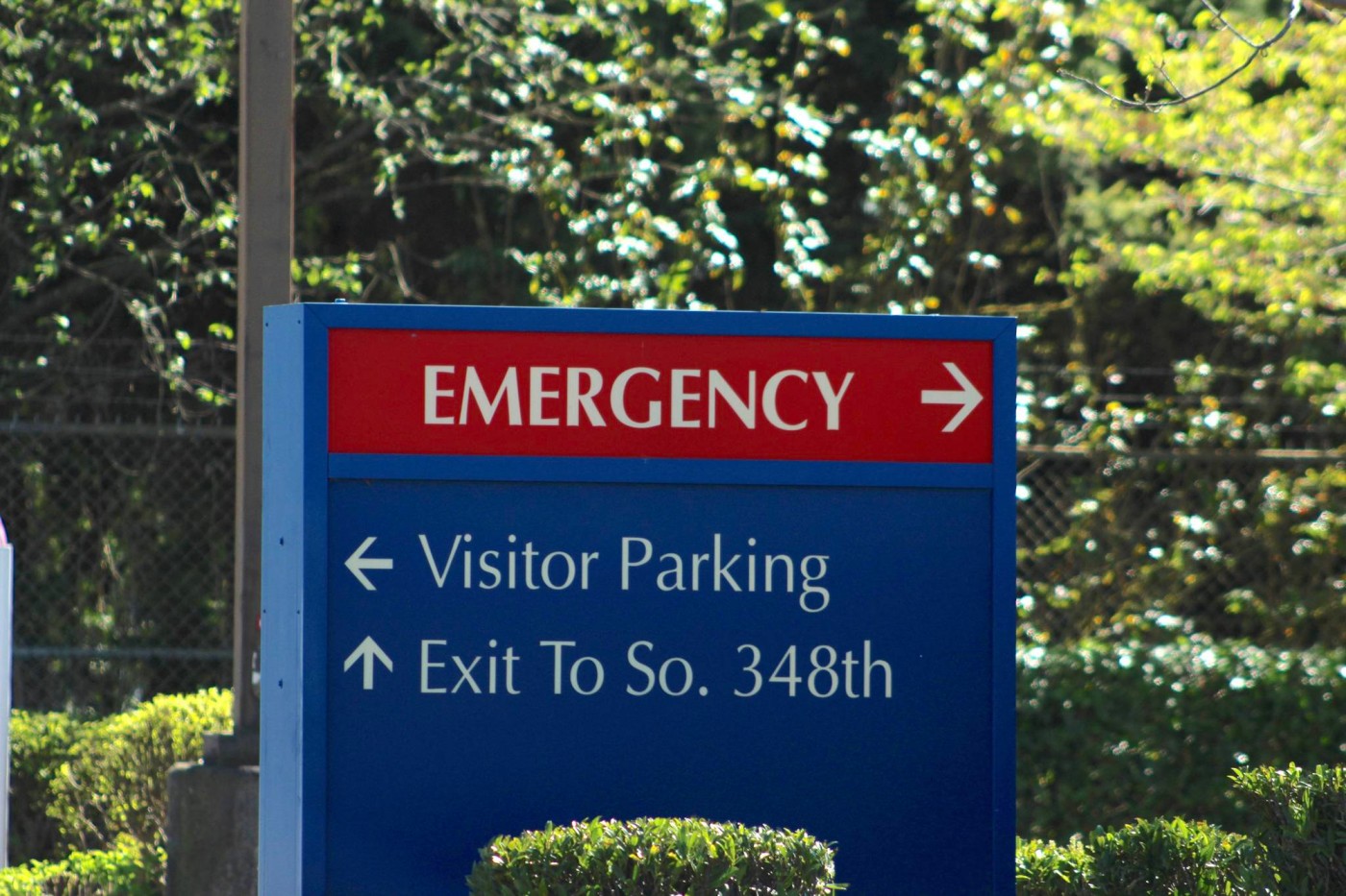
 When patients lose their way, tension builds. They hesitate in hallways, double back, and ask the front desk for help while the phone keeps ringing. Confusing layouts make a professional clinic feel unorganized. We solve that problem by mapping real movement, not imagined paths. Our team studies traffic flow, sightlines, and decision points before producing a single layout. A clear wayfinding system turns frustration into confidence and gives your staff one less distraction to handle.
Design That Works as Hard as You Do
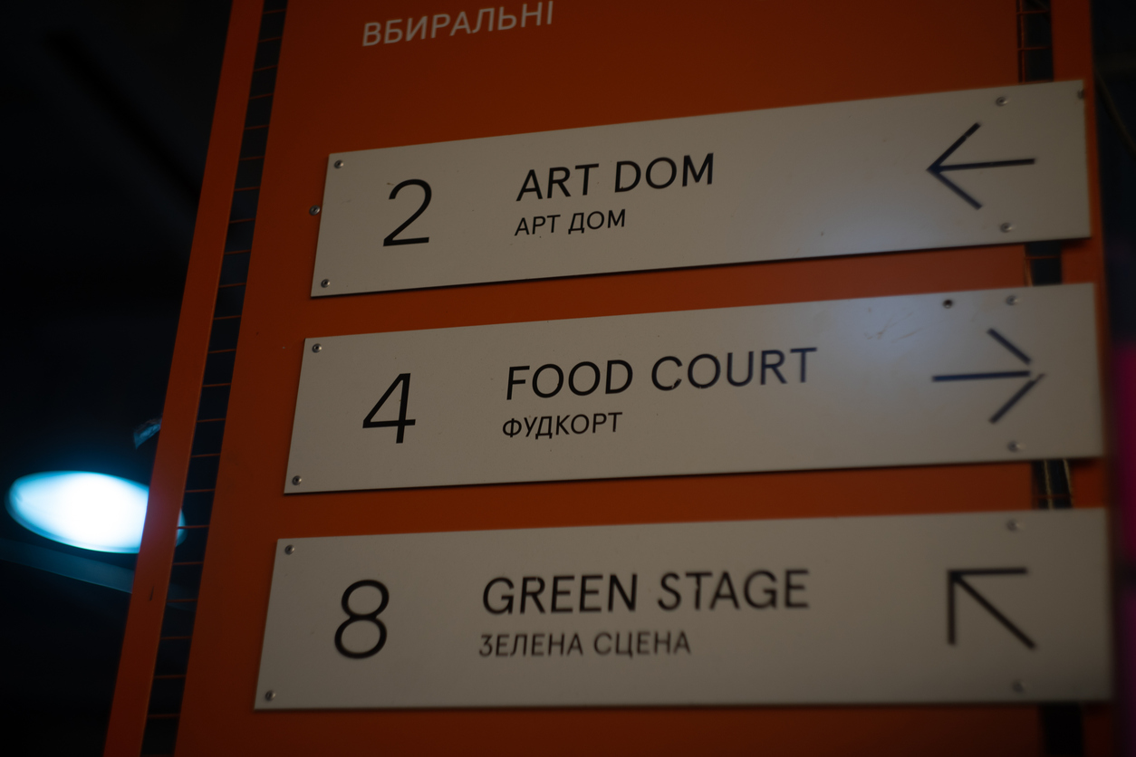
Fonts must be clean, letters sized for distance, and colors chosen for contrast, not decoration. We use sans-serif typefaces that hold shape under bright light and matte finishes that prevent glare. High-contrast palettes help every visitor, from the young to the elderly, find what they need without squinting. Soft gray and blue tones feel professional without being cold. When signs are designed to work quietly, patients feel cared for before they ever meet a doctor.
Placement That Follows Real Behavior
A perfect design on paper can fail in practice. We build systems for the way people actually move. Arrows are installed where eyes land first, around four feet from the floor. Door and wall signs follow ADA guidelines for height and tactile lettering depth, ensuring accessibility for all patients. We check placement under both artificial and natural light to guarantee legibility throughout the day. The smallest adjustment, like shifting a sign by a few inches, can turn hesitation into flow.
Light That Guides, Not Glares
Lighting shapes mood as much as it shapes visibility. We use LED fixtures calibrated around 4000K, which provides brightness without harshness. During installation, we walk the hallway and study how light hits each surface from different angles. Every fixture and sign is tested together so illumination feels even, not overpowering. When light is balanced, movement feels natural, and the space feels welcoming. Thoughtful lighting turns navigation into instinct instead of effort.
Durability That Matches Your Pace
Medical facilities never stop moving, and neither should their signs. We print on UV-stable film and use aluminum composite panels sealed tightly against moisture. Every surface is coated to resist cleaning agents and daily disinfection. Mounting hardware is flush and tamper-resistant, keeping everything looking professional year after year. Durable materials save time, prevent replacement costs, and keep your space looking sharp. Good signage should outlast the paint, not fade with it.
Consistency That Builds Trust
Patients notice when the environment feels steady. Matching fonts, color tones, and layouts creates rhythm in motion. Consistency across every floor and hallway makes navigation feel effortless. We build signage systems that carry one visual language from reception to exam rooms. When a patient feels guided instead of guessing, anxiety drops and trust rises. Clear signs don’t just point directions; they reinforce confidence in your entire operation.
Start Every Visit with Clarity
If your clinic in Pleasanton feels harder to navigate than it should, start with your signage. Call (925) 268-8488 and talk with Elevate Sign Studio in San Ramon. We design medical wayfinding systems that guide patients smoothly, meet ADA compliance, and last through years of use. When the layout is clear, the experience feels calm, and that’s something every visitor will remember.
When patients lose their way, tension builds. They hesitate in hallways, double back, and ask the front desk for help while the phone keeps ringing. Confusing layouts make a professional clinic feel unorganized. We solve that problem by mapping real movement, not imagined paths. Our team studies traffic flow, sightlines, and decision points before producing a single layout. A clear wayfinding system turns frustration into confidence and gives your staff one less distraction to handle.
Design That Works as Hard as You Do
Fonts must be clean, letters sized for distance, and colors chosen for contrast, not decoration. We use sans-serif typefaces that hold shape under bright light and matte finishes that prevent glare. High-contrast palettes help every visitor, from the young to the elderly, find what they need without squinting. Soft gray and blue tones feel professional without being cold. When signs are designed to work quietly, patients feel cared for before they ever meet a doctor.
Placement That Follows Real Behavior
A perfect design on paper can fail in practice. We build systems for the way people actually move. Arrows are installed where eyes land first, around four feet from the floor. Door and wall signs follow ADA guidelines for height and tactile lettering depth, ensuring accessibility for all patients. We check placement under both artificial and natural light to guarantee legibility throughout the day. The smallest adjustment, like shifting a sign by a few inches, can turn hesitation into flow.
Light That Guides, Not Glares
Lighting shapes mood as much as it shapes visibility. We use LED fixtures calibrated around 4000K, which provides brightness without harshness. During installation, we walk the hallway and study how light hits each surface from different angles. Every fixture and sign is tested together so illumination feels even, not overpowering. When light is balanced, movement feels natural, and the space feels welcoming. Thoughtful lighting turns navigation into instinct instead of effort.
Durability That Matches Your Pace
Medical facilities never stop moving, and neither should their signs. We print on UV-stable film and use aluminum composite panels sealed tightly against moisture. Every surface is coated to resist cleaning agents and daily disinfection. Mounting hardware is flush and tamper-resistant, keeping everything looking professional year after year. Durable materials save time, prevent replacement costs, and keep your space looking sharp. Good signage should outlast the paint, not fade with it.
Consistency That Builds Trust
Patients notice when the environment feels steady. Matching fonts, color tones, and layouts creates rhythm in motion. Consistency across every floor and hallway makes navigation feel effortless. We build signage systems that carry one visual language from reception to exam rooms. When a patient feels guided instead of guessing, anxiety drops and trust rises. Clear signs don’t just point directions; they reinforce confidence in your entire operation.
Start Every Visit with Clarity
If your clinic in Pleasanton feels harder to navigate than it should, start with your signage. Call (925) 268-8488 and talk with Elevate Sign Studio in San Ramon. We design medical wayfinding systems that guide patients smoothly, meet ADA compliance, and last through years of use. When the layout is clear, the experience feels calm, and that’s something every visitor will remember.
Pleasanton, CA - How a Custom Sign Business Elevates Medical Office Wayfinding
SYNOPSIS: Elevate Sign Studio in San Ramon designs medical wayfinding for Pleasanton clinics—clear, calming signs that guide patients easily, reduce confusion, and improve comfort for all.
Clarity That Moves People and Calms the Room
BY: ,
When patients lose their way, tension builds. They hesitate in hallways, double back, and ask the front desk for help while the phone keeps ringing. Confusing layouts make a professional clinic feel unorganized. We solve that problem by mapping real movement, not imagined paths. Our team studies traffic flow, sightlines, and decision points before producing a single layout. A clear wayfinding system turns frustration into confidence and gives your staff one less distraction to handle.
Design That Works as Hard as You Do
Fonts must be clean, letters sized for distance, and colors chosen for contrast, not decoration. We use sans-serif typefaces that hold shape under bright light and matte finishes that prevent glare. High-contrast palettes help every visitor, from the young to the elderly, find what they need without squinting. Soft gray and blue tones feel professional without being cold. When signs are designed to work quietly, patients feel cared for before they ever meet a doctor.
Placement That Follows Real Behavior
A perfect design on paper can fail in practice. We build systems for the way people actually move. Arrows are installed where eyes land first, around four feet from the floor. Door and wall signs follow ADA guidelines for height and tactile lettering depth, ensuring accessibility for all patients. We check placement under both artificial and natural light to guarantee legibility throughout the day. The smallest adjustment, like shifting a sign by a few inches, can turn hesitation into flow.
Light That Guides, Not Glares
Lighting shapes mood as much as it shapes visibility. We use LED fixtures calibrated around 4000K, which provides brightness without harshness. During installation, we walk the hallway and study how light hits each surface from different angles. Every fixture and sign is tested together so illumination feels even, not overpowering. When light is balanced, movement feels natural, and the space feels welcoming. Thoughtful lighting turns navigation into instinct instead of effort.
Durability That Matches Your Pace
Medical facilities never stop moving, and neither should their signs. We print on UV-stable film and use aluminum composite panels sealed tightly against moisture. Every surface is coated to resist cleaning agents and daily disinfection. Mounting hardware is flush and tamper-resistant, keeping everything looking professional year after year. Durable materials save time, prevent replacement costs, and keep your space looking sharp. Good signage should outlast the paint, not fade with it.
Consistency That Builds Trust
Patients notice when the environment feels steady. Matching fonts, color tones, and layouts creates rhythm in motion. Consistency across every floor and hallway makes navigation feel effortless. We build signage systems that carry one visual language from reception to exam rooms. When a patient feels guided instead of guessing, anxiety drops and trust rises. Clear signs don’t just point directions; they reinforce confidence in your entire operation.
Start Every Visit with Clarity
If your clinic in Pleasanton feels harder to navigate than it should, start with your signage. Call (925) 268-8488 and talk with Elevate Sign Studio in San Ramon. We design medical wayfinding systems that guide patients smoothly, meet ADA compliance, and last through years of use. When the layout is clear, the experience feels calm, and that’s something every visitor will remember.