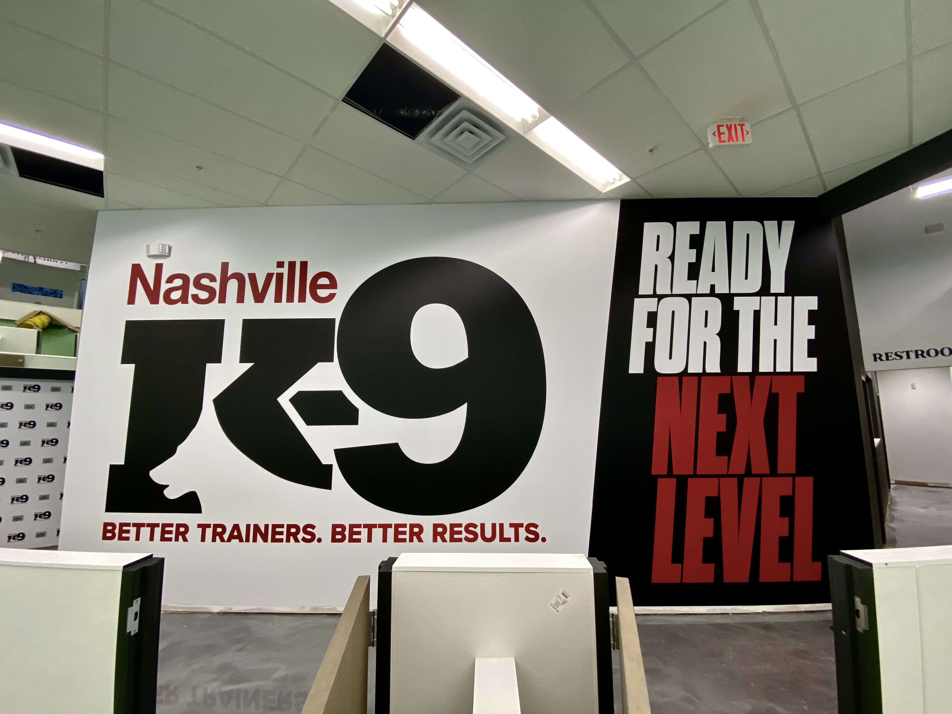
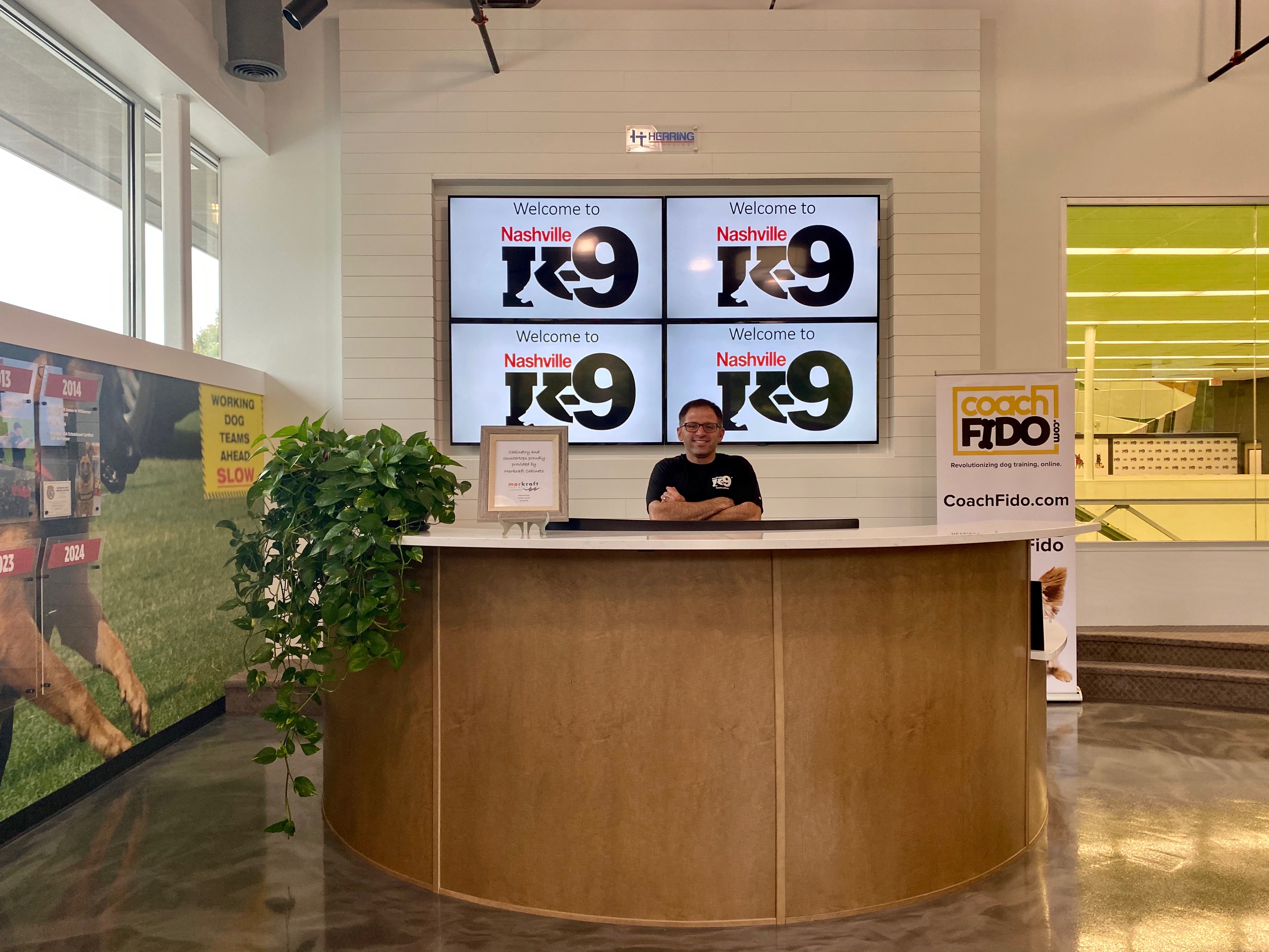
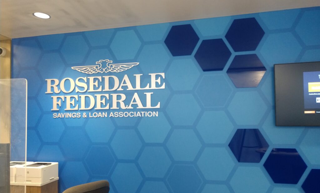
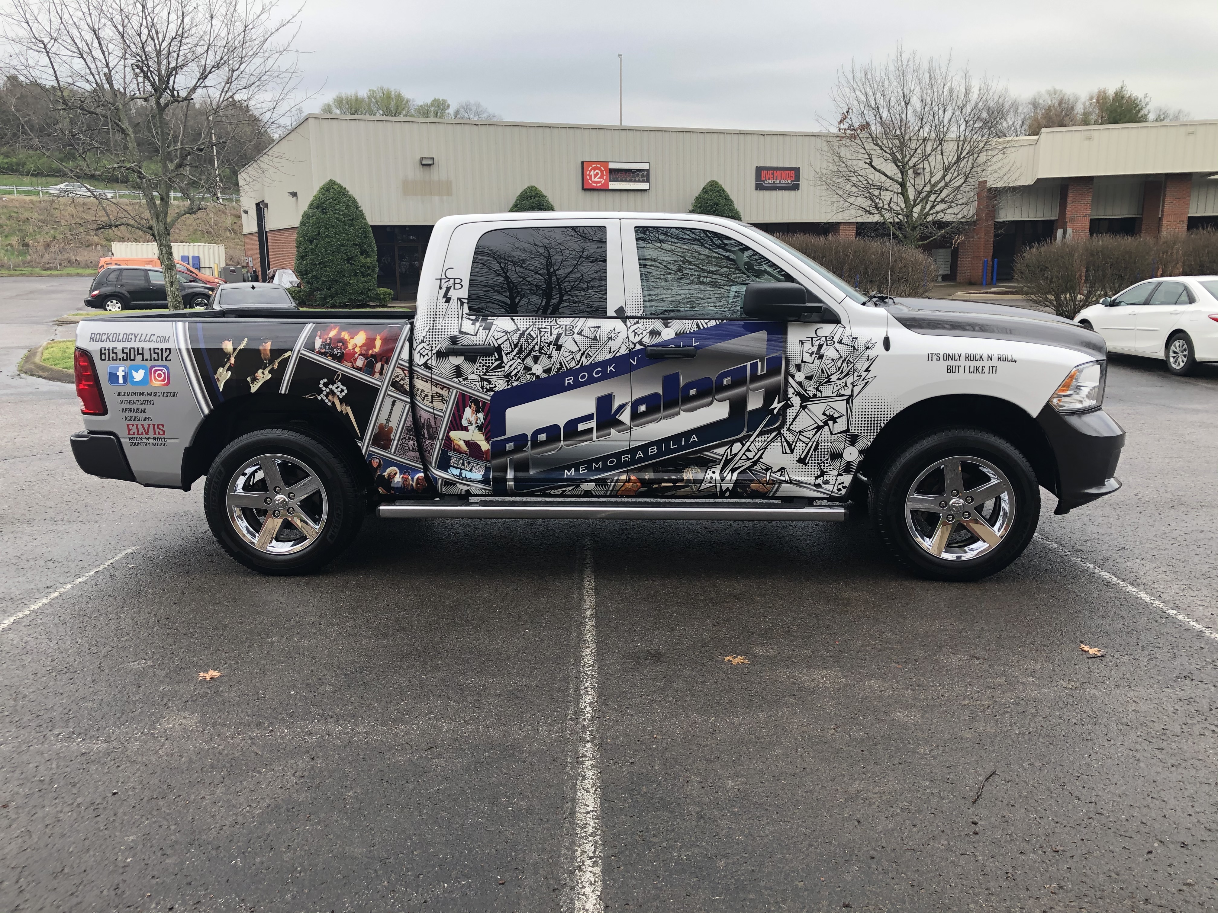
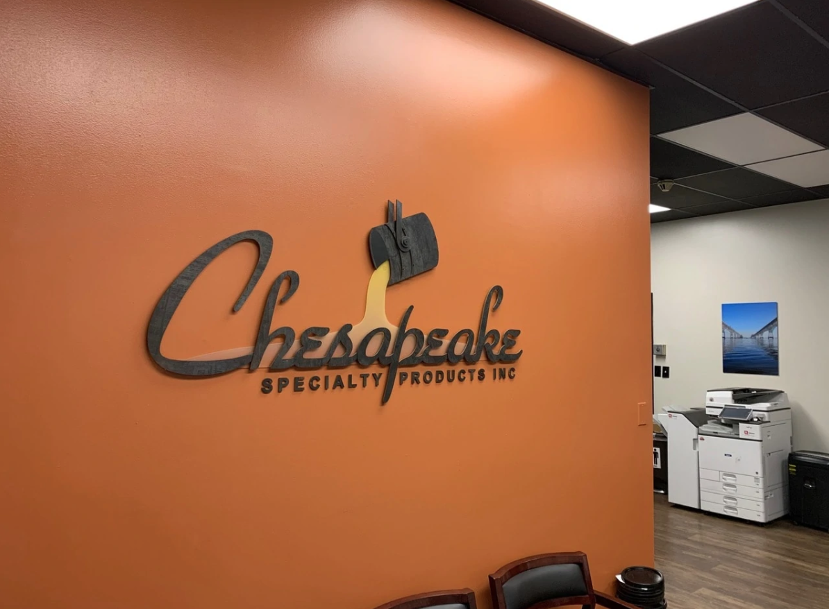
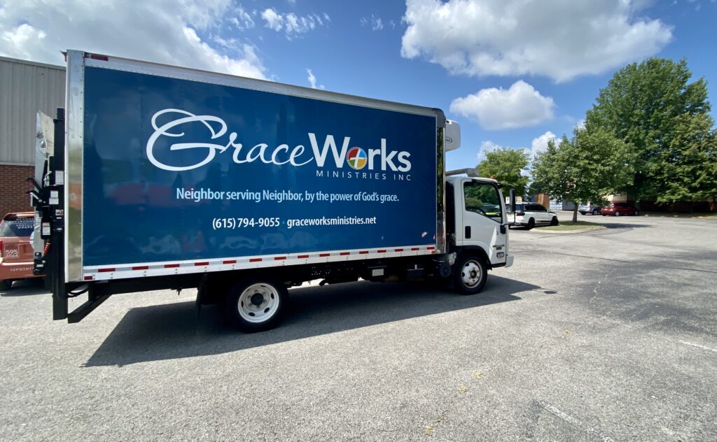
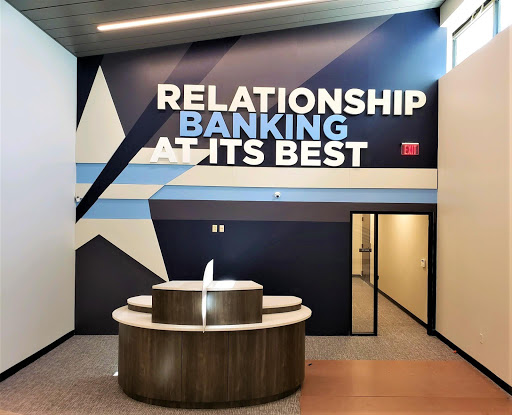
A company's logo represents all it stands for, and should therefore be created with the upmost quality and design in mind. We've created a couple things that we try and keep in mind while designing logo signs to maximize their effectiveness and impact!
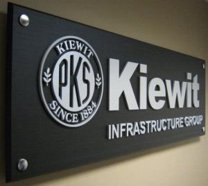 Easy To Read, Bold
 - Your logo sign should grab the attention of anyone walking by, and its intended message should be easily communicated.
Simplicity - A simple design is often the most effective way to communicate to the public. Keep it short and sweet, so that a quick glance from a passerby is enough to understand the intended message of the sign.
Size - Larger logo signs are typically more ornate and complex because of their size, while smaller signs are more simplistic and less detailed, like a yard sign or business card!
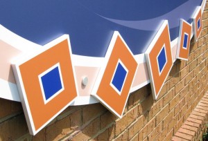
Tie It In - We try and implement the theme of the company into the actual design of the logo sign when appropriate! For example, these dimensional acrylic blocks up close have no significane, but when you stand back, you'll realize they're actually the individual braces!