 A work truck in Fort Oglethorpe moves through hundreds of eyes every hour. Each glance is a test. Can they read your name before the light changes? Can they call your number from twenty feet away without squinting? Those seconds decide whether the next job goes to you or the company parked behind you.
Size Is Science
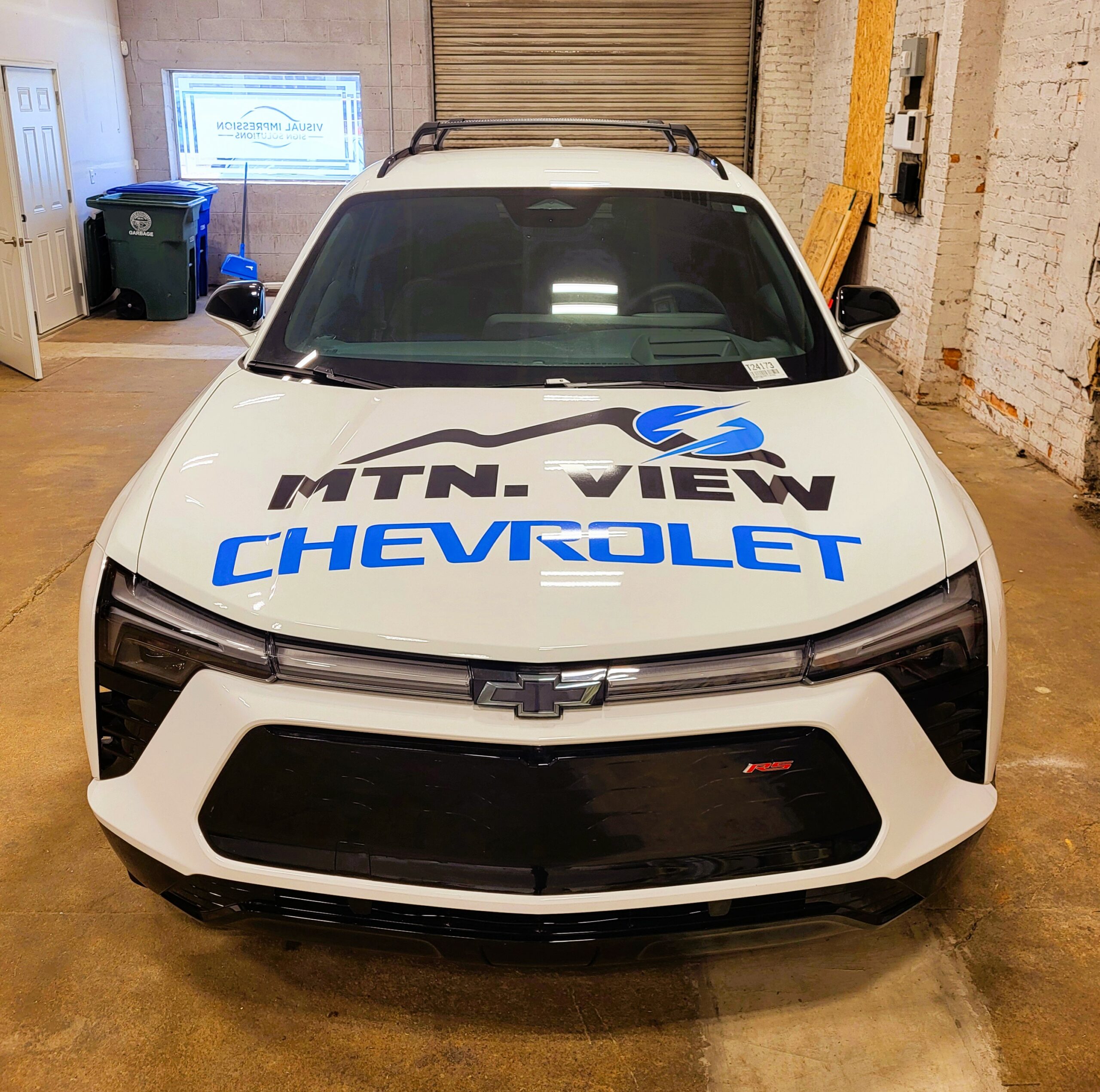
Letter height rules everything. We measure it backward from real-world sightlines, traffic flow, and viewing distance. The ten-to-one ratio governs all design: one inch of letter height equals ten feet of clarity. A three-inch phone number reads cleanly at thirty feet. A six-inch logo holds its shape at sixty. These numbers drive placement before a single color choice enters the conversation. They keep designs functional when drivers only have a moment to understand who you are and what you do.
Placement Defines Legibility In Motion
Rear panels handle the heavy lifting. They face stopped traffic where attention is longest. That’s where the phone number and website go—large, central, and away from handles or seams. Side doors handle brand identity. They must command quick recognition when your vehicle crosses intersections or parks on job sites. We balance lettering around door lines, body curves, and reflective zones so every element stays true to the body, not distorted by it. For taller vans and box trucks, upper corners catch sight from overpasses and parking decks where visibility keeps working long after the road clears.
Every Color, Every Contrast, Every Surface Counts
Fort Oglethorpe sunlight exposes every flaw. Faded vinyl, muddy tones, and reflective glare destroy credibility faster than broken taillights. Our design process uses measured contrast ratios that keep text readable under both midday brightness and low-angle afternoon light. We test color performance against your existing brand palette to maintain integrity across every truck in your fleet.
Materials Built for Weather and Wear
Rain, dust, and road debris are constant in North Georgia. We specify high-performance cast films rated for long-term exterior use with UV protection baked into the laminate layer. These films resist curling, edge lift, and brittleness when the heat climbs above ninety. Surfaces are scrubbed, rinsed, and degreased to create a clean bond that holds tight through years of vibration and temperature swing. When the lettering still reads clean after three summers, that’s material science doing its job.
Compliance That Protects The Business Behind The Wheel
Georgia’s Department of Transportation requires proper identification for vehicles over 10,001 pounds. We apply those markings with precision: company name, USDOT number, and GA designation; each rendered in a contrasting color and placed on both sides of the power unit. We size characters for legibility at fifty feet and align them on level body lines. Proper compliance ensures the truck reflects the credibility your clients expect.
Design Hierarchy That Pulls The Eye Through The Message
Good design moves the eye on purpose. First the name, then the service, then the call to action. The name builds recognition. The service clarifies what you do. The phone number and website invite immediate contact. That sequence works because the brain reads hierarchy faster than detail. We refine spacing, letter weight, and white space until the message reads naturally, even at forty miles per hour.
Local Roads Shape How Design Performs
Fort Oglethorpe traffic blends slow city blocks and fast parkway turns. That mix changes design decisions. City speeds demand taller numbers for closer range; highways require bolder weight and wider spacing for clarity at distance. We model these differences across typical routes before layout approval. A design that reads perfectly in one location must also hold its own across every route your crews drive daily.
Every Truck Should Tell The Same Story
A consistent fleet builds trust faster than any advertisement. When every vehicle carries the same color, letter height, and spacing, customers recognize your operation before they even read the name. At Visual Impression Sign Solutions in Chattanooga, we help Fort Oglethorpe businesses build that consistency. We measure, design, fabricate, and install with the same focus we bring to fixed signage projects. Call (423) 635-7144 to schedule a fleet assessment and make sure your next mile speaks clearly.
A work truck in Fort Oglethorpe moves through hundreds of eyes every hour. Each glance is a test. Can they read your name before the light changes? Can they call your number from twenty feet away without squinting? Those seconds decide whether the next job goes to you or the company parked behind you.
Size Is Science
Letter height rules everything. We measure it backward from real-world sightlines, traffic flow, and viewing distance. The ten-to-one ratio governs all design: one inch of letter height equals ten feet of clarity. A three-inch phone number reads cleanly at thirty feet. A six-inch logo holds its shape at sixty. These numbers drive placement before a single color choice enters the conversation. They keep designs functional when drivers only have a moment to understand who you are and what you do.
Placement Defines Legibility In Motion
Rear panels handle the heavy lifting. They face stopped traffic where attention is longest. That’s where the phone number and website go—large, central, and away from handles or seams. Side doors handle brand identity. They must command quick recognition when your vehicle crosses intersections or parks on job sites. We balance lettering around door lines, body curves, and reflective zones so every element stays true to the body, not distorted by it. For taller vans and box trucks, upper corners catch sight from overpasses and parking decks where visibility keeps working long after the road clears.
Every Color, Every Contrast, Every Surface Counts
Fort Oglethorpe sunlight exposes every flaw. Faded vinyl, muddy tones, and reflective glare destroy credibility faster than broken taillights. Our design process uses measured contrast ratios that keep text readable under both midday brightness and low-angle afternoon light. We test color performance against your existing brand palette to maintain integrity across every truck in your fleet.
Materials Built for Weather and Wear
Rain, dust, and road debris are constant in North Georgia. We specify high-performance cast films rated for long-term exterior use with UV protection baked into the laminate layer. These films resist curling, edge lift, and brittleness when the heat climbs above ninety. Surfaces are scrubbed, rinsed, and degreased to create a clean bond that holds tight through years of vibration and temperature swing. When the lettering still reads clean after three summers, that’s material science doing its job.
Compliance That Protects The Business Behind The Wheel
Georgia’s Department of Transportation requires proper identification for vehicles over 10,001 pounds. We apply those markings with precision: company name, USDOT number, and GA designation; each rendered in a contrasting color and placed on both sides of the power unit. We size characters for legibility at fifty feet and align them on level body lines. Proper compliance ensures the truck reflects the credibility your clients expect.
Design Hierarchy That Pulls The Eye Through The Message
Good design moves the eye on purpose. First the name, then the service, then the call to action. The name builds recognition. The service clarifies what you do. The phone number and website invite immediate contact. That sequence works because the brain reads hierarchy faster than detail. We refine spacing, letter weight, and white space until the message reads naturally, even at forty miles per hour.
Local Roads Shape How Design Performs
Fort Oglethorpe traffic blends slow city blocks and fast parkway turns. That mix changes design decisions. City speeds demand taller numbers for closer range; highways require bolder weight and wider spacing for clarity at distance. We model these differences across typical routes before layout approval. A design that reads perfectly in one location must also hold its own across every route your crews drive daily.
Every Truck Should Tell The Same Story
A consistent fleet builds trust faster than any advertisement. When every vehicle carries the same color, letter height, and spacing, customers recognize your operation before they even read the name. At Visual Impression Sign Solutions in Chattanooga, we help Fort Oglethorpe businesses build that consistency. We measure, design, fabricate, and install with the same focus we bring to fixed signage projects. Call (423) 635-7144 to schedule a fleet assessment and make sure your next mile speaks clearly.
Fort Oglethorpe, GA - Choosing the Right Size & Placement for Vehicle Graphics
SYNOPSIS: Visual Impression Sign Solutions in Chattanooga designs vehicle lettering for Fort Oglethorpe businesses, ensuring clarity, durability, and compliance so your brand stands out confidently on the road.
Visibility Built Into Every Fort Oglethorpe Mile
BY: ,
A work truck in Fort Oglethorpe moves through hundreds of eyes every hour. Each glance is a test. Can they read your name before the light changes? Can they call your number from twenty feet away without squinting? Those seconds decide whether the next job goes to you or the company parked behind you.
Size Is Science
Letter height rules everything. We measure it backward from real-world sightlines, traffic flow, and viewing distance. The ten-to-one ratio governs all design: one inch of letter height equals ten feet of clarity. A three-inch phone number reads cleanly at thirty feet. A six-inch logo holds its shape at sixty. These numbers drive placement before a single color choice enters the conversation. They keep designs functional when drivers only have a moment to understand who you are and what you do.
Placement Defines Legibility In Motion
Rear panels handle the heavy lifting. They face stopped traffic where attention is longest. That’s where the phone number and website go—large, central, and away from handles or seams. Side doors handle brand identity. They must command quick recognition when your vehicle crosses intersections or parks on job sites. We balance lettering around door lines, body curves, and reflective zones so every element stays true to the body, not distorted by it. For taller vans and box trucks, upper corners catch sight from overpasses and parking decks where visibility keeps working long after the road clears.
Every Color, Every Contrast, Every Surface Counts
Fort Oglethorpe sunlight exposes every flaw. Faded vinyl, muddy tones, and reflective glare destroy credibility faster than broken taillights. Our design process uses measured contrast ratios that keep text readable under both midday brightness and low-angle afternoon light. We test color performance against your existing brand palette to maintain integrity across every truck in your fleet.
Materials Built for Weather and Wear
Rain, dust, and road debris are constant in North Georgia. We specify high-performance cast films rated for long-term exterior use with UV protection baked into the laminate layer. These films resist curling, edge lift, and brittleness when the heat climbs above ninety. Surfaces are scrubbed, rinsed, and degreased to create a clean bond that holds tight through years of vibration and temperature swing. When the lettering still reads clean after three summers, that’s material science doing its job.
Compliance That Protects The Business Behind The Wheel
Georgia’s Department of Transportation requires proper identification for vehicles over 10,001 pounds. We apply those markings with precision: company name, USDOT number, and GA designation; each rendered in a contrasting color and placed on both sides of the power unit. We size characters for legibility at fifty feet and align them on level body lines. Proper compliance ensures the truck reflects the credibility your clients expect.
Design Hierarchy That Pulls The Eye Through The Message
Good design moves the eye on purpose. First the name, then the service, then the call to action. The name builds recognition. The service clarifies what you do. The phone number and website invite immediate contact. That sequence works because the brain reads hierarchy faster than detail. We refine spacing, letter weight, and white space until the message reads naturally, even at forty miles per hour.
Local Roads Shape How Design Performs
Fort Oglethorpe traffic blends slow city blocks and fast parkway turns. That mix changes design decisions. City speeds demand taller numbers for closer range; highways require bolder weight and wider spacing for clarity at distance. We model these differences across typical routes before layout approval. A design that reads perfectly in one location must also hold its own across every route your crews drive daily.
Every Truck Should Tell The Same Story
A consistent fleet builds trust faster than any advertisement. When every vehicle carries the same color, letter height, and spacing, customers recognize your operation before they even read the name. At Visual Impression Sign Solutions in Chattanooga, we help Fort Oglethorpe businesses build that consistency. We measure, design, fabricate, and install with the same focus we bring to fixed signage projects. Call (423) 635-7144 to schedule a fleet assessment and make sure your next mile speaks clearly.