 Signs—they're everywhere. But how many of them do you actually remember? At Visual Impression Signs, we believe that great sign design is more than just slapping some text on a board. It’s about creating something memorable. Something that stops people in their tracks. And here in Chattanooga, TN, where every corner of the city holds its own personality, a well-designed sign is essential to standing out.
But what makes a sign design successful? Let’s break it down.
Keep It Simple
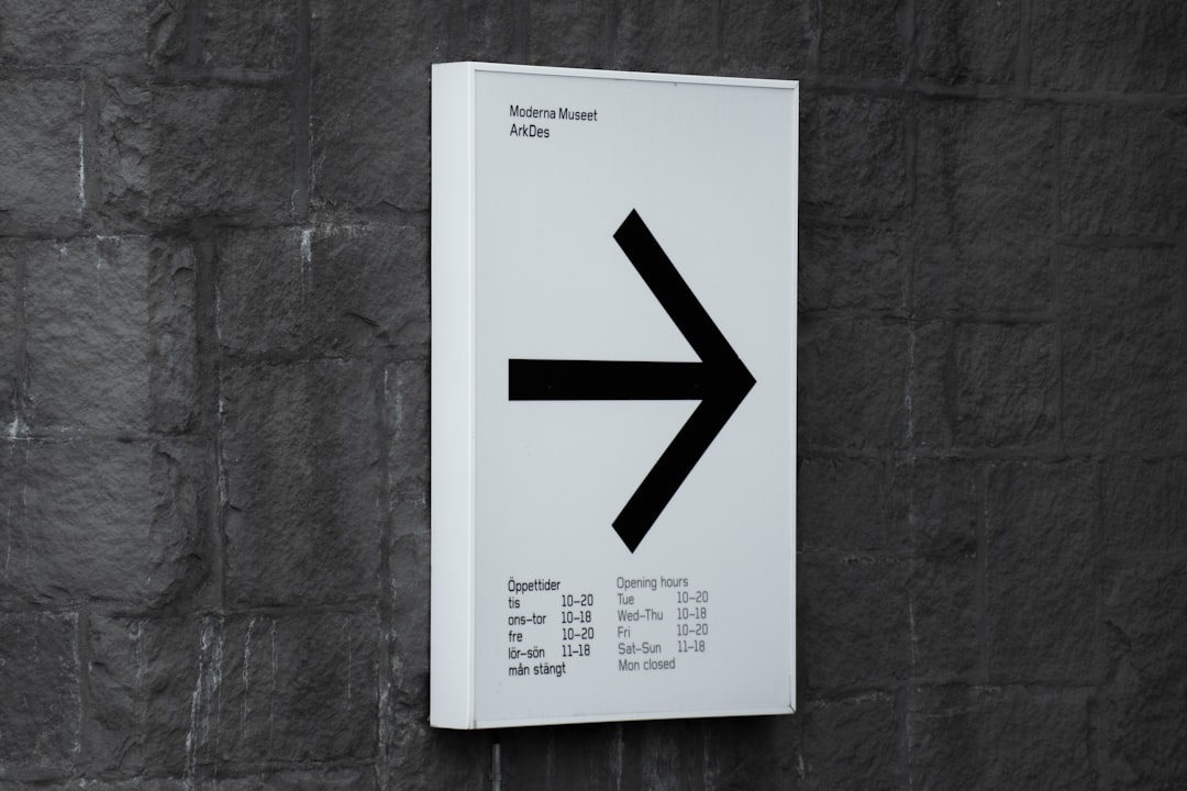
If your sign is trying to say too much, it's saying nothing at all. The most powerful signs communicate one thing clearly. Too many details? You’ve lost your audience before they even glance at your logo. We’ve seen it time and again in Chattanooga—cluttered signs that try to do too much. Don’t be that business. Instead, ask yourself, “What’s the one message I want to get across?” Stick to that. Simple. Clean. Impactful. That’s how you win.
Colors That Pop
In design, color isn’t just decoration. It’s communication. Choosing the right color palette can mean the difference between your sign blending into the background or jumping off the wall. High contrast? Always a good idea. In Chattanooga, we see a lot of businesses using color schemes that blend into the environment—and that’s not always a good thing. You want your sign to stand out.
The secret? Contrast. Think dark text on a light background or vice versa. You want to draw attention without overwhelming the eyes. And don’t forget—lighting matters. How will your sign look at night under streetlights or in the glare of the afternoon sun?
Font Choice Is Everything
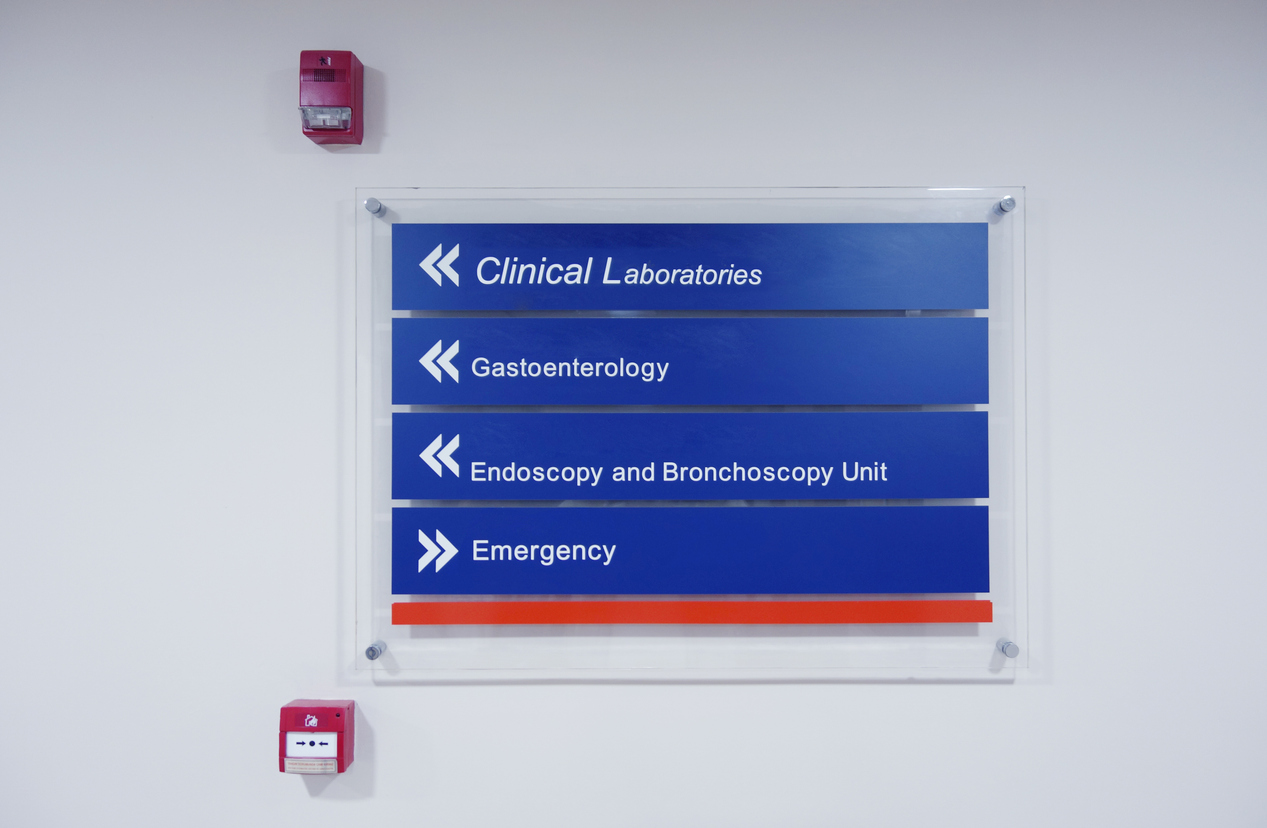
The wrong font can destroy even the best sign design. Yes, it’s that serious. At Visual Impression Signs, we can’t stress this enough—choose a font that’s easy to read, even from a distance. Sure, a fancy script might look beautiful in theory, but it’s useless if your customers can’t make it out from across the street.
Large, bold fonts often work best. You’ve got just seconds to grab attention, so your text needs to be clear. And here in Chattanooga, where people are often on foot or driving by, your font must be legible in an instant. Don’t make them squint.
Size and Placement: Strategy Over Size
Here’s a common misconception: Bigger signs are always better. They’re not. In fact, a massive sign can be overwhelming. Instead, focus on strategic size and placement. Think about the environment where your sign will live. Is it on a busy street? A pedestrian-friendly area? In Chattanooga, a sign downtown may need to be smaller and placed at eye level to cater to foot traffic, while a sign on the highway might need to be larger for drivers to spot it from a distance.
Where you place your sign matters just as much as its size. The wrong placement can turn your masterpiece into an afterthought.
Materials Matter
Chattanooga weather can be unforgiving—think sudden storms, blazing sun, and everything in between. That’s why the materials you choose are critical. Metal, vinyl, acrylic—each has its benefits, but some might wear faster than others depending on where you place your sign. At Visual Impression Signs, we always recommend materials that balance durability with aesthetics. Your sign should look as good in two years as it does the day it goes up.
Don’t Forget Consistency
Your sign should be part of your brand’s identity. Think about how it connects with your overall look. Do the colors, fonts, and imagery align with your website, business cards, and other marketing materials? Consistency builds recognition—and recognition builds trust.
Compliance: The Unseen Hero of Design
It’s not the most exciting part of sign design, but it’s one of the most important. Local regulations in Chattanooga, TN, can dictate everything from the size of your sign to where it’s placed. Get it wrong, and you could face hefty fines or the hassle of redoing your sign altogether. At Visual Impression Signs, we make sure your sign not only looks great but also ticks all the regulatory boxes.
Closing Thoughts
In Chattanooga, TN, where charm meets modern design, your sign should do more than just fit in—it should stand out. At Visual Impression Signs, we know the elements that make a sign truly successful. Whether it’s the right color, the perfect font, or strategic placement, we’re here to make your sign one that people remember. Ready to get started? Let’s create something unforgettable together.
Signs—they're everywhere. But how many of them do you actually remember? At Visual Impression Signs, we believe that great sign design is more than just slapping some text on a board. It’s about creating something memorable. Something that stops people in their tracks. And here in Chattanooga, TN, where every corner of the city holds its own personality, a well-designed sign is essential to standing out.
But what makes a sign design successful? Let’s break it down.
Keep It Simple
If your sign is trying to say too much, it's saying nothing at all. The most powerful signs communicate one thing clearly. Too many details? You’ve lost your audience before they even glance at your logo. We’ve seen it time and again in Chattanooga—cluttered signs that try to do too much. Don’t be that business. Instead, ask yourself, “What’s the one message I want to get across?” Stick to that. Simple. Clean. Impactful. That’s how you win.
Colors That Pop
In design, color isn’t just decoration. It’s communication. Choosing the right color palette can mean the difference between your sign blending into the background or jumping off the wall. High contrast? Always a good idea. In Chattanooga, we see a lot of businesses using color schemes that blend into the environment—and that’s not always a good thing. You want your sign to stand out.
The secret? Contrast. Think dark text on a light background or vice versa. You want to draw attention without overwhelming the eyes. And don’t forget—lighting matters. How will your sign look at night under streetlights or in the glare of the afternoon sun?
Font Choice Is Everything
The wrong font can destroy even the best sign design. Yes, it’s that serious. At Visual Impression Signs, we can’t stress this enough—choose a font that’s easy to read, even from a distance. Sure, a fancy script might look beautiful in theory, but it’s useless if your customers can’t make it out from across the street.
Large, bold fonts often work best. You’ve got just seconds to grab attention, so your text needs to be clear. And here in Chattanooga, where people are often on foot or driving by, your font must be legible in an instant. Don’t make them squint.
Size and Placement: Strategy Over Size
Here’s a common misconception: Bigger signs are always better. They’re not. In fact, a massive sign can be overwhelming. Instead, focus on strategic size and placement. Think about the environment where your sign will live. Is it on a busy street? A pedestrian-friendly area? In Chattanooga, a sign downtown may need to be smaller and placed at eye level to cater to foot traffic, while a sign on the highway might need to be larger for drivers to spot it from a distance.
Where you place your sign matters just as much as its size. The wrong placement can turn your masterpiece into an afterthought.
Materials Matter
Chattanooga weather can be unforgiving—think sudden storms, blazing sun, and everything in between. That’s why the materials you choose are critical. Metal, vinyl, acrylic—each has its benefits, but some might wear faster than others depending on where you place your sign. At Visual Impression Signs, we always recommend materials that balance durability with aesthetics. Your sign should look as good in two years as it does the day it goes up.
Don’t Forget Consistency
Your sign should be part of your brand’s identity. Think about how it connects with your overall look. Do the colors, fonts, and imagery align with your website, business cards, and other marketing materials? Consistency builds recognition—and recognition builds trust.
Compliance: The Unseen Hero of Design
It’s not the most exciting part of sign design, but it’s one of the most important. Local regulations in Chattanooga, TN, can dictate everything from the size of your sign to where it’s placed. Get it wrong, and you could face hefty fines or the hassle of redoing your sign altogether. At Visual Impression Signs, we make sure your sign not only looks great but also ticks all the regulatory boxes.
Closing Thoughts
In Chattanooga, TN, where charm meets modern design, your sign should do more than just fit in—it should stand out. At Visual Impression Signs, we know the elements that make a sign truly successful. Whether it’s the right color, the perfect font, or strategic placement, we’re here to make your sign one that people remember. Ready to get started? Let’s create something unforgettable together.
Chattanooga, TN - Elements of a Successful Sign Design | Sign Company News
SYNOPSIS: At Visual Impression Signs, located in Chattanooga, TN, we know what makes a sign truly work. The design. The impact. The ability to stand out in a sea of sameness.
Designing Signs That Speak Louder in Chattanooga
BY: ,
Signs—they're everywhere. But how many of them do you actually remember? At Visual Impression Signs, we believe that great sign design is more than just slapping some text on a board. It’s about creating something memorable. Something that stops people in their tracks. And here in Chattanooga, TN, where every corner of the city holds its own personality, a well-designed sign is essential to standing out.
But what makes a sign design successful? Let’s break it down.
Keep It Simple
If your sign is trying to say too much, it's saying nothing at all. The most powerful signs communicate one thing clearly. Too many details? You’ve lost your audience before they even glance at your logo. We’ve seen it time and again in Chattanooga—cluttered signs that try to do too much. Don’t be that business. Instead, ask yourself, “What’s the one message I want to get across?” Stick to that. Simple. Clean. Impactful. That’s how you win.
Colors That Pop
In design, color isn’t just decoration. It’s communication. Choosing the right color palette can mean the difference between your sign blending into the background or jumping off the wall. High contrast? Always a good idea. In Chattanooga, we see a lot of businesses using color schemes that blend into the environment—and that’s not always a good thing. You want your sign to stand out.
The secret? Contrast. Think dark text on a light background or vice versa. You want to draw attention without overwhelming the eyes. And don’t forget—lighting matters. How will your sign look at night under streetlights or in the glare of the afternoon sun?
Font Choice Is Everything
The wrong font can destroy even the best sign design. Yes, it’s that serious. At Visual Impression Signs, we can’t stress this enough—choose a font that’s easy to read, even from a distance. Sure, a fancy script might look beautiful in theory, but it’s useless if your customers can’t make it out from across the street.
Large, bold fonts often work best. You’ve got just seconds to grab attention, so your text needs to be clear. And here in Chattanooga, where people are often on foot or driving by, your font must be legible in an instant. Don’t make them squint.
Size and Placement: Strategy Over Size
Here’s a common misconception: Bigger signs are always better. They’re not. In fact, a massive sign can be overwhelming. Instead, focus on strategic size and placement. Think about the environment where your sign will live. Is it on a busy street? A pedestrian-friendly area? In Chattanooga, a sign downtown may need to be smaller and placed at eye level to cater to foot traffic, while a sign on the highway might need to be larger for drivers to spot it from a distance.
Where you place your sign matters just as much as its size. The wrong placement can turn your masterpiece into an afterthought.
Materials Matter
Chattanooga weather can be unforgiving—think sudden storms, blazing sun, and everything in between. That’s why the materials you choose are critical. Metal, vinyl, acrylic—each has its benefits, but some might wear faster than others depending on where you place your sign. At Visual Impression Signs, we always recommend materials that balance durability with aesthetics. Your sign should look as good in two years as it does the day it goes up.
Don’t Forget Consistency
Your sign should be part of your brand’s identity. Think about how it connects with your overall look. Do the colors, fonts, and imagery align with your website, business cards, and other marketing materials? Consistency builds recognition—and recognition builds trust.
Compliance: The Unseen Hero of Design
It’s not the most exciting part of sign design, but it’s one of the most important. Local regulations in Chattanooga, TN, can dictate everything from the size of your sign to where it’s placed. Get it wrong, and you could face hefty fines or the hassle of redoing your sign altogether. At Visual Impression Signs, we make sure your sign not only looks great but also ticks all the regulatory boxes.
Closing Thoughts
In Chattanooga, TN, where charm meets modern design, your sign should do more than just fit in—it should stand out. At Visual Impression Signs, we know the elements that make a sign truly successful. Whether it’s the right color, the perfect font, or strategic placement, we’re here to make your sign one that people remember. Ready to get started? Let’s create something unforgettable together.