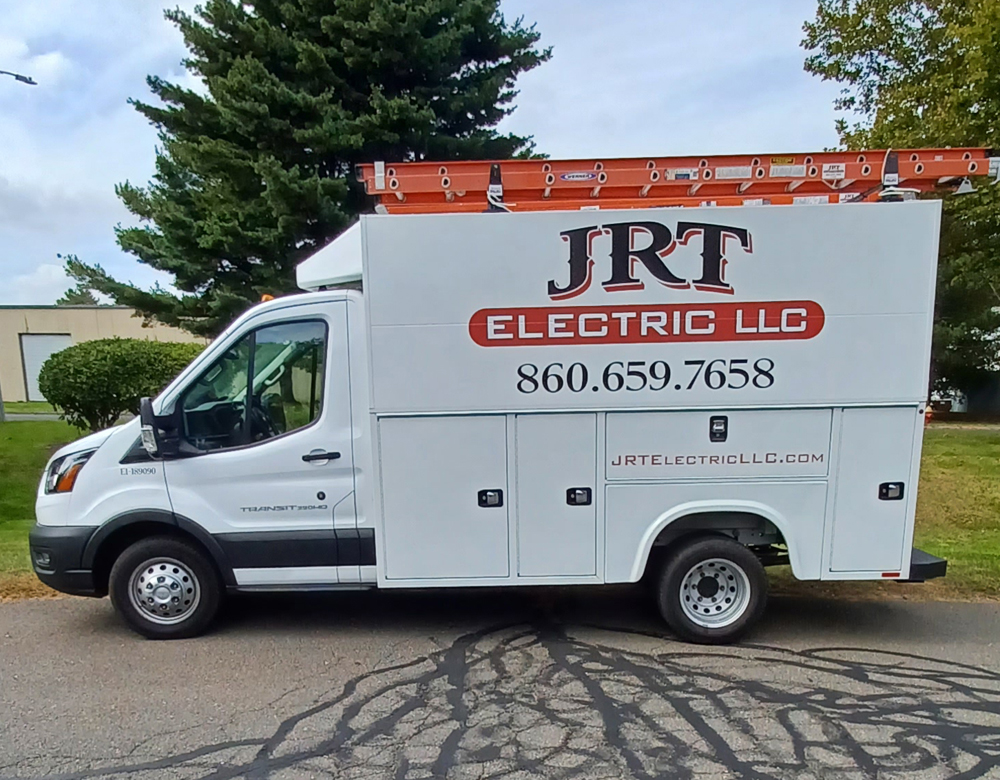
 When JRT Electric came to us at G-Force Signs & Graphics, they wanted something clear. Something unmistakable. A design that says everything without saying too much. They knew the drill—minimalist design, maximum impact. And we delivered.
Clear and Simple – That’s How You Win
Why complicate things? JRT Electric's Ford Transit is now a prime example of how less can truly be more. We stripped back the extras, zeroing in on the essentials—logo, phone number, and website. No fuss, just facts. You’re driving down Glastonbury’s streets, and there it is, staring you in the face. That’s the power of simplicity done right.
It’s about making a statement without shouting. We’ve seen too many cluttered designs on the road—graphics that fight for attention and lose every time. Not here. With the JRT Electric van, your eyes lock in on the bold logo and that easy-to-read phone number. Need an electrician? You know exactly who to call.Brand Identity on the Move
In Glastonbury, CT, your vehicle isn’t just a means of transport. It’s your brand in motion. JRT Electric needed their van to do more than just get from one site to another. They wanted it to speak for them—loudly, clearly, but without the noise. We took their request and turned it into a moving billboard. Every glance counts. Every view is a potential client.
How did we do it? Simple. We put the logo and phone number front and center, where it belongs. The website? A clean addition, placed to catch your eye without stealing the show. The whole look is sharp, professional, and—most importantly—effective.Why Minimal Works
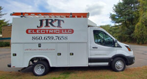 Let’s face it—when you’re rolling through busy streets or parked outside a client’s house, you only have a few seconds to grab someone’s attention. That’s it. And in those seconds, clutter loses. Clarity wins. JRT Electric’s new vehicle design makes sure you know who they are and how to reach them instantly. Nothing more, nothing less.
Designed for Impact
Glastonbury’s streets are busy, but now, JRT Electric’s van stands out without even trying. We kept the lines clean, the colors high-contrast, and the typography bold—ensuring that whether you’re passing by or stuck behind it at a light, you get the message. That’s how you make an impact in a world full of distractions.
At G-Force Signs & Graphics, we understand that vehicle lettering isn’t just about putting information on the side of a van. It’s about maximizing every inch of space, ensuring every viewer walks away knowing who you are. JRT Electric’s van shows that when you get the fundamentals right, you don’t need bells and whistles to stand out.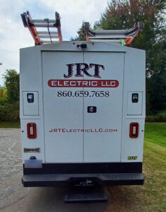
Take Your Fleet to the Next Level
In Glastonbury and beyond, G-Force Signs & Graphics is here to make sure your fleet works for you. Whether you’re parked at a job site or cruising down the highway, your vehicle should be more than just transportation—it should be an advertisement on wheels. JRT Electric’s minimalist design proves that when you keep it simple, you get results.
Ready to let your brand do the talking? Let’s create something that catches the eye and keeps your phone ringing. With our experience in vehicle lettering, we know how to turn any fleet into a powerful marketing tool that works every mile. To learn more about vehicle graphics, visit our website by CLICKING HERE.