Every business has purchased signage or other branded items (printed materials, promotional products, apparel, etc.) for the first time, and if it’s not the first time for the company, it might be the first time for that Marketing Manager, HR associate, or summer intern. Or it might be a Sales Rep doing a trade show without any existing displays or sponsoring a golf outing. Step one in the process is agreeing on what is needed; step two is collecting the artwork, which often goes like this for first-time buyers:
Sign Company: “We’ll need your logo in vector format. It’s usually an .eps or .ai file.”
Client: “Here’s a .jpg from our website. Will that work?”
Sorry, no, generally it won’t. There are two types of graphics files: “raster” and “vector”. A raster file is a discrete collection of pixels in a rectangular grid, with each pixel having a defined color. Jpg, png, and gif files are all raster formats. A vector file is a mathematical description of where lines are drawn and colors are filled. This is the major difference: when raster files are enlarged, the number of pixels remains the same, they only get larger. When vector files are enlarged, the math is just multiplied; vector files can be enlarged (or shrunk) infinitely with no loss of resolution. Other than photos, virtually every raster file (such as a logo) started life as a vector file, and it was only saved as a jpg by the designer for convenience and portability.
Why Does That Matter?
Typically the logo in the corner of your website is no more than 200 pixels (px) wide at 72 dpi (dots per inch, effectively the same as pixels). When printed at native size it would be about 3” wide. When you blow that up to 24” wide (8x), it’s now 9 dpi – each pixel is about 1/8” wide. It doesn’t seem like much, but look how big that is on a ruler in terms of visibility and you’ll start to understand.
But My Logo Is Just One Color – It Should Still Be Crisp
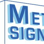
Unfortunately when jpg and png files are created, there are always “transition pixels”, a sort of gradient from one color to the next. At native resolution they’re not apparent, but when blown up they become grossly obvious. Curves also become choppy when individual pixels are visible. Here’s an example… on the left is a piece of the MetroCenter Signworks logo in png format at original resolution, and on the right is a version enlarged three times.

By the way, a similar thing happens when you scale down. Pixels end up being deleted, so resolution is lost, just in a different way.
Here are some other things people try, with all good intentions, that don’t work:
- “My phone takes great photos – here’s a picture of the logo on our wall.” Sorry, no.
- “I scanned our letterhead.” Nope.
- “Here’s my business card with the logo on it.” Definitely no.
- “I renamed logo.jpg to logo.eps.” Um… no.
There are various reasons why, but they all relate back to how digital files are created and the difference between raster and vector files.
What’s the Solution?
The best solution is in the first question – vector format. If we get a vector file we can make it any size you want. Ask whoever is in charge of managing your brand… your Marketing Department, the owner, maybe the designer who created the logo? If no one seems to be responsible for the brand, your brand is in trouble (but that’s another blog). There are two other choices: live with a fuzzy, distorted, off-color representation of your logo, or have it recreated in a usable format.
We recreate a couple of logos every month. Sometimes it’s complicated and costly, sometimes pretty simple, but in every case it’s at best close to the original, never perfect. In the absence of a branding guide, we have to trace graphics, sample colors, and find the closest font match. At MetroCenter Signworks we understand the importance of brand integrity and work really hard to maintain it; but every time there’s a little variation, brand integrity erodes a little. When you have several unofficial versions of your logo and no one knows which is the original, there’s a real problem.
What About Photos?
Photos are another story altogether… we’ll cover that in another blog.
What’s the Bottom Line? Can You Make a Great Sign From My Logo?
Definitely yes. At MetroCenter Signworks we’ll make sure you get a great-looking sign that represents your brand well. We just ask that you help us… understand the differences in file types, what’s usable and what’s not, and do your best to give us what we need. If you can’t do that, understand that there may be time and cost involved in recreating your logo so that you get a sign you’ll be happy with. At the end of the day, the quality of your brand image is a reflection on our brand.
If you want to know how your brand can stand out, look great, and represent your company well, call MetroCenter Signworks today at 615-649-5003, or visit us at MetrocenterSignworks.com.