Are your indoor signs ADA compliant?
Before moving towards, let’s talk about what ADA is. ADA is the abbreviation for the Americans with Disabilities Act. This act became effective in 1990, and it was the outcome of the rigorous efforts of disabled individuals and their advocates. However, in the year 2011, the act became enforceable by law. According to civil rights laws, any discrimination against disabled individuals in any public setting is illegal. This law also applies to businesses that do not have a disability-friendly environment.
Having the right signage is a crucial part of making your business ADA-compliant. Let’s take a look at some of the ADA signs requirements.
ADA Sign Requirements
According to the ADA, indoor signage must be posted in a way that makes it easy for blind people to touch it. They must also be placed in a way that they remain prominent to the naked eye. People often mistake ADA signs for Braille signs. Although Braille signs are a crucial component of ADA compliance, there is more to it.
Well, not every sign in your company needs to comply with ADA requirements. Signs put up for marketing and advertising purposes don’t need to fulfil the ADA requirements. The signs that fall within the ADA signage requirements are the ones that specify the location and use of particular spaces in a building. Signs that signify accessibility also fall within the ADA requirements. These include signs for a wheelchair ramp and wheelchair-accessible washrooms.
How to Make Your Signage ADA Compliant?
Here are some of the ADA signage requirements one needs to follow.
Height of the Sign
If the sign has Braille on it, its height should match the height of the door’s latch. The character on the Braille signs shouldn’t be higher than 60 inches or lower than 48 inches from the floor. The sign should be placed in a way that people can read it without any difficulty. In the case of an overhead sign, the height must not be more than 80 inches off the ground.
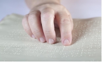
Braille and Raised Letters
Raised letters or Braille allow visually-impaired individuals to read the signs easily. To make it even easier, the letters should all be in upper case with a Sans Serif font. The size of the letters should not exceed two inches. They should be placed right beside the text and must contain round dots instead of square ones. Overhead signs don’t need raised letters or Braille, but those closer to the ground do.
Sign Contrast
The design and the colour of the signs must be easy to read. Also, the background shouldn’t be too glossy and it must absorb light rather than reflect it. Also, the contrast between the letters and the background should be high. It is better to use light-coloured letters on lighter backgrounds and vice versa. Make sure there is a minimum similarity between the background and the letters on it. High contrast should especially be observed in overhead signs with pictograms.
If you want ADA compliant signs for your business, feel free to visit our website now.