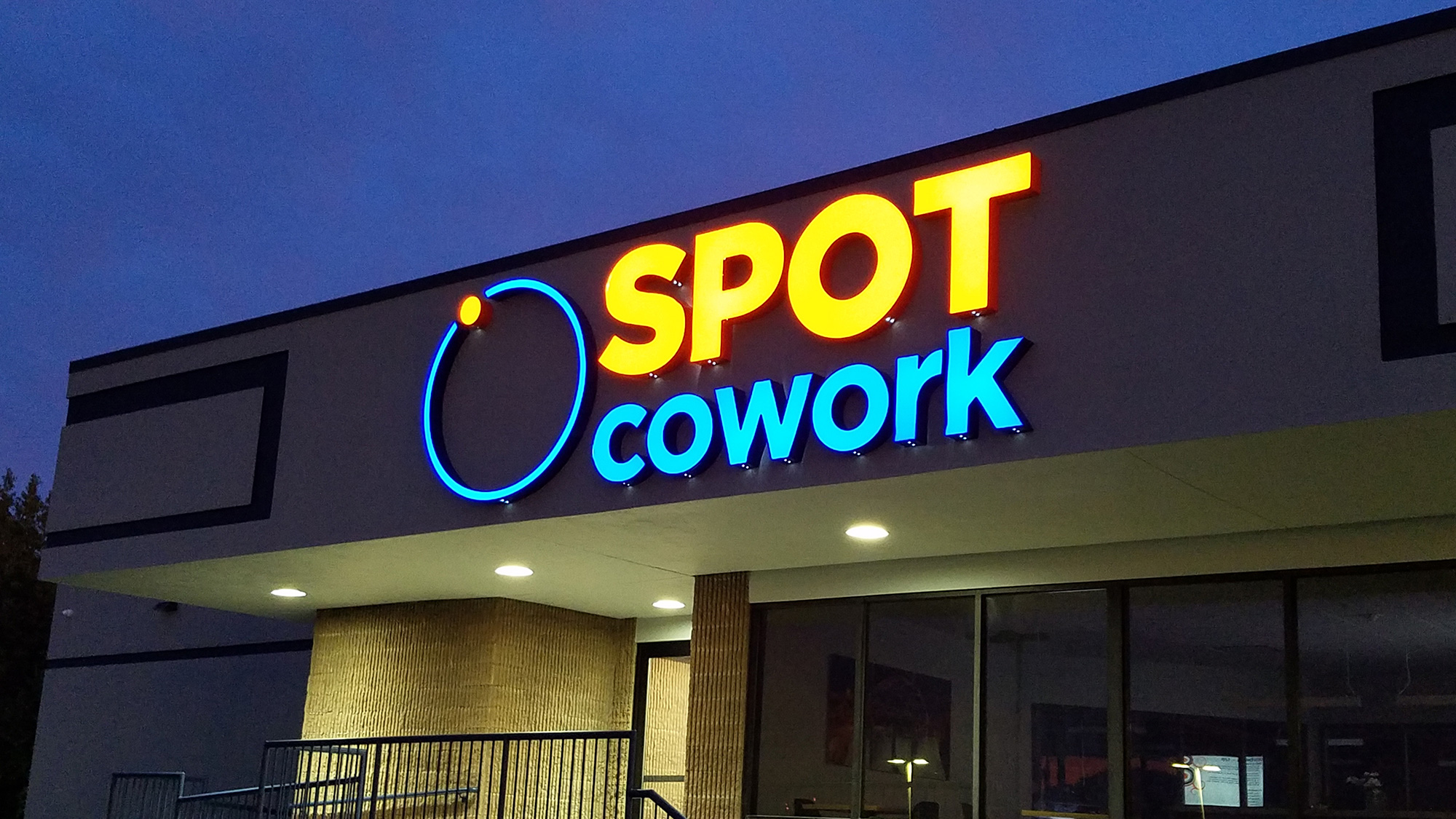
- Kerning: Kerning is referred to as the space between two characters. The purpose of kerning is to adjust the white space between two characters and keep it from being too much or too little.
- Tracking: in each word, phrase, and paragraph, space is known as tracking. If the tracking is too tight, the characters will appear cluttered, thus giving off an unprofessional look. As a result, the readability of your text will drop.
- Leading: The third and final spacing option on our list is leading. Between the lines of your text, leading serves as the vertical spacing.
Georgetown, TX | Things to Consider When Choosing Sign Font | Sign Company News
SYNOPSIS: Do you want the right sign for your business signs? Here are some tips that will help you along the way.
When designing something as crucial as your business signage, the most important consideration should be the font. Oftentimes, it is the font
How the right font choice boosts sign readability
BY: MIKE VOLLING, GEORGETOWN SIGN COMPANY
Do you want the right sign for your business signs? Here are some tips that will help you along the way.
When designing something as crucial as your business signage, the most important consideration should be the font. Oftentimes, it is the font that determines whether or not your project will be good enough. The primary goal behind signage is to reach and engage your customers while putting your message out and the font plays a vital part. If you are on the lookout for the perfect font for your business signs, the following tips will help you along the way.
Let’s begin.
The Font Should Be Relevant to Your Business
There are times when the font in your signage doesn’t relate to the message you are trying to put out. For example, you have a sign to ensure safety in the workplace, but the font is cursive. As a result, you won’t be able to convey the message. On the contrary, a straight bold font might be effective when trying to use signage for safety in the workplace. Choosing the font that resonates with your message is instrumental in attracting more eyes to your business.
The Font Should be Readable
There is a variety of factors that determines the readability of your signage text. Some of which include spacing, color, and font. The first factor that makes your sign readable is color. However, your signage manufacturer can help you find the right color. As far as spacing is concerned, the following factors must be kept in mind.