Fonts can feel like a small decision, but they have a huge influence on how people view your business. A good font makes your message easy to read, easy to remember, and visually appealing.
Start with Function First: Can People Read It?
You would be surprised how many signs look great but are tough to read from more than a few feet away.
- Simple over fancy: Decorative fonts can be stylish, but they are often hard to read, especially on larger signs or in low light.
- Spacing matters: Crammed text feels chaotic. Letters need breathing room.
- Size counts: Think about distance. Will people be driving by? Walking past? Use a font size that fits the setting.
Drive or walk by other businesses around Highlands Ranch. Notice which signs are easiest to read and which ones you need to squint to read.
Match the Font to Your Brand’s Personality
Fonts speak in style, not just letters. A sleek sans-serif font says something totally different than a cursive script.
Here’s a quick overview:
- Sans-serif (like Helvetica or Arial): Clean, modern, approachable
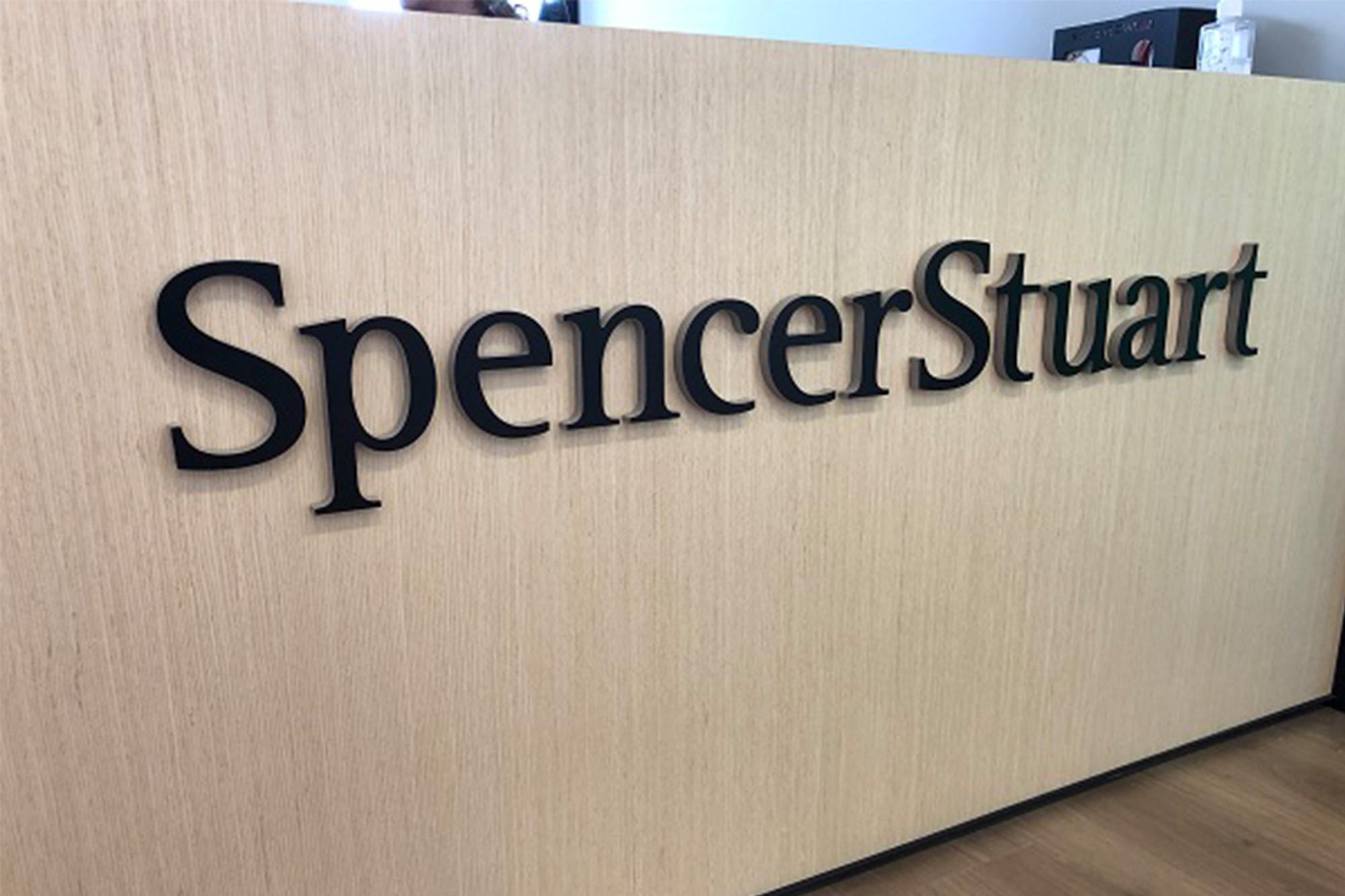
- Serif (like Times New Roman or Georgia): Traditional, professional, dependable
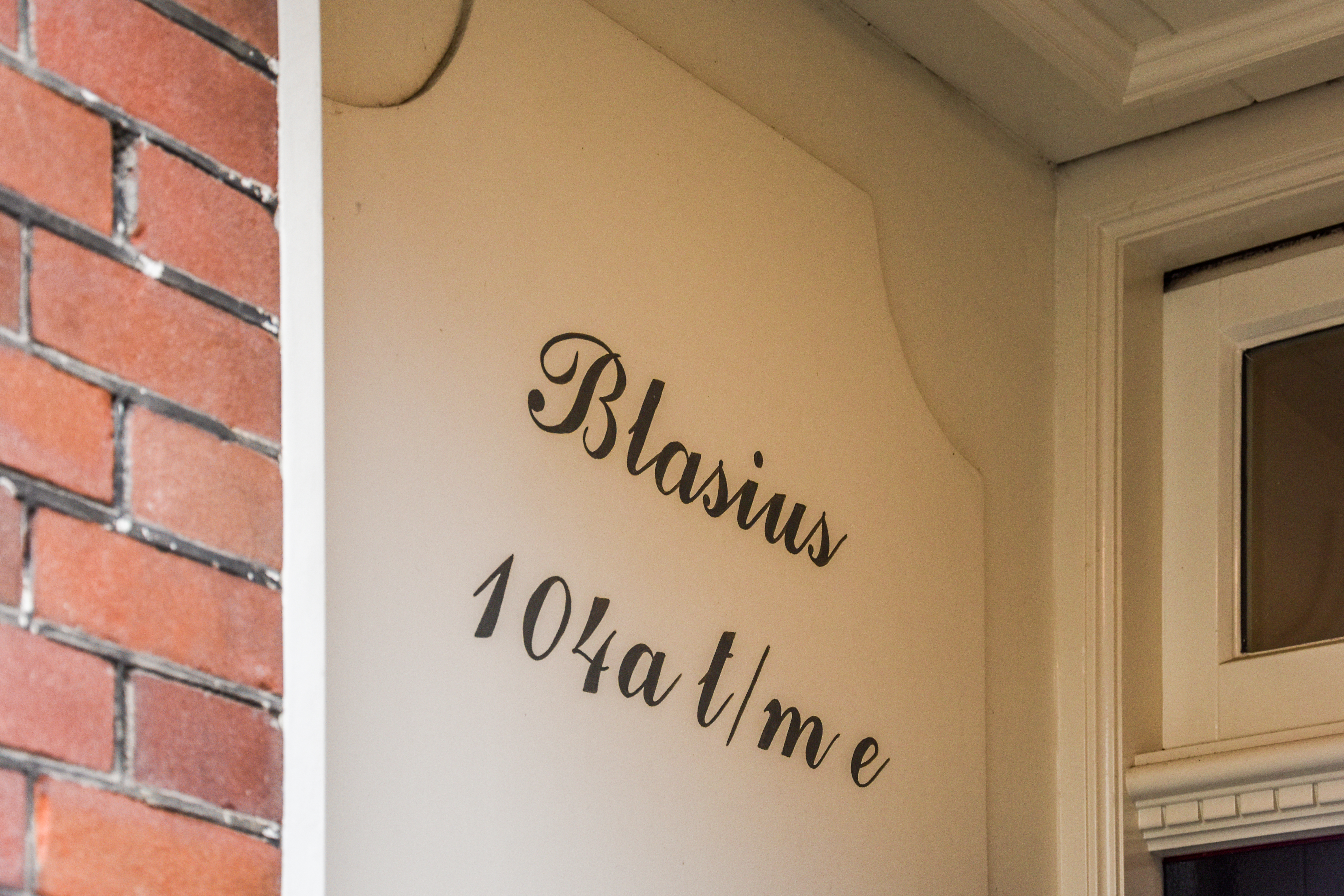
- Script fonts (like Pacifico or Brush Script): Elegant, personal, artistic (but use sparingly)
- Display fonts (bold, chunky, or stylized): Loud, energetic, memorable
What matters is alignment. A law firm and a frozen yogurt shop won’t benefit from the same vibe. Choose a font that feels like your business.
Consider Where the Font Will be Displayed
The material and lighting can change how a font actually looks once it’s printed or fabricated. A font that looks clean on a website might blur on a backlit acrylic sign or get lost in vinyl cutouts.
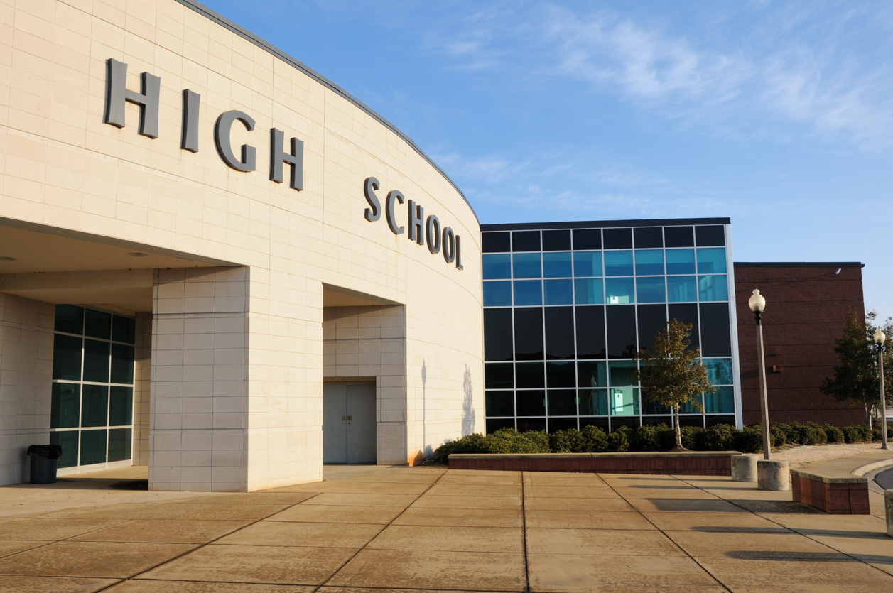
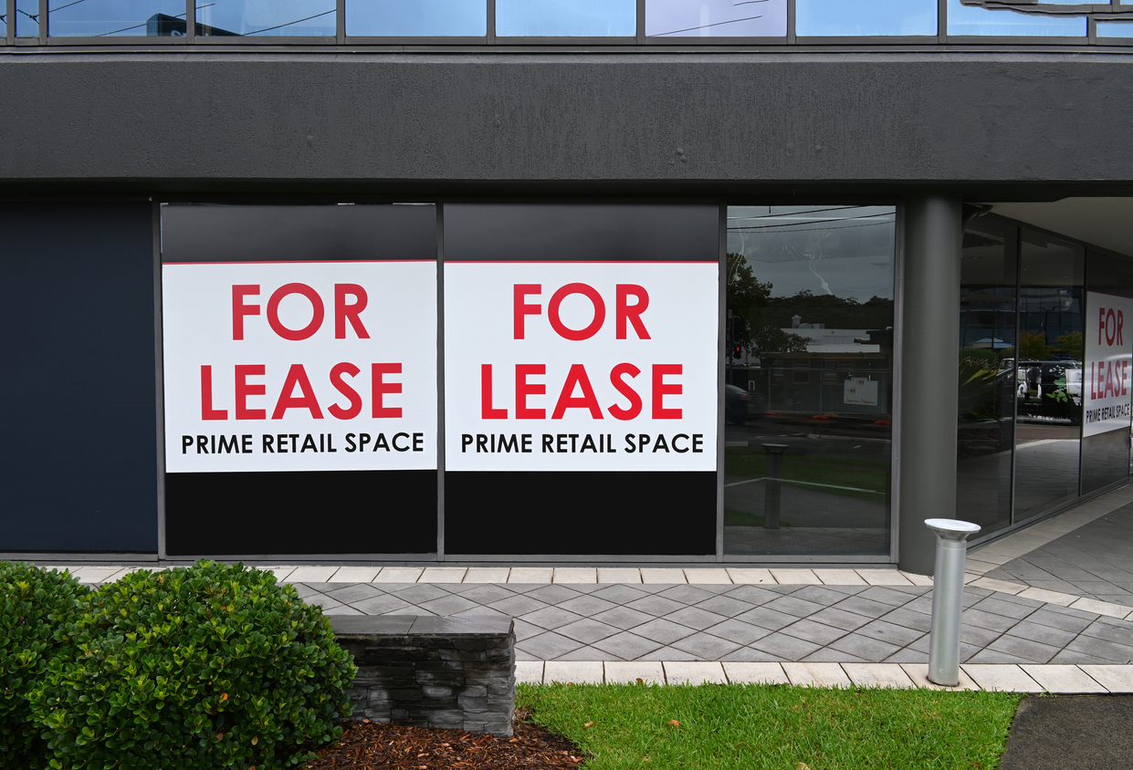
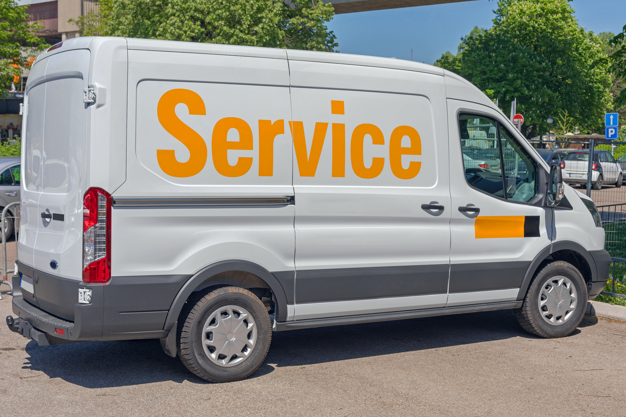
- For outdoor signs: Go bold. Thicker lines and high-contrast fonts hold up better against sun glare, distance, and shadows.
- For indoor signs or lobby displays: Make sure the font fits the environment. Do you have a modern space? Go clean. Cozy or boutique? You can add a little flair.
Don’t Rely on Guesswork and Test It First
This is where a good sign shop comes in. At Legacy Custom Signs & Graphics, we always recommend mockups. We’ll show you what your message looks like with different fonts, sizes, and materials before anything gets made.
What looks perfect on your laptop might feel totally different on a 6-foot wall. We make sure it feels right and that it actually works.
Let’s Find the Font That Matches Your Company
Picking a font might not seem like a big deal, but it’s one of those small things that can make a big difference. It affects how customers see you and whether they even notice you at all.
At Legacy Custom Signs & Graphics in Highlands Ranch, we help local businesses create signs that are easy to read, true to their brand, and built to last.
Reach out today, and let’s find the font that fits.