A retail store layout lends itself to numerous opportunities to grab attention and display messages. Owners concentrate on product display, flow of traffic through a store, lighting and general ambiance. These are all important factors. But, think about what consumers see before they enter the store.
There is a saying about people that goes, “The eyes are the windows to the soul.” For a retail store, that sentiment can be expressed as, “The windows are the windows to the store.” Not very poetic, but a retail store window can alter how many patrons step foot inside of a store.
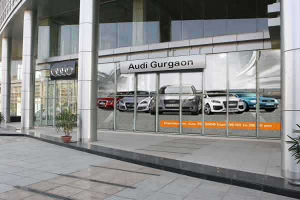
With that, retail shops have to find a way to separate their displays from every other store down the line. This is where window graphics come into play. Here are some tips to creating inspiring window displays with graphics.
BE Conscious
Even before the store opened for business, the owner or manager should have made note of the daily foot traffic that passes the store front. Specifically, what are the demographics of the passersby—age, income level, habits, etc. This will help immensely in creating effective window displays.
Taking good notes will help direct the display message, the timeliness and the content. For example, a toy store, which obviously offers items for use by children, would typically use bright colors, simple words and graphics that focus on toys, actions figures, games and general fantasy. However, consider a toy store located in an upscale mall surrounded by niche boutiques and fine dining establishments. While the inside of the store may scream wonderland, the outside might attract the clientele better with subdued messages aimed at the purchaser (mom and dad) rather than the end user (child).
Consciously evaluating your local consumers will go a long way toward using your window space effectively.
BE Current

Vinyl Graphics
Display marketing works best when it is fresh in the minds of consumers. This means window displays should change. They should change with the seasons, with the current trends, with the neighboring stores’ efforts or with the needs of the store displaying the message. The important thing is to remember that visual displays become the landscape after a matter of weeks.
Think about political signs. One day, a couple of months before election day, you will leave your house on your way to work. Today is different because, at a large intersection you go through every day, you notice a large red and blue political sign the reads “Vote So-and-So for Senate.” That sign was put up overnight. You noticed it immediately because it was a change to your daily visuals. However, two weeks later, you will not notice that sign on the corner. This is because the sign has now become the landscape, just like every oak tree that lines your street.
Changing a window display on a regular basis makes a window display seem “new” each time it is altered. This creates interest in the store and fills people with a sense of curiosity.
BE Clear
The message, sale items, current specials or whatever a store is trying to promote, has to be easily indentified when a consumer first sees your window. Nothing is more confusing or off-putting than a retail window display with no clear message or direction.
Window Graphics
Consumers may be able to overlook a poorly designed window display, but if they can’t figure out what a store is offering from the display, the chances of them going in to the store find out severely decrease.
A general rule is “one window, one message.” Choose a single hot item or a one amazing special to advertise on a window and make is shine.
The clarity of the display should be enhanced with proper text sizing, a matching color scheme, readable fonts and visually pleasing and relevant graphics.
BE Clean
If you want to draw people to your store, you can’t drive them away with a display that makes them cringe and walk the opposite direction.
This tactic may work when a company creates an audio jingle so absurd that you actually catch yourself humming the tune hours after you hear it. However, when you’re dealing with visual stimulus, a negative image creates a negative experience and people will tend not to return to the source of the image.
An important tip to remember is, with graphic displays, white space is often positive and increases the effectiveness of the display. White space is essentially blank space; the space on a window not covered by a graphic. This space helps to separate ideas, create a flow of your message and ultimately help viewers to see what it is you actually want them to notice.
So, don’t look at your glass canvas and try to fill every inch of glass with text or graphics. This causes confusion, which will quickly lead to frustration.
A store front offers a very important marketing pallet with the potential to actually increase a store’s relevance and revenue. Window graphics are very affordable, extremely versatile and proven effective. Remember these important tips and, above all, Be Creative.