[/caption]
Logo Change
SYNOPSIS: While consistency is important when establishing image and a presence in the ever flooded world of advertising. It's always good to take a step back to look at and evaluate your logo and how it reflects who you are and where you are going with your b
BY: ,
While consistency is important when establishing image and a presence in the ever flooded world of advertising. It's always good to take a step back to look at and evaluate your logo and how it reflects who you are and where you are going with your business.
Recently we've gone through a process of coming up with a new logo for Pillar Signs and Graphics. It was a process filled with redraws, multiple ideas, voting, eliminations, etc. But the final result is a good solid logo professional looking with an added flair of personal design elements.
There are a lot of companies going through logo revisions: Pepsi, McDonalds, Mountain Dew, etc. The changes are subtle, but enough to make you look again. It could be the way Mountain Dew has some of it's products with MTN instead of 'Mountain', or how McDonald's is giving 'facelifts' to there locations or Pepsi staying with the same theme: red, white and blue 'swirls' in a circle, but completely different. They are changes that still have you knowing that the product you are looking for/seeing is still the same and yet... is that Pepsi?
[caption id="attachment_325" align="aligncenter" width="300" caption="Our new logo as of January 2012"]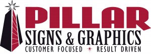 [/caption]
[/caption]