Color Contrast on a sign
Posted in: Industry News
Readability is important. You don’t expect someone to choose colors that don’t contrast well with each other. For instance, dark brown on black. It would all blend together and the text on the sign would be pretty tough to read. The same can be true for colors that are not really close on the color wheel, but they simply don’t get along….like green text with a red background. It can cause a vibration effect that can make you nauseous.

And as important as it is for your sign to be colorful, going overboard may cause a negative effect. If the eye has to work too hard to decipher the information in your sign, the individual reading the sign will probably need put more effort into absorbing the information displayed. This could be good and bad, but ideally you want your message to come across clear and quick.
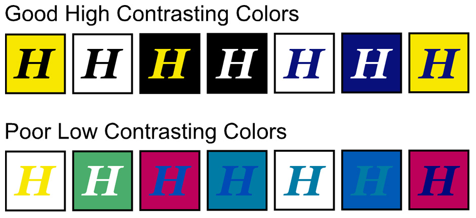
So, color contrast being the topic here, I have placed a chart in this writing that shows a handful of good high contrasting colors and a selection of poor low contrasting colors so you can understand how blending colors can lead to certain results.
I hope my efforts have help increase your knowledge on color contrast, and you don’t make these types of mistakes.
Return to: Color Contrast on a sign
Social Web