Attention to Detail is Key
Posted in: Industry News
Attention to detail separates great sign companies from good. This thought occurred to me as Designs Phoenix was installing a wall-paper graphic in the third of four different store locations for one of our clients. We were considering the optimal location to begin the installation layout that would best hide the starting point. We naturally gravitated to a spot that would not be obvious to the casual observer. The graphic we were installing was a two foot high band of printed wall paper installed around the entire interior of the store.
The design contained ten large full-color pictures of different product types that are the main offering of the store, interspersed with the store logo. The pictures were laid out in a line, one picture adjacent to the next with the client logo following. The pattern was repeated over and over around the perimeter of the store. The graphics were installed at the junction of the walls and ceiling. This design was duplicated in all four stores.
Designs Phoenix surveyed each store to get an accurate measurement of the perimeter of each. The average length of wall paper for each store was roughly 200 feet. We printed the panels on our HP Design Jet printer on HP PVC-Free pre-pasted wall paper. We cut and rolled each panel in our facility and organized the rolls by store location for installation. We divided each panel into two pieces to allow easy handling. Typical installation panels were roughly ten feet long containing five pictures.
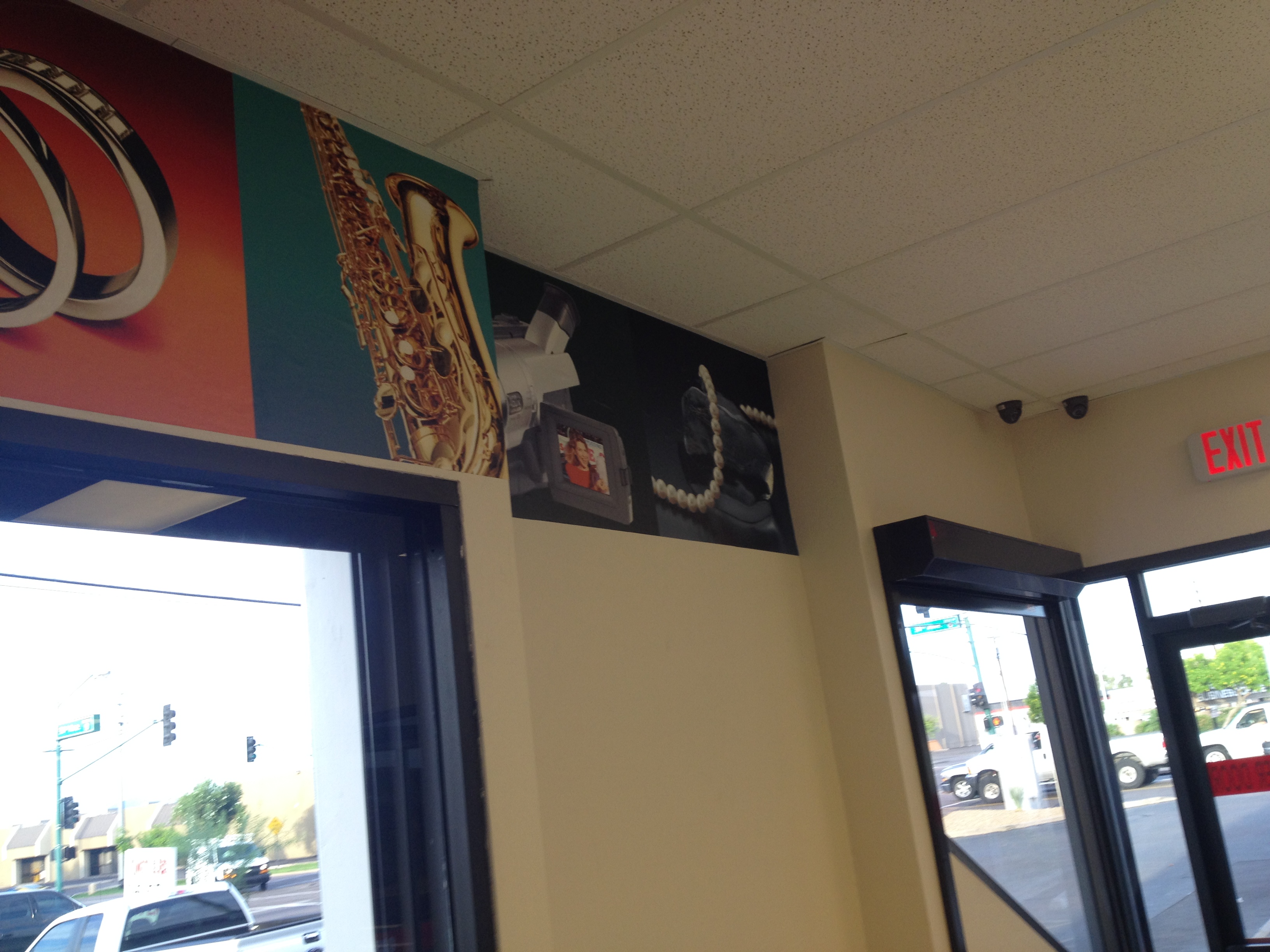
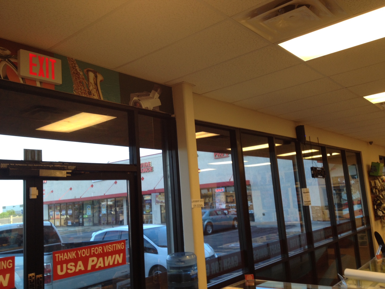
In this installation there were two critical factors: 1) laying out the graphics to insure the correct repeat sequence of pictures; and 2) since the graphic covered the entire perimeter, picking the optimal location to begin and end. Because we had little control over the spot in the panels where the graphic came together, the key to the location selection was picking a spot where the intersection would be least noticeable. Here are a couple of visuals of the installed graphic. ( As they say, a picture is worth a thousand words…)
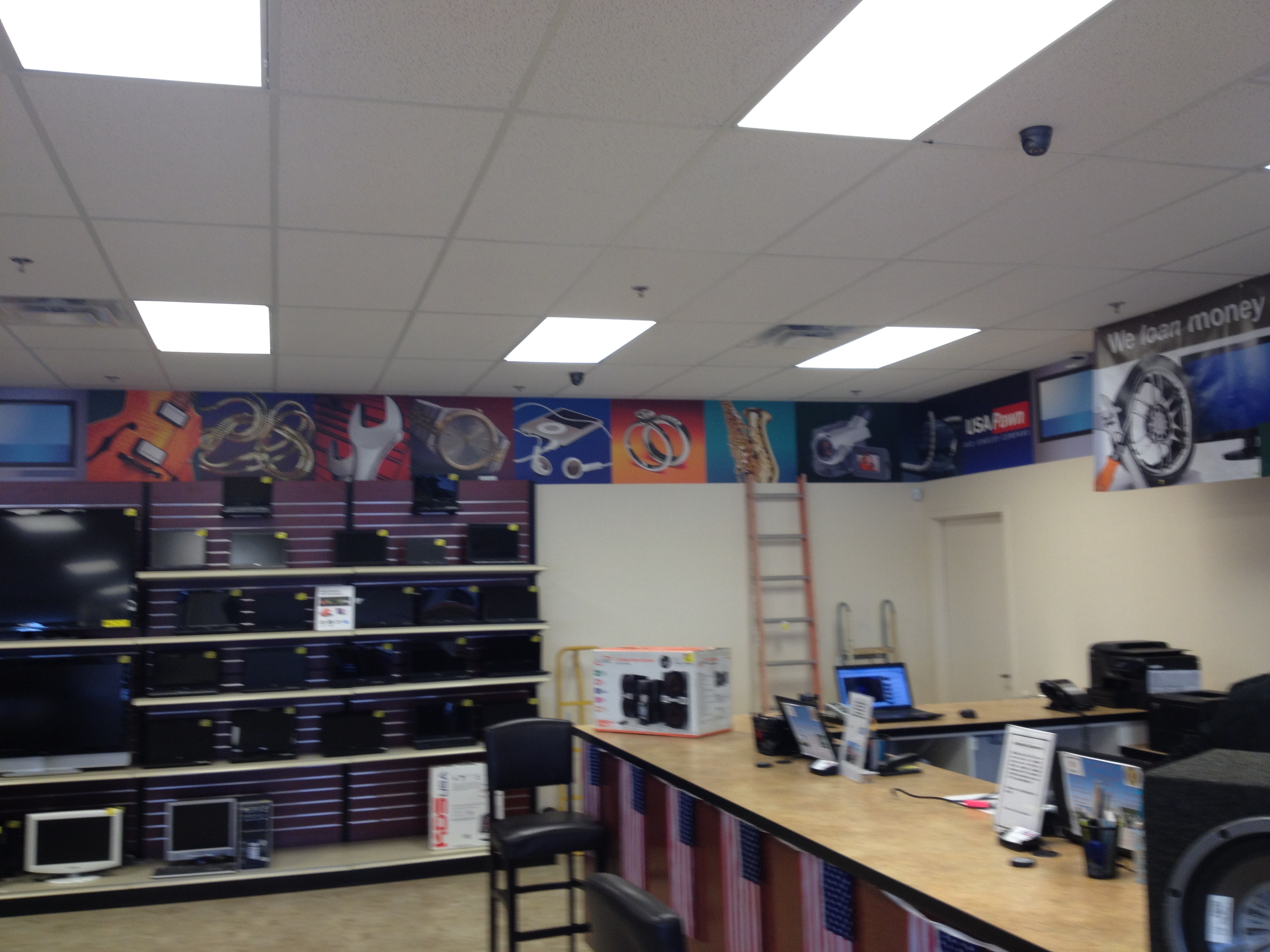
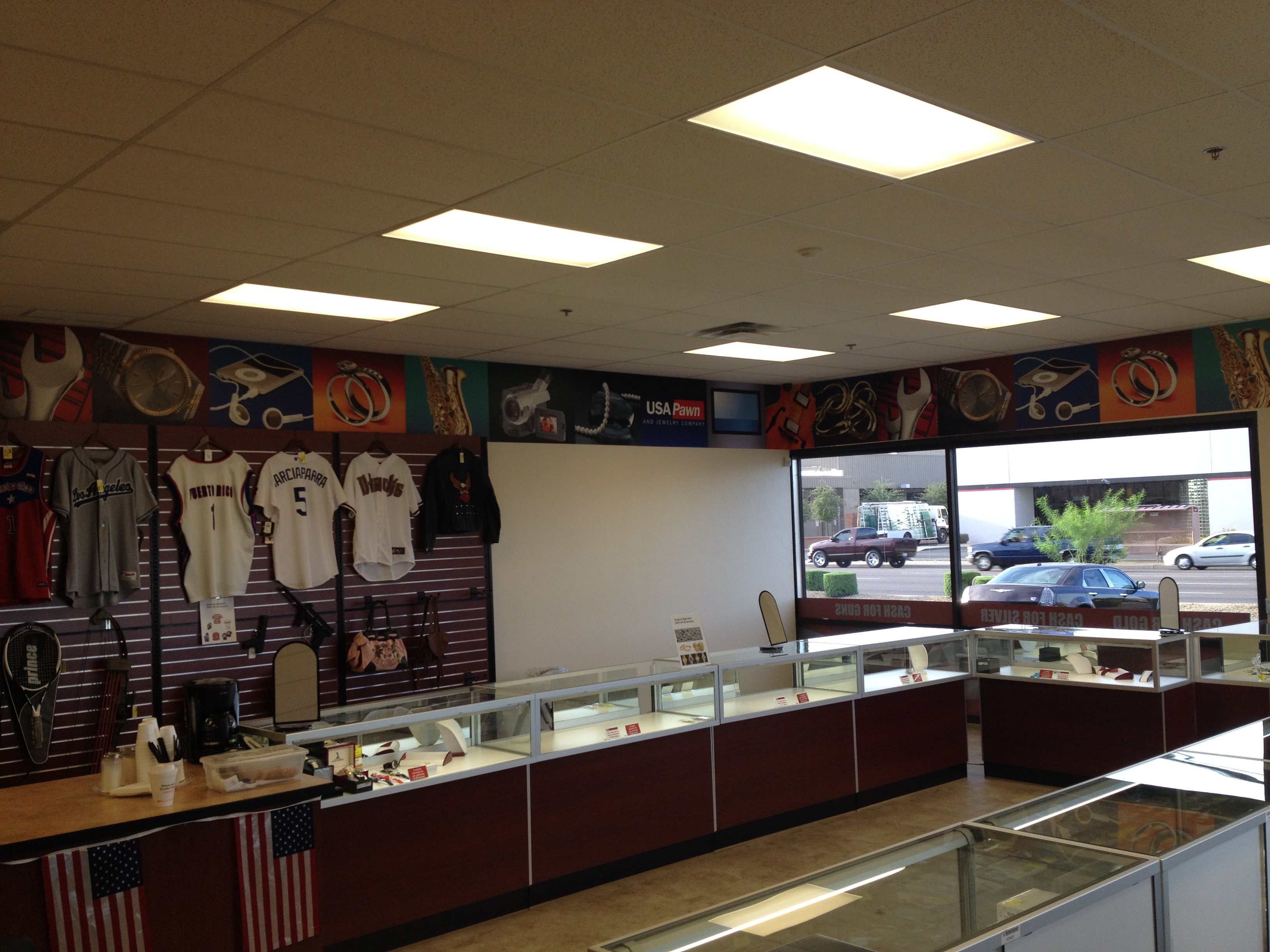
A good sign shop would probably pick a corner in the back of the store to begin the installation sequence and that would most likely be acceptable. Designs Phoenix looked for an irregularity in the middle of a wall such as an indented section or a bumped-out section. We began the installation on the hidden side of that feature, so the intersection where the graphics came together would be essentially hidden and incorporated into the irregular feature. Here are examples from two stores.
In further attention to detail, we installed in the hours before the stores opened to eliminate disruption to their operation. The results were graphics that greatly enhanced the appearance of each store, and that appear to be seamless. Contact Designs Phoenix today for exceptional graphics to enhance your space for your customers and employees.
Return to: Attention to Detail is Key
Social Web