What the Font – The ABCs of ADA Signage Fonts
Posted in: Industry News
- What is a font? A font is a shape style for a letter. Designers use fonts to give a word an
ADA Signs can use a limited number of fonts
interesting look or feel. You probably know this from using word processors. Arial and Helvetica and two common fonts.
- There are a lot of font type. Many are less readable, but more interesting than the standard fonts. ADA Fonts need to be readable to the visually impaired and touchable to the blind and visually impared. Having a lot of serfs, that is decorative points or strokes withing the letters, is confusing and unnecessary for communication.
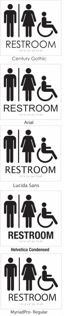
- San is latin for “none” so San Serf fonts are those without decoration, points, or strokes. These are clear and easy to read. They include:

Sans Serif
Arial
Century Gothic
Frutiger 55 Roman
FrutigerLTStd-Cn
Helvetica Condensed
Helvetica Regular
IKEA Sans Regular
Lucida Sans Unicode
MyriadPro-Regular
Examples of these are on the right side.
- Size: The size of a font is adjustable from tiny to massive. The text is always just about the Braille and below the pictogram. There must be at least 1/8” between the letters. These letters must also be at least 5/8” high and are normally higher.
- Tactile reading, that is reading by touch, is a slow process. Seifis are for the sighted and look great, but they make reading by touch much harder.
- So there is a compromise. Using one font may work, but the ability to use a number of fonts opens up doors to better design and more interesting signs. While most fonts are not used for ADA signs, a few are and there is hope to create a more intereing sign with these variations.
Using Upper case. The lower case letters in a font vary a lot. This is confusing for the tactil reader as well. All ADA signs use upper case only.
- Weight: ADA guidelines tell us a “medium” or “semi-bold” weight will maximize the readablity of the sign.
- You may be wondering if Braille is used, do I need tactile letters? While Braille readers can read quickly, not all vision empaired people read Braille. Braille is taught to young people who are blind at a young age. Older people who lose their sight ussually do not know Braille. These people who had sight and now do not, are better at letter shapes.
- Want to know more? Give us a call
760-730-5118

Social Web