Littleton, CO – Use These Tips to Design the Best Digital Menu Board Signs
Posted in: Industry News
Do you want attractive digital menu boards for your restaurant or eatery? These simple tips will help you out.
In the world of business signage, digital menu boards are the talk of the town and conventional menu boards are but a thing of the past. Digital menu boards are illuminated, vibrant and more colorful. At the same time, they allow you to publish engaging content with a single click. However, just because you have digital menu boards, it doesn’t mean that they will automatically attract customers. You need to put a significant amount of effort to make the most of them. In this article, we will discuss ways to design the best digital menu boards.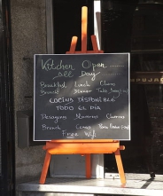
Let’s begin.
Structure Your Digital Menu Board
The first step is to structure the content on your digital menu board so that customers find it easy to understand. To sort out all the items, categorize them. For example, your salads should be under one category and your main course and beverages should be placed under separate categories.
Rows and columns help arrange all of your items within different categories. For example, you can mention food items in one column and their prices in the column beside them.
If you structure your content using categories, rows and columns, customers will find it easier to order their food,
Refrain From Overusing Images
A common mistake that people make when they are designing their digital menu boards is that they overuse images. A bombardment of images can create clutter, which can eventually damage your design. Opt for one or two images However, if they get in your way and affect your message, it is advisable to let them go. Interestingly, there are some digital menu boards that look much better without any images.
The Contrast Shouldn’t Be Too Harsh
Whether it is an image, a piece of text or some video, try not to overcomplicate the color contrast. Not only does high color contrast affect readability, but it also irritates the eyes.
Convey the Message of Your Brand
As discussed earlier, your menu board is the visual representation of your brand. So, when you are designing a menu board, take elements from the logo on your webpage as well as your store to conceptualize the design of your digital menu board.
The Text Should Flow in a Hierarchy
The text on your digital menu board should be well-structured and follow a hierarchy. In terms of size, the main headings should be the biggest, followed by subheadings. The food items, their prices and descriptions should have a smaller font.
These were some of the easiest ways to come up with an effective digital menu board sign. To explore further, get in touch with signage professionals in Littleton, CO.
Return to: Littleton, CO – Use These Tips to Design the Best Digital Menu Board Signs
Social Web