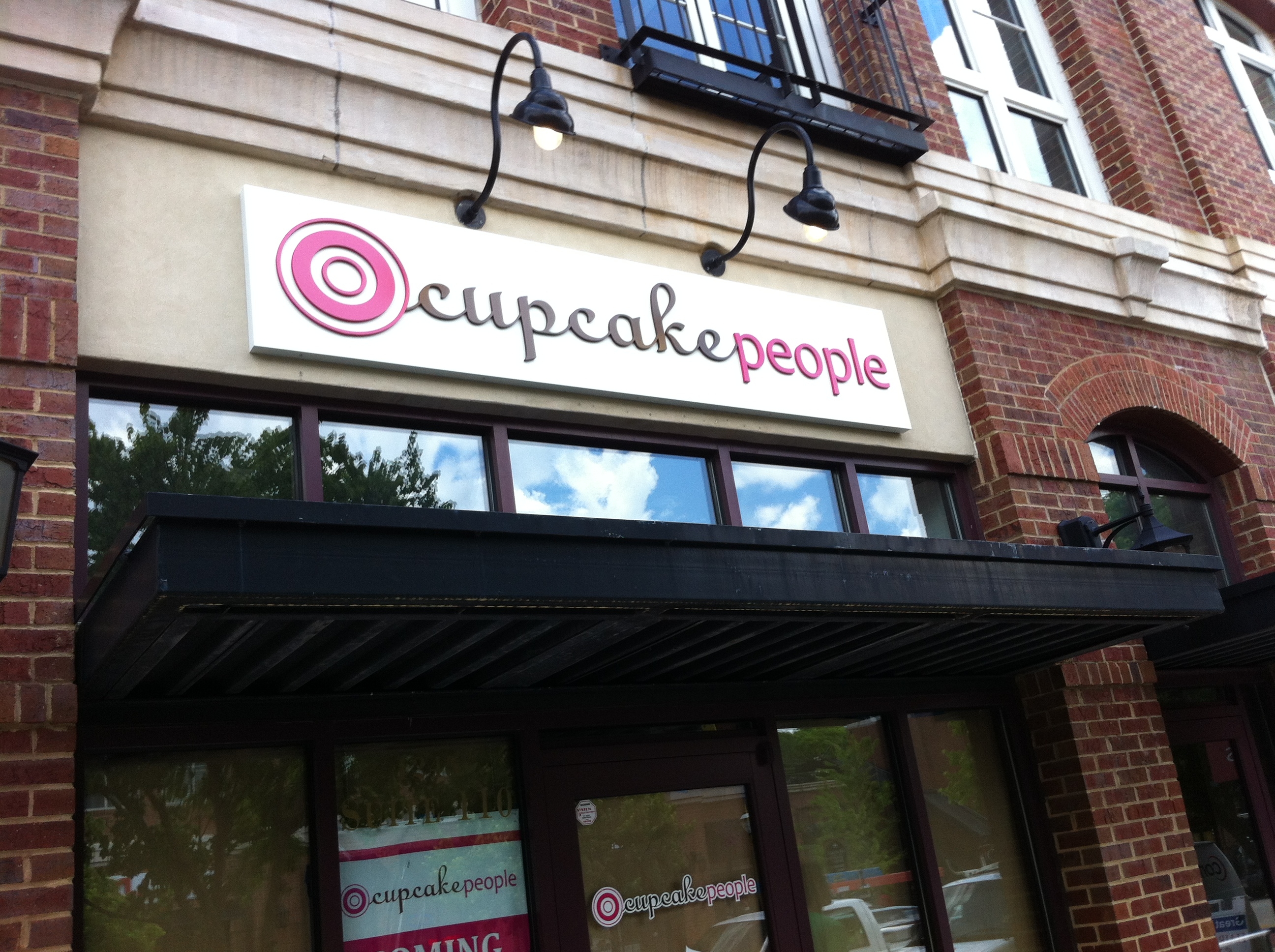
Retro Storefront Sign in Atlanta, GA for The Cupcake People
Posted in: Industry News
One of my very favorite storefront sign projects ever was also one of the simplest. While many signs today tend to dazzle with a variety of features meant to grab the attention of those passing by, this sign was really just the opposite. It included no neon tubing or LED, no transformers or power supplies, no photo cells or timers. It’s not backlit, front lit, or combination lit. It doesn’t utilize materials that change color when it’s dark out. It’s not reflective or luminescent. In fact, its only illumination comes from a pair of goose-neck lights anchored to the storefront just above the sign.
Calling the storefront sign for The Cupcake People’s location at 1245 Caroline Street in Atlanta’s Edgewood Retail District “just a sign” is kind of like referring to their Pancakes & Bacon creation as “just a cupcake.” Trust me when I tell you, “Pancakes and Bacon” most certainly is not just a cupcake. It is confectionary perfection – – Vanilla maple cupcake with a vanilla cream cheese frosting and bacon sprinkles with a maple syrup drizzle. I dare you to eat one and call it just a cupcake.
Like the “Pancakes & Bacon” cupcake, this sign isn’t just a sign. Like the cupcakes, this sign is perfect in its simplicity – – comfortable and charming. It not only fits the storefront, it fits the building. This sign tells a story about the product you will encounter when you walk in the door. It sets the expectation – – You almost say out loud, “I bet their cupcakes are amazing…” And, they don’t disappoint.
I believe that is what a great sign is supposed to do. They are supposed to help form a positive opinion about the business they promote, and they are supposed to add value. Great signs are supposed to help sell the product. So, no, this most certainly isn’t just a sign. This sign does all of those things. More accurately, it’s a reverse .125 aluminum pan sign with ½” thick router-cut PVC graphics. The graphics are cut, any rough edges are sanded smooth, then each letter is custom painted PMS hot pink #214 and PMS chocolate brown #476, then stud-mounted to the white painted aluminum background. Those are the basics. The secret ingredients are fit and personality. This sign, and this business, has both.
If you are a business owner, ask yourself if your sign helps you sell your product or service. Is it unique? Is it memorable? It doesn’t have to be complex or complicated, this sign is proof that sometimes simple works. I once had a client tell me that he wanted a sign for a new salon he and a business partner were opening. I asked him a confusing question, “What type of salon are you planning to open?” His response was, “To cut women’s hair.” I believe that before you can possibly know what kind of sign you need, and how it should look, you have to know what message you are trying to portray. There are a lot of different types of women’s hair salons. Know what type of salon you want to own, then choose a sign that will help get your message across.
Written by Big Mouth Signs, Inc. – Lilburn, GA
Return to: Retro Storefront Sign in Atlanta, GA for The Cupcake People

Social Web