
Healthcare website design
How Do You Choose The Right Website Design for Your Healthcare Firm or Medical Practice?
By Deanna Wright
It’s essential to make sure you know your brand guidelines and who your audience is to determine which website design is appropriate for your business/practice. This article will give you a brief overview of what components make a website great to help you create the best website for your healthcare firm. If you are interested in marketing your practice, review the credentials of Fisher Design who specializes in healthcare marketing.
Why Your Website Matters
Your firm’s website is the first thing a patient will see when researching healthcare providers near them. Your website only has about 15 seconds to grab the attention of patients online before they close your website. Since there are multiple healthcare providers in the general location, patients will be looking at different options, which means you need to stand out and make them want to come to your firm/practice. Another reason it is essential is that the way you present the website can represent your company to your audience. If it is nice looking and reflects the culture and values, a person might choose you over another whose website is plain and doesn’t show their care value.
Which Website Design Fits Your Brand Personality?
It is essential to know what your brand personality is. Here’s what you should focus on:
- Is your brand more masculine or feminine traditionally?
- Is the tone of your brand playful or serious?
- Does your brand value tend to be more luxurious or affordable?
- Is your brand more modern or classic?
- Are your patients younger or more mature?
- Is your brand loud or more subdued?
Critical Elements For A Great Website
One major factor of a great website is when it is very professional but still has a welcoming presence. Remember that your website will be the first thing clients see online and frequent patients either don’t like hospitals and doctors or have had bad experiences at other healthcare places that they fear going somewhere new.
Color palettes used on websites and in the building play a key role in making sure there is a welcoming presence. Further down, there will be a section on the color palette to figure out which colors fit your brand the best.
Another important factor is making sure your website is easy to navigate. If your website does not have good functionality, then the bounce rate of your page could be high.
What is a Bounce Rate? The Definition. You may come across a high bounce rate while analyzing your website. Bounce rate is the number of people who are landing on your website and then immediately leaving.
The definition states that the person leaves immediately after clicking on your website, but this does not always mean your website has a problem. This definition brings me back to my point about easy navigation. If your website has a high bounce rate but brings in patients, it probably means one or two things. You either have an excellent navigation system on the website where the patient finds information quickly then bounces or is looking for key details like phone number, address, or even how to book an appointment on the main page.
This leads to my next point, having this essential information on the main screen of your website is important. Usually, a patient wants to find this information quickly, and if it is on the main page, then your website is doing the job it needs to be doing. An additional key is that there needs to be coherence throughout the website. This goes with using fonts and colors that are correspondent throughout the website and your healthcare brand.
Color Psychology
Understanding color psychology in marketing will make or break your website.
There are leading colors that are more commonly used within the healthcare industry, as seen in the graph from 99designs (Vista Print).
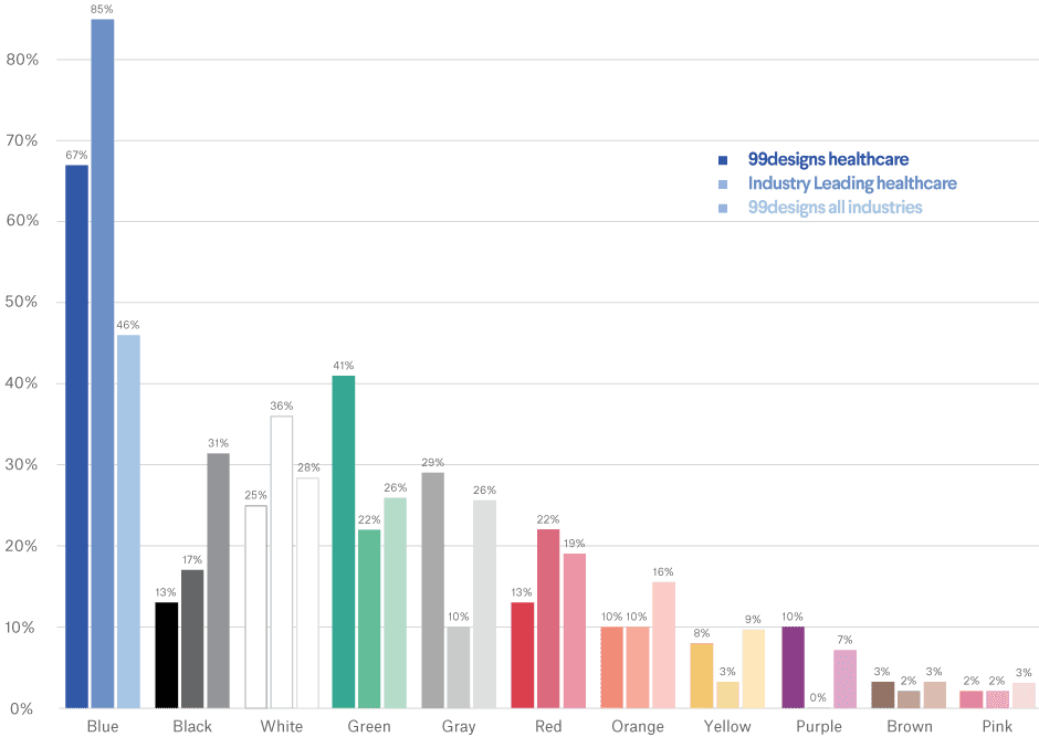
Data visualizations designed by MH Designs.
As you can see in the graph above, blue is the most commonly used color for the healthcare industry, with green right behind it and neutral colors like white and gray right behind that. There is a reason why blue is the most commonly used color which I will discuss in the next section.
What Each Color Represents
There is science and art behind the meanings of colors. As a designer or even entrepreneur, it is vital to be aware of these color meanings to help choose the right color. These color choices will be consequential for your online communication and marketing presence. According to 99 Designs color meanings stem from psychological effects, biological conditioning, and cultural developments. Everyone pays attention to bright colors because brightly colored animals or plants tend to be poisonous.
Another example is how we pick red fruit over green fruit because the color indicates ripeness and sweetness. Depending on where your location is across the world can influence the meaning of a color. Like in China, red represents good luck, whereas, in North America, red represents passion or even danger depending on the person.
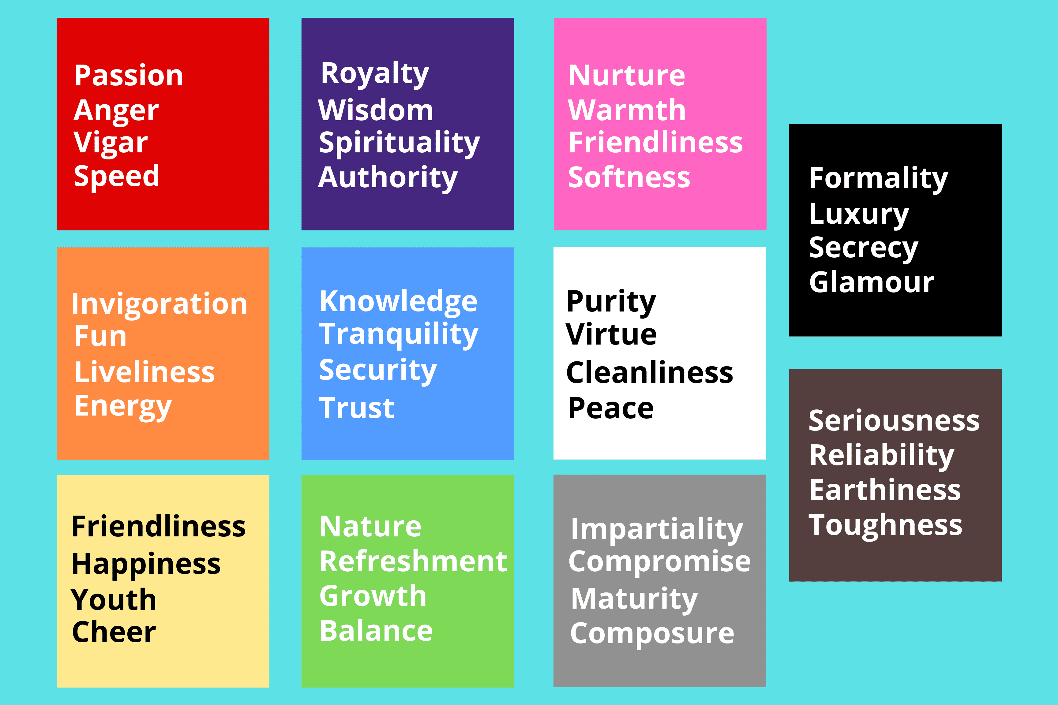
Meanings behind each color of the rainbow as well as neutral colors.
As you can see in the graphic above, each color has a different meaning behind it. Both pink and yellow share one common intention: friendliness, but these two colors usually are not used in a hospital or even an adult doctor’s office. This is because hospitals typically try to use relaxed and calming colors to portray a tranquil environment, and pink and yellow are more warm color tones. If your business is a hospital or an adult doctor’s office, it would be better to use cool tones like blue, teal, whites, and grays. Blue, teal, whites, and graystones shown in the graphic above represent tranquility, trust, knowledge, cleanliness, peace, and maturity.
In contrast, an assisted living center is looking for warmer colors to convey a welcoming atmosphere. They might pick green, blue, white, yellow, or brown tones to convey knowledge, nature, balance, peace, happiness, and reliability, which helps older patients feel at ease, especially when getting closer to their time. If your office is a pediatrics office, colors like orange, yellow, blue, green, pink, and some neutral tones would fit best. These colors represent fun, liveliness, youth, cheer, trust, growth, nurture, warmth, softness, and even purity which generally are associated with the youth. If you own a dentist’s office, green, white, and gray tones are most commonly used in these settings.
If you are interested in redesigning your healthcare website to be more functional and reach more of your audience, contact Fisher Design and Advertising at info@fisherdesignandadvertising.com, 904-398-3699 x 1.