Huntsville, AL – Avoid ADA Sign Mistakes: Consult a Local Sign Company
Posted in: Industry News
Do you want your AD signs to be accurate? Here are a few mistakes to avoid.
With time, a lot of businesses have started installing ADA signs in their workplaces. While some of them are designed and installed correctly, most fail to meet the ADA standards. The regulations surrounding ADA sign standards are well understood by sign experts who have been manufacturing and installing these signs for a long time.
When it comes to ADA signs, there are a few simple guidelines which should be followed.
Companies who fail to meet the ADA sign standards do it for two main reasons. For starters, they may be unaware of the ADA sign guidelines or perhaps they are ignorant of the details. Regardless of the reason for not following these guidelines, you are subject to a big fine.
In the upcoming paragraphs, we will discuss some common ADA sign mistakes and how to avoid them.
Let’s begin.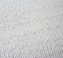
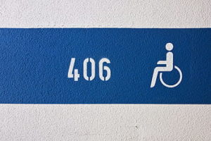
Incorrect Font Choice
One of the most widely made ADA sign mistakes is the improper selection of font. The characters used in your ADA signs should always be in the uppercase and they must follow a san serif font. Moreover, all the characters must always be straight and not in italics. Sometimes, there may be a few limitations surrounding your font choices, because of the proportions and height restrictions.
Wrong Mounting
How you mount your ADA sign is as important as the design itself. Correct mounting also plays a crucial part in ensuring ADA compliance. The height of your tactile characters from the ground should be somewhere between 48 and 60 inches. If you fail to abide by the rules, your signs will be denied their ADA compliance.
Wrong Character Size
The incorrect size of characters is also a common ADA sign mistake which should be avoided at all costs. The standard size of tactile characters on an ADA sign should be around 5/8 inches. However, if there is a dual message on your signs, the character size can be somewhere between 5/8 inches and 2 inches. To be on the safe side, it is better to keep the character size to half an inch.
Braille Misuse
The braille on your sign may just seem fine to you, but it may not comply with ADA standards. A common mistake seen in ADA signs is the use of square dot, while they really should be round. Furthermore, there are also some guidelines related to the spacing between dots, which you cannot afford to ignore. Moreover, you need to make sure that the characters are placed right above the braille. Not abiding by these rules can get you into some legal trouble.
Why Hire a Local Sign Company?
These were some of the ADA sign mistakes you really shouldn’t commit. To avoid them altogether, reach out to a local sign company in Huntsville, AL. These companies execute such projects on a daily basis and know exactly how to avoid ADA sign mistakes. Moreover, with their experience and creativity, they can open you up to an array of sign options you might have never heard of before.
For the best business signs in Huntsville, AL, feel free to visit our website today.
Return to: Huntsville, AL – Avoid ADA Sign Mistakes: Consult a Local Sign Company
Social Web