Say it with Style: Selecting Fonts
Posted in: Industry News
_________________________________________________________________________________
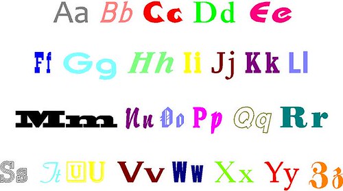
Life gives us many choices which allow us to preserve our individually. When it comes to selecting the right font the choices are many. Many of the ones in use today are fairly recent inventions. The font you choose should represent you, and most importantly, should be legible and easy to read. Avoid very thin or script fonts as they tend to be less legible due to the limited stroke width.
Helvetica is one of the most commonly used and it was created by two graphic artists from Switzerland. Their goal was to create a legible typeface that would be used globally by the signage industry. Helvetica, the Latin word for Switzerland, uses universal lettering that is not language specific and works with the Latin, Hebrew, Hindi, Korean, Japanese, Cyrillic, Greek and Chinese alphabets. In fact, it is the standard typeface throughout the New York subway system. It is also used by CBS Sports during broadcasts.
Contact SignWorks at (510) 357-2000 if you having trouble finding a font that resonates with you. We can make a few suggestions and show you font samples, or send you to one of our favorite lettering websites.
Return to: Say it with Style: Selecting Fonts
Social Web