Elements of Effective Business Sign Design
Posted in: Industry News
Did you know? 29% of shoppers in a study by the University of Cincinnati said they were drawn into a store just based on the quality of the business sign. In the 18-24 age group, the number rose to 55%. 49% in the same study said they had driven by a store because the signs were too small or hard to read.
The three objectives of effective business sign design are to make the sign visible, legible, and readable:
- visibility means the sign can be seen
- legibility means the text and / or graphics are decipherable
- readability means the information is understandable
The elements of business sign design that drive these objectives are size, colors, fonts, layout and content.
Size – Obviously a business sign must be large enough overall to be seen by its intended viewers. Numerous studies have been done to determine the impact of viewing distance and traffic speeds on readability. For example, drivers have only 3.0 seconds to read 4in letters at 45mph.
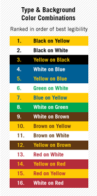 Color – McDonalds is a classic example of the impact colors have on signage. The combination of yellow and red is supposedly one that increases hunger! There is an emotional component to color that marketing gurus use daily… believe it! It is also in the top 10 color combinations that give the highest level of color contrast which makes it more legible and readable. Put green and yellow together and it does not have nearly the same impact because there’s not enough contrast.
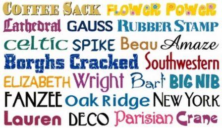 Font – San serif (no tails) is almost always easier to read though some say serif fonts are easier when reading heavy text as in a book. While there’s no hard and fast rule fonts need to be legible from the expected distance. The width of the stroke on a letter is important too. Check out a few different fonts and compare them before deciding which ones to use.

Layout – The organization of the information on a business sign will impact readability. Segmenting the logo, the products / services, and other information like address, phone, etc. will help readers grasp the information more readily. On this image of the real estate sign it’s clear this property is for sale as opposed to for lease. The next section tells what is for sale followed by contact information. Each section is set off with colors or lines that help the reader grasp the information in a logical manner.
Content – The purpose of the business sign determines the content. A storefront sign’s primary purpose is to identify the store’s location. Window lettering or a sidewalk sign might be more of a list of products / services. A vehicle wrap or car magnet needs to promote the brand and the services as well as provide a means of obtaining the products such as a website, phone number or location.
Return to: Elements of Effective Business Sign Design
Social Web