Design Tips for your Business Signs in Boca Raton, Florida
Posted in: Industry News
 Who hasn’t been driving around, stopped at a store and made a purchase, merely because they saw the sign? I am sure all of you did. However how often did you pass by a sign because you couldn’t read the sign properly or it had a poor design and nothing attractive? I am confident that all of you experienced this as well.
This is what we would like to avoid and therefore we would like to give you some tips on the right design for your business signs.
1. Attractive colors
Color is an important factor when designing your sign. It’s part of your brand identity and you want to make sure the color is right. Who doesn’t know Coca Cola red? Well there is only one right color out of hundred shades of red and how confused would the market be, seeing a burgundy red Coca Cola sign?
Be careful with trendy colors. You might be attracted to it and want to convey your personality through that color but remember that today’s color of the year might fade the year after. Certainly you want to be attractive more then one year
2. Contrast for visibility
 The contrast between the foreground and background colors of a sign is crucial for it’s visibility. Therefore this needs to be kept in mind when designing your sign.
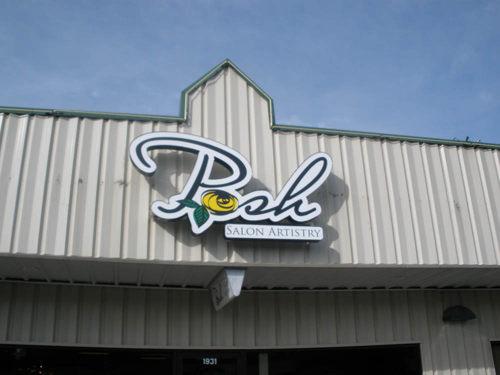
Most of the times logo’s and company branding is designed prior to the sign design so challenges of low visibility might appear. For example having a yellow logo to be displayed on a white background? We can increase the visibility by adding a dark border around the text or graphic.
Left is an example of low contrast due to the color selection.
3. The right size
 Prior to determining the size of the sign we need to consider the viewing distance and speed. A sign along the highway needs a much bigger size due to distance and speed of cars driving by, compared to a sidewalk sign where pedestrians walk by closely and slow.
A good rule of thumb might be 10 feet per inch of letter height. So lettering with 10 inches of height may have the best impact at 100 feet distance.
4. Font for readability
 In addition to the color, contrast and size of the sign, the font plays a big role. Some fonts are beautiful and enhance your brand experience, but they might not be the right choice for a sign. An existing font in a logo can be overcome by enhancing the contrast and choose the right color. However as soon as more text is required an easy to read font is recommended.
Excited to start working on your signage? Feel free to have a look at the different products Sign Partners has to offer!
Written by: Sign Partners – Boca Raton, Florida
Return to: Design Tips for your Business Signs in Boca Raton, Florida
Social Web