Have you been driving along, glanced over to your left to try to get a glimpse at a sign in a storefront, only to discover it was too small to read? Unfortunately it happens to me more than I can mention, and with a little knowledge on this topic, it doesn't have to.
Making a sign with letters inappropriately sized is not going to provide you with good ROI. There are a few things to keep in the back of your mind when designing a sign where people will be viewing it from a distance, or while driving. While some of this may seem like common sense, there is actually a mathematical standard for all the different scenarios signs may be exposed to.
For instance, distance can be a big issue. If you don't make the font size large enough, your audience won't be able to read it. This should be obvious, but there is also another aspect to consider. Negative space...or white space. Your sign, ideally should have a 40/60 ratio of copy and negative space so there is a balance, and the sign can't be too busy. The chart below can give you an idea of how large your letters need to be when laying your sign out for distance.
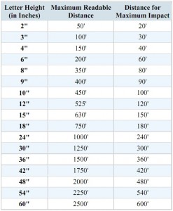
While distance is still a factor, reading a sign while driving introduces another complication. You need to make sure you keep enough 'white space' between the letters so the sign is readable. Using a font like Helvetica or Arial should provide good results. Be careful not to squeeze the letters too close together. Also make sure your color contrast between the letters and the background don't clash.
If you still want to know more, I found a PDF that goes into this subject. Feel free to look over and read all about it.
Sign Legibility Rules Of Thumb
Happy reading!